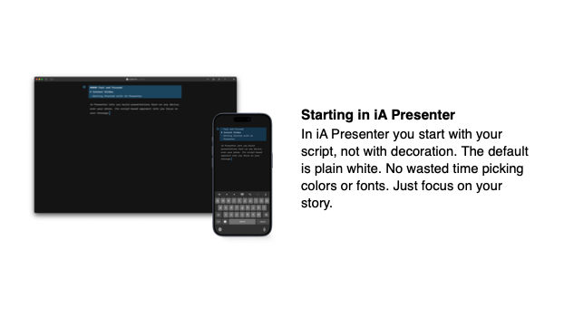
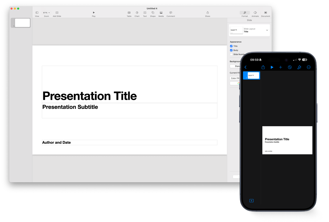
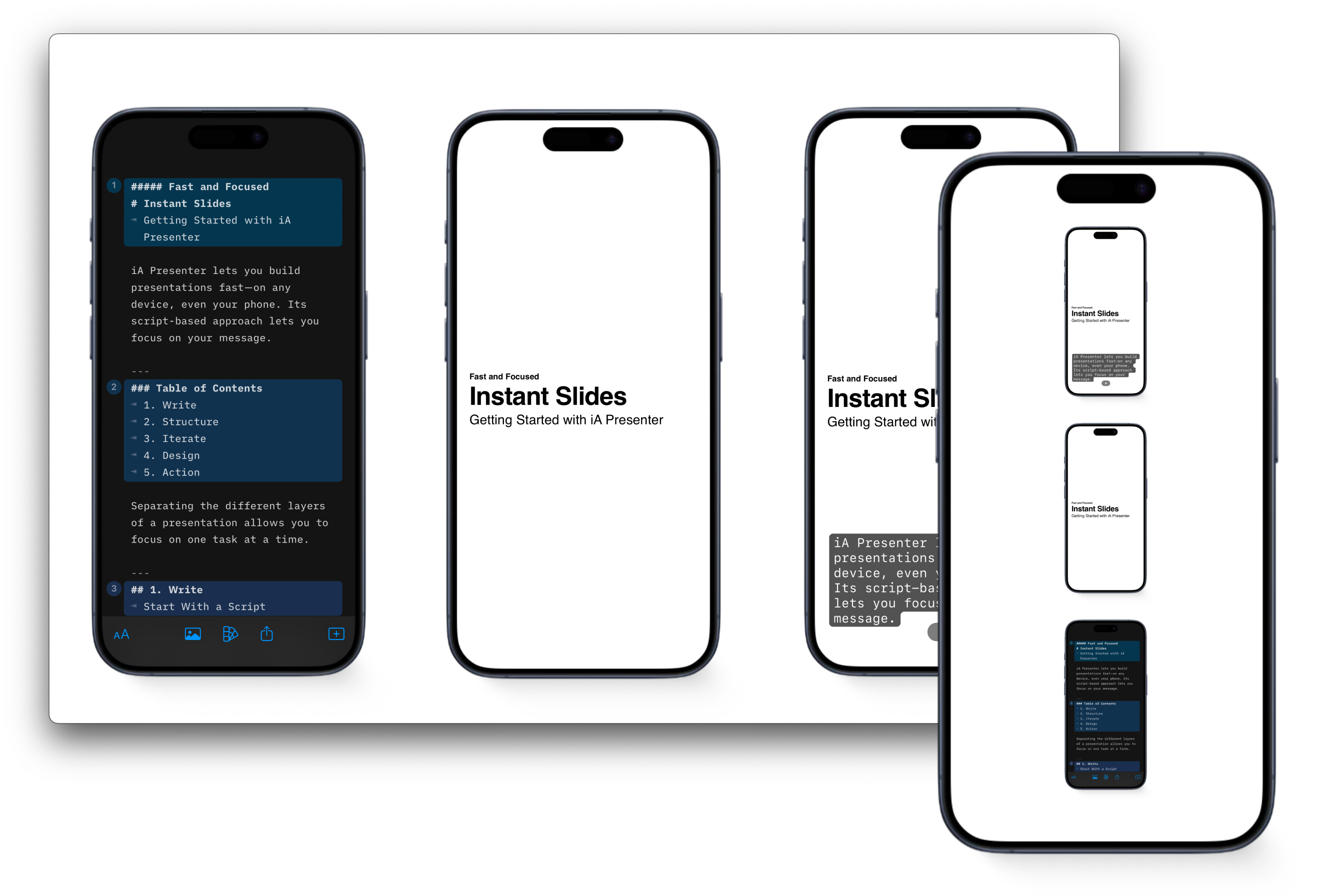
Starting in iA Presenter
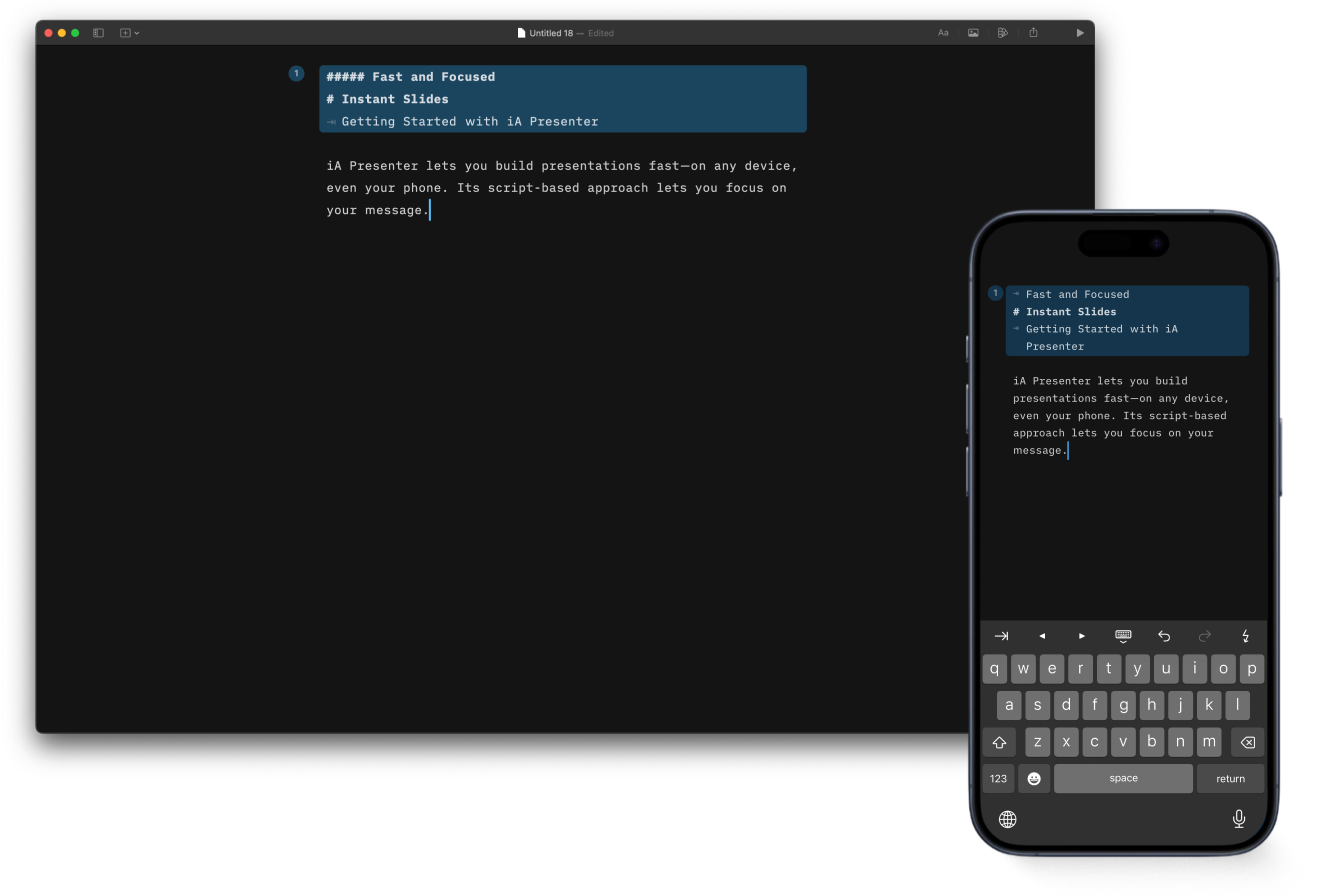
In iA Presenter you start with your script, not with decoration. The default is plain white. No wasted time picking colors or fonts. Just focus on your story.
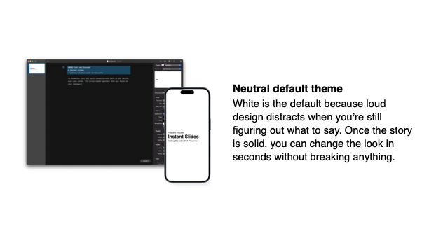
Neutral default theme
White is the default because loud design distracts when you’re still figuring out what to say. Once the story is solid, you can change the look in seconds without breaking anything.
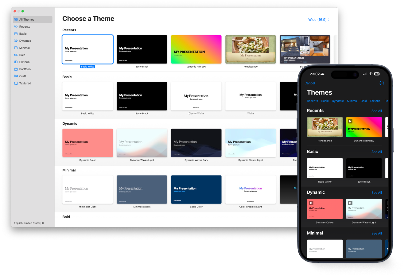
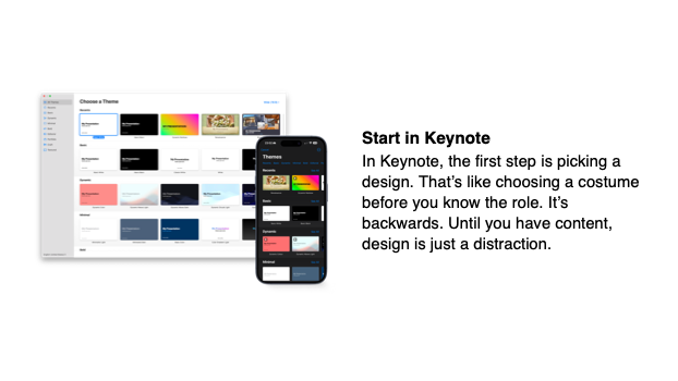
Start in Keynote
In Keynote, the first step is picking a design. That’s like choosing a costume before you know the role. It’s backwards. Until you have content, design is just a distraction.
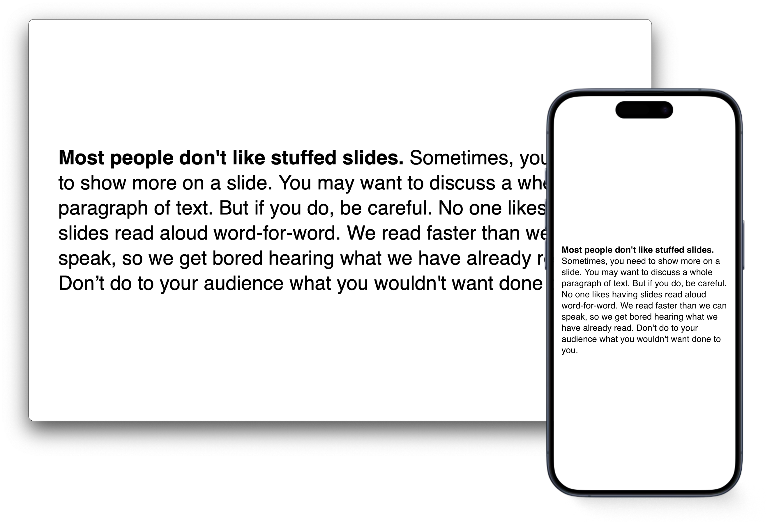
This is a fundamental mistake. To focus on the message, design should be minimized. Flashy colors in the default template are counterproductive.
In iA Presenter you start with the script: Until you know your story, every design decision is a wild guess.
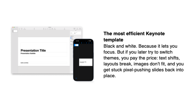
The most efficient Keynote template
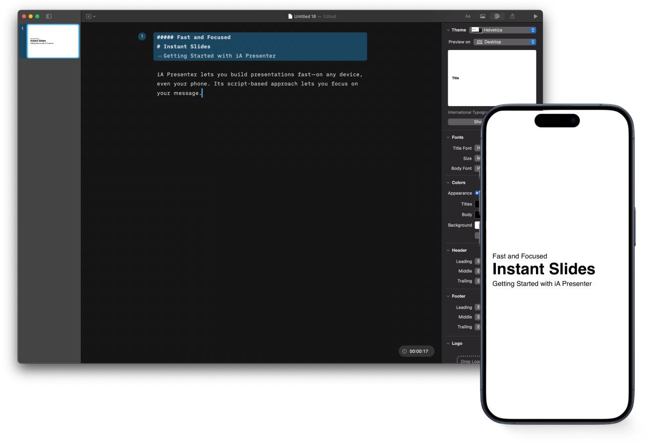
Black and white. Because it lets you focus. But if you later try to switch themes, you pay the price: text shifts, layouts break, images don’t fit, and you get stuck pixel-pushing slides back into place.
Rather than picking a random template based on taste or color preference, you begin with what you want to say. You stick with a neutral template until your story is solid. Once your content is ready, you can change fonts, colors, and layout details like footers, font scaling, or logo size.
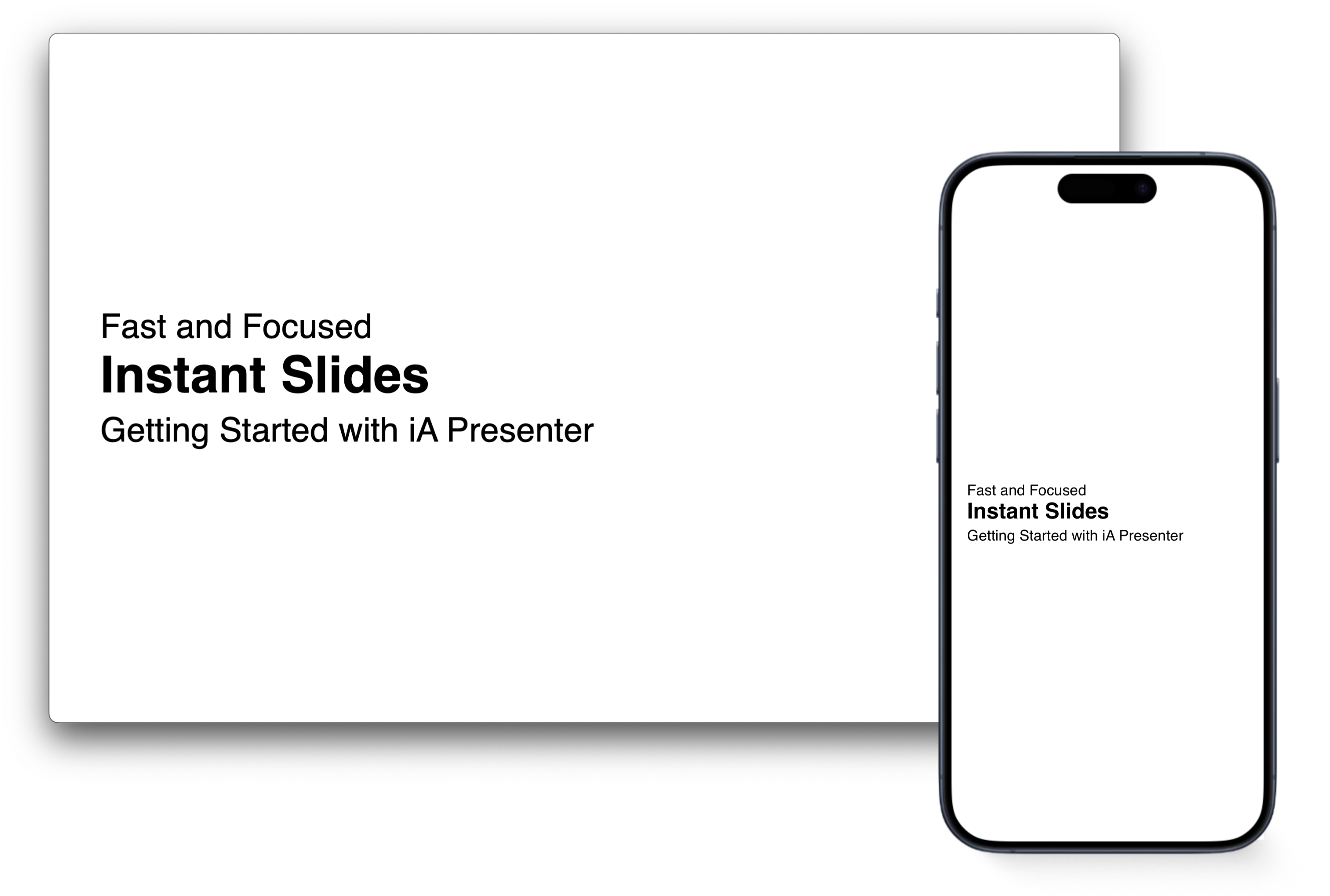
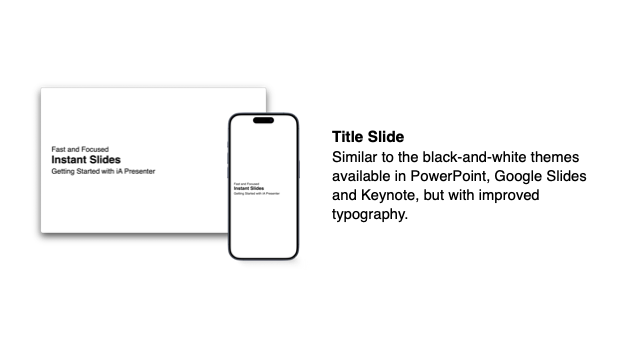
Title Slide
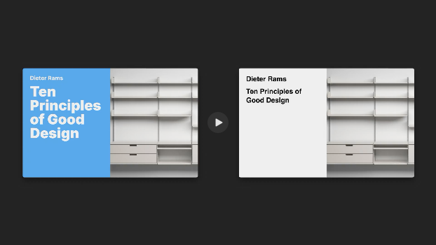
Similar to the black-and-white themes available in PowerPoint, Google Slides and Keynote, but with improved typography.
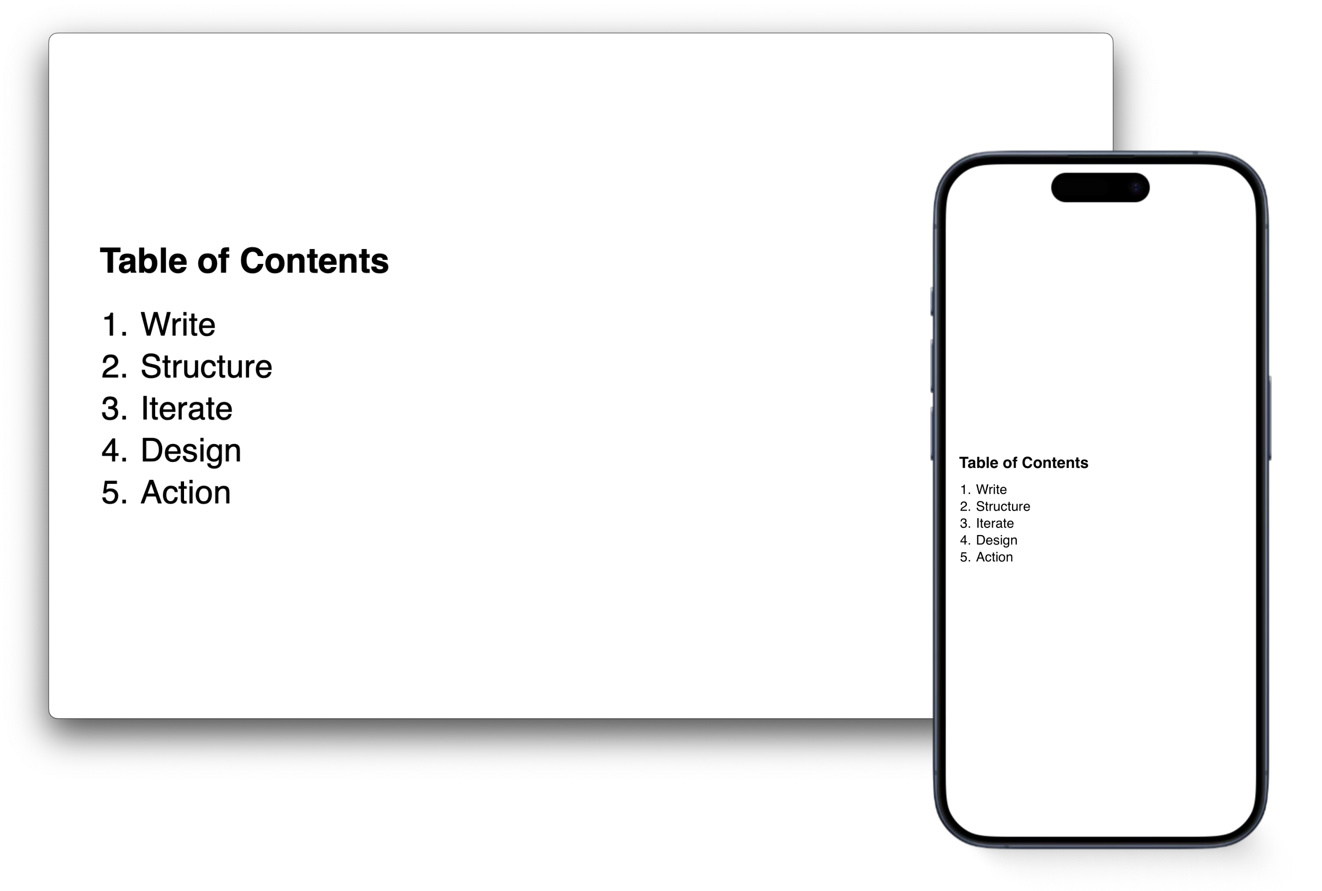
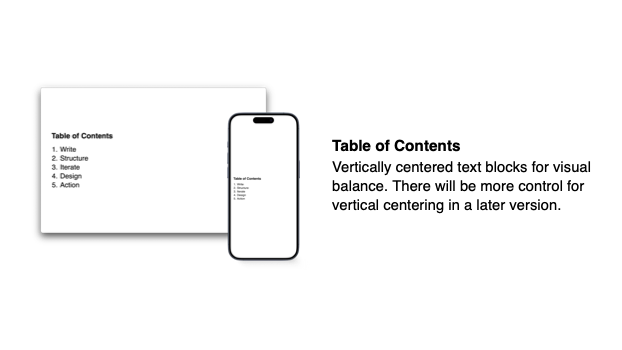
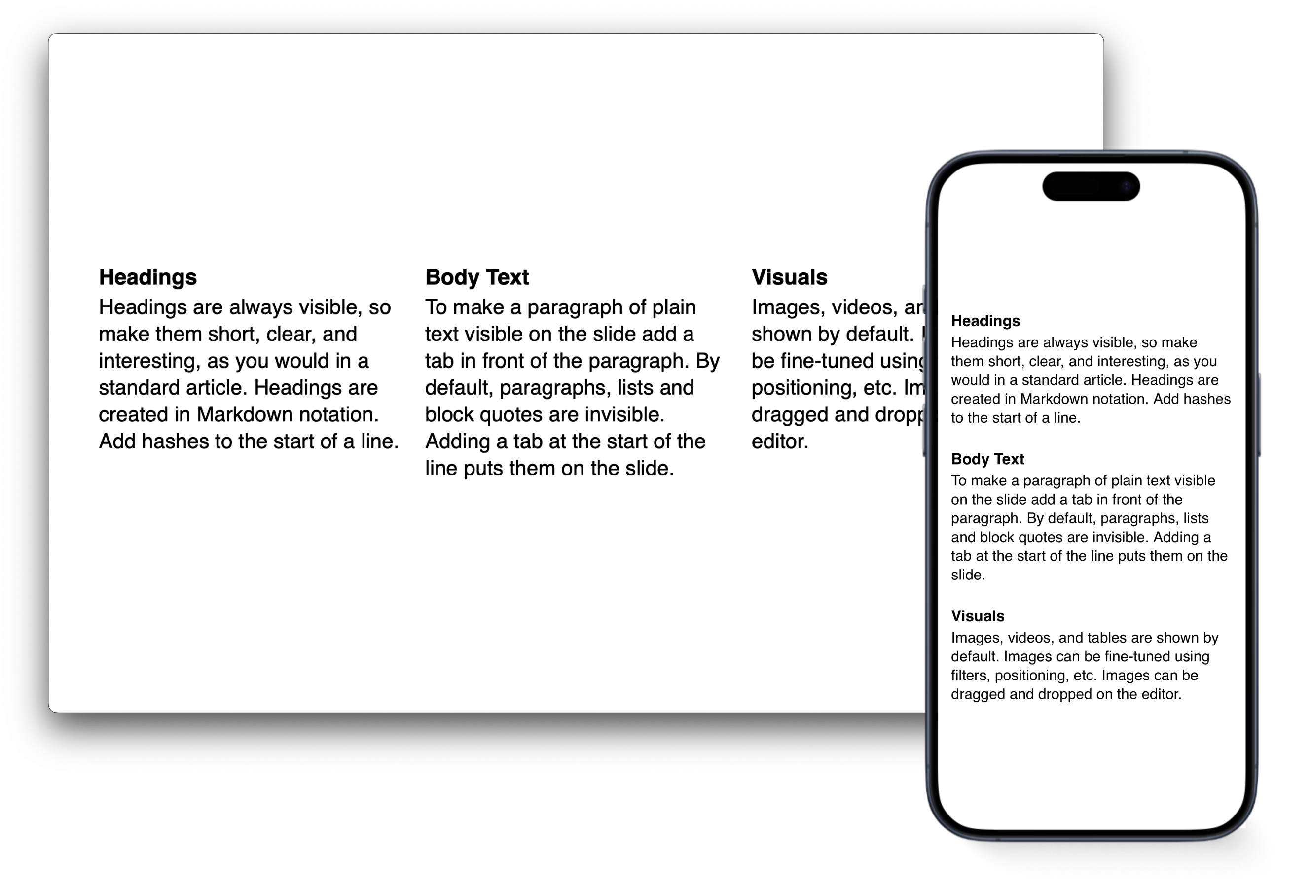
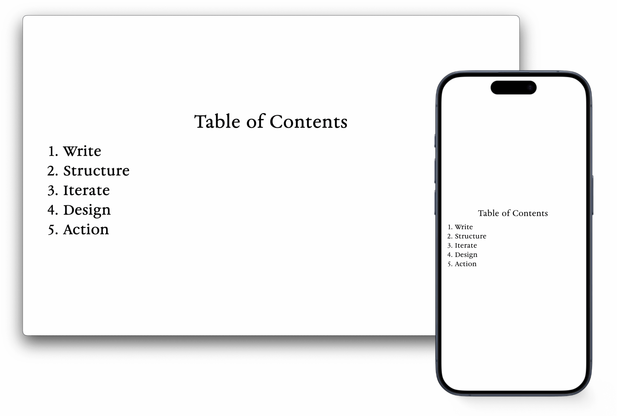
Table of Contents
Vertically centered text blocks for visual balance. There will be more control for vertical centering in a later version.
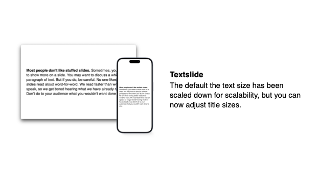
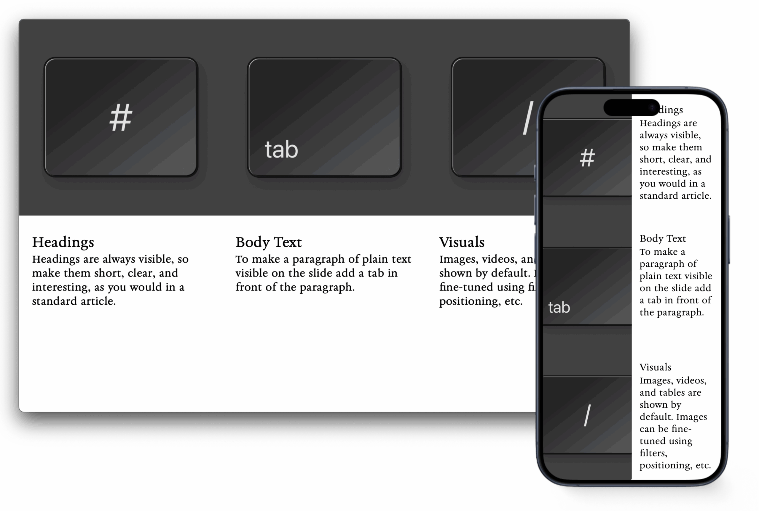
Textslide
The default the text size has been scaled down for scalability, but you can now adjust title sizes.
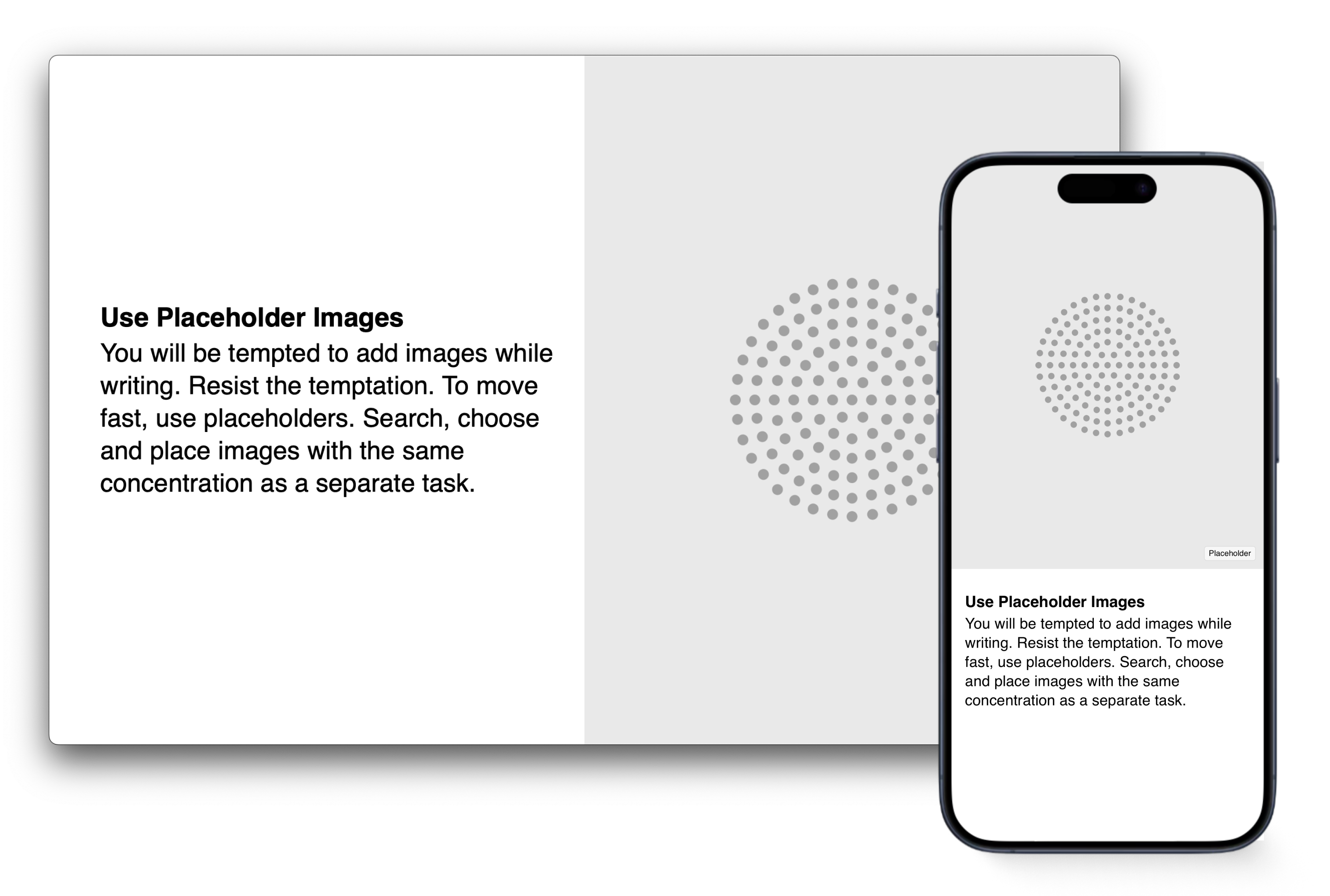
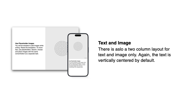
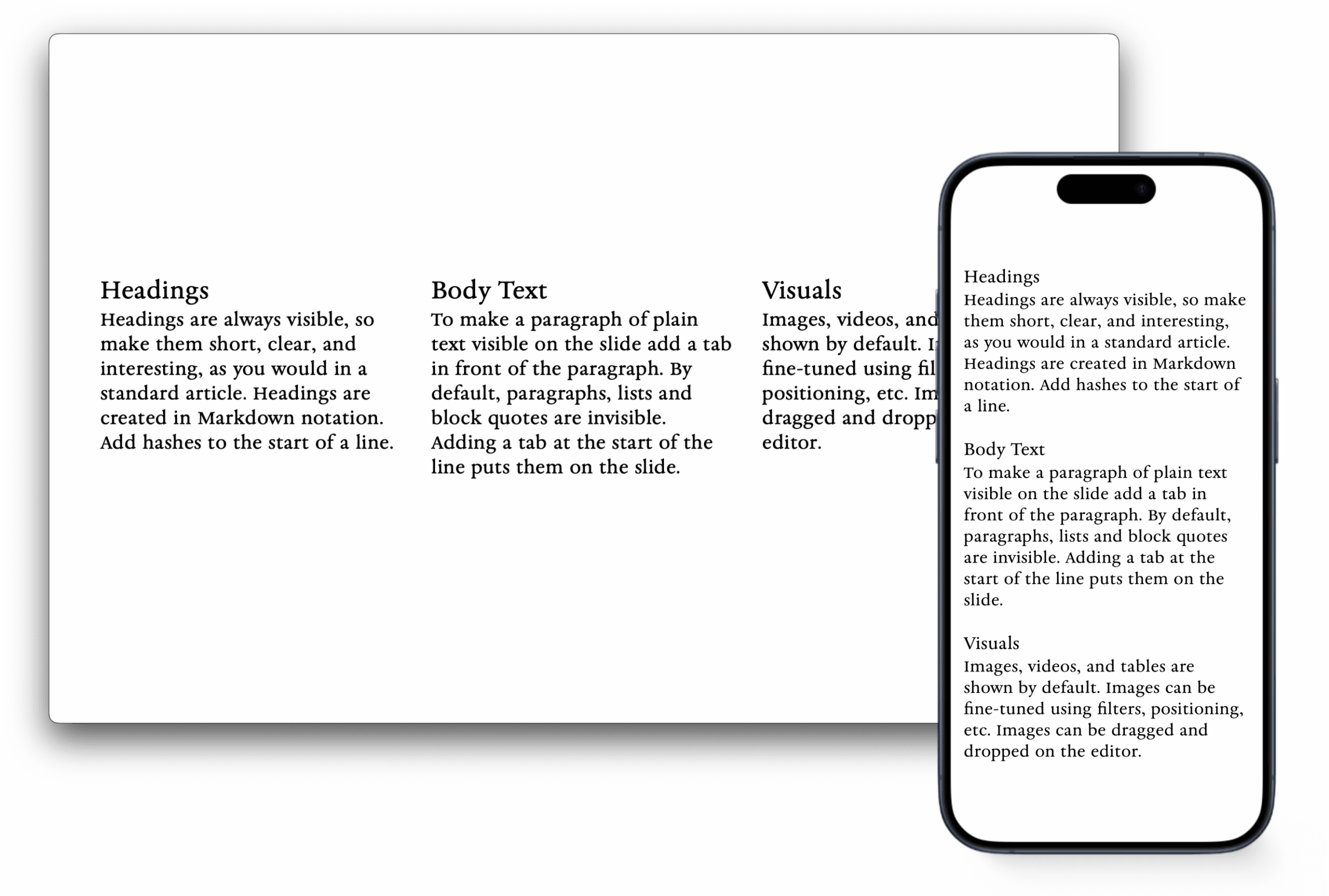
Text and Image
There is aslo a two column layout for text and image only. Again, the text is vertically centered by default.
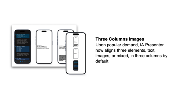
Three Columns Images
Upon popular demand, iA Presenter now aligns three elements, text, images, or mixed, in three columns by default.
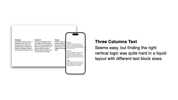
Three Columns Text
Seems easy, but finding the right vertical logic was quite hard in a liquid layout with different text block sizes.
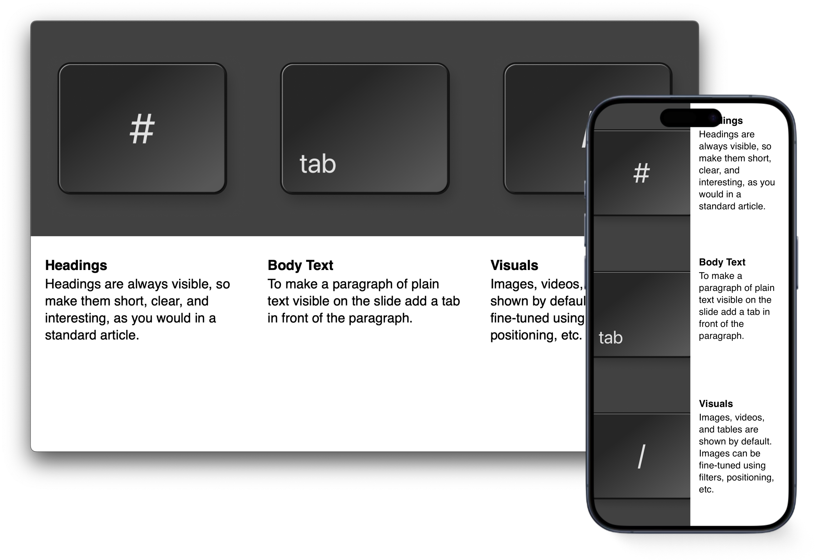
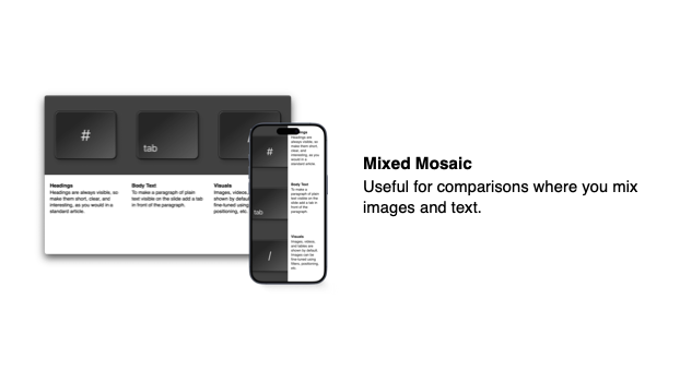
Mixed Mosaic
Useful for comparisons where you mix images and text.
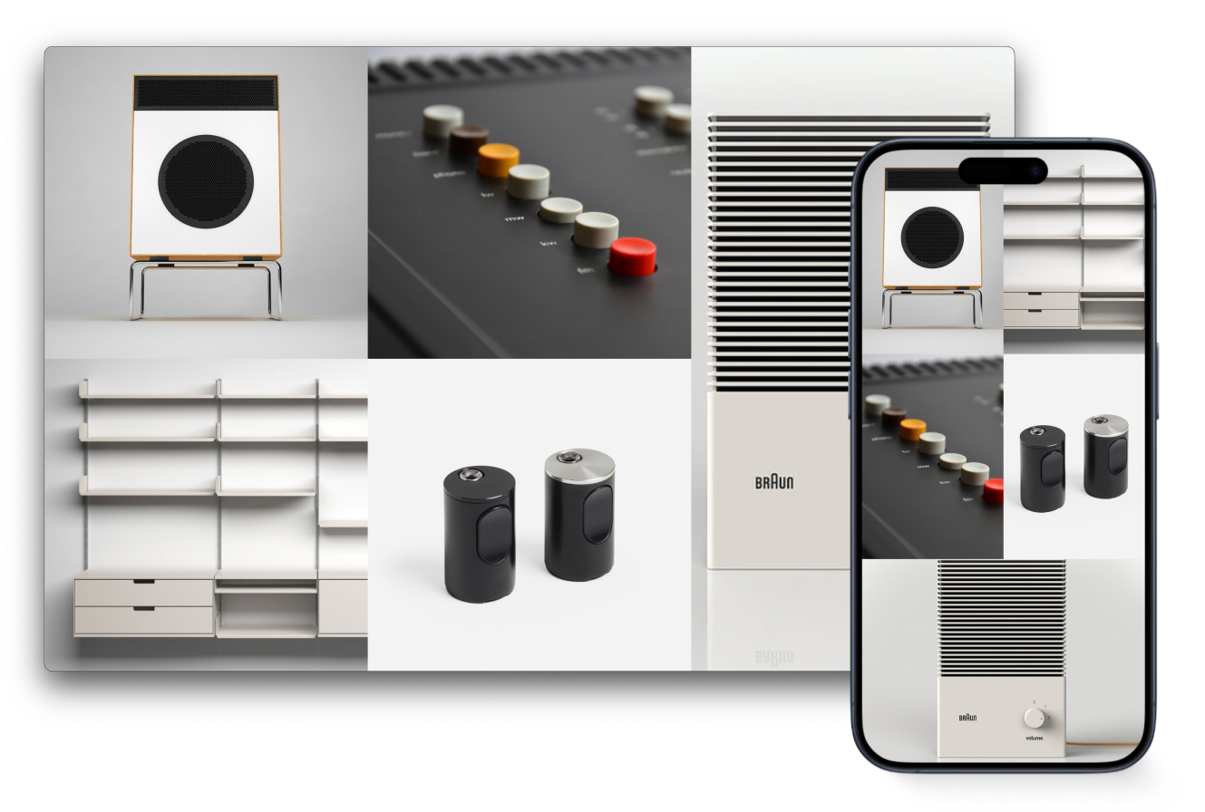
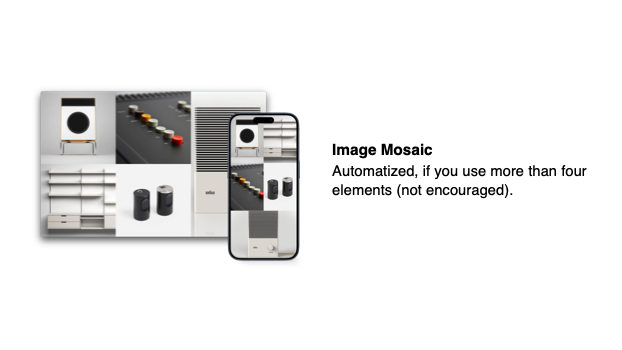
Image Mosaic
Automatized, if you use more than four elements (not encouraged).
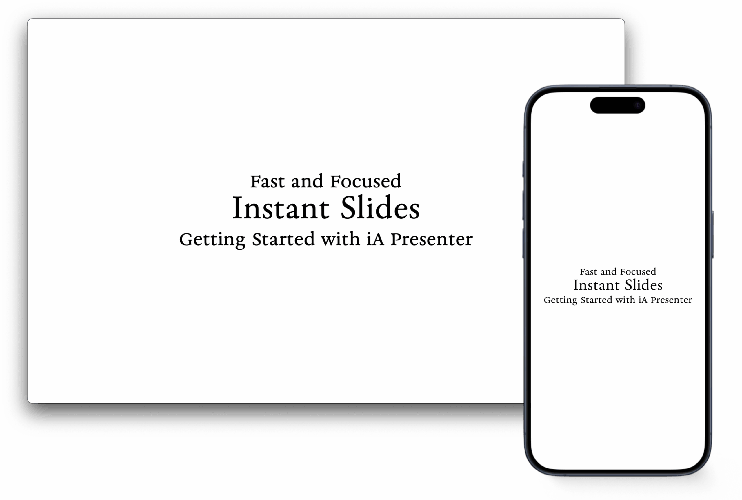
We spent weeks fine-tuning the typography. With thought-through vertical spacing, type sizes, padding, margins, the liquid type metrics, iA Presenter delivers a typographic quality that is unmatched. In this first step we offer two designs: The International or Swiss Style in the Helvetica template, and a classic French book design in the iA Garamond template.
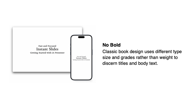
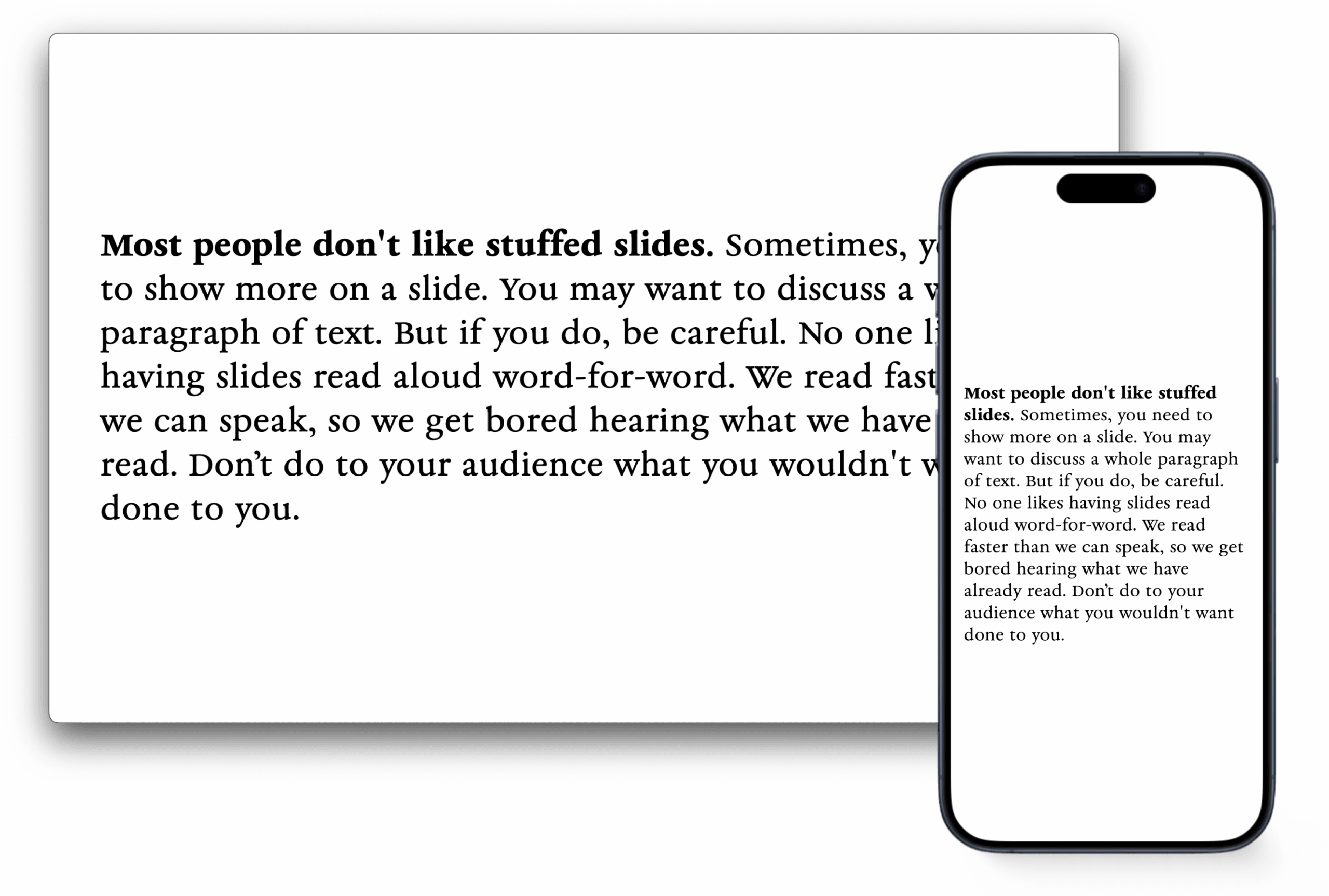
No Bold
Classic book design uses different type size and grades rather than weight to discern titles and body text.
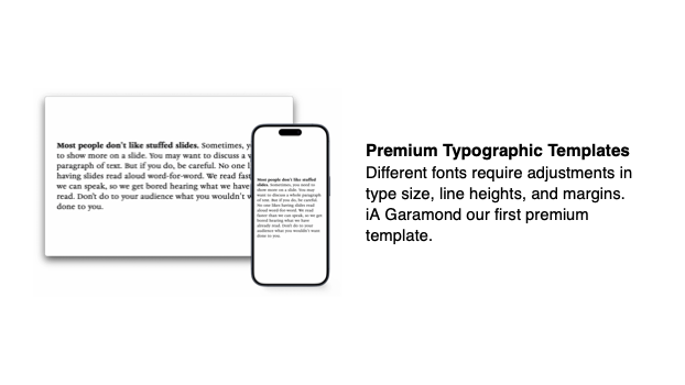
Premium Typographic Templates
Different fonts require adjustments in type size, line heights, and margins. iA Garamond our first premium template.
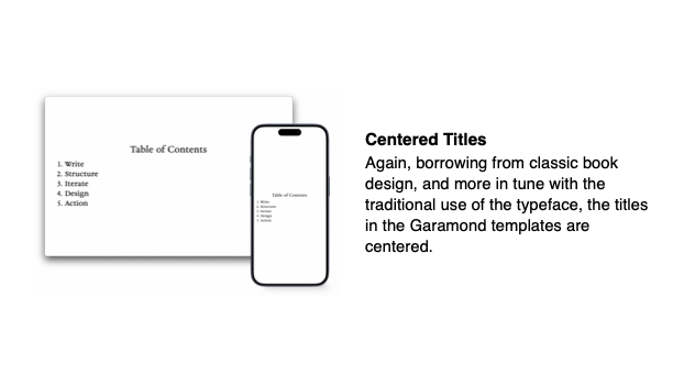
Centered Titles
Again, borrowing from classic book design, and more in tune with the traditional use of the typeface, the titles in the Garamond templates are centered.
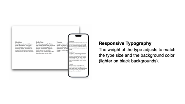
Responsive Typography
The weight of the type adjusts to match the type size and the background color (lighter on black backgrounds).
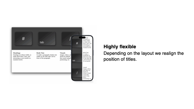
Highly flexible
Depending on the layout we realign the position of titles.
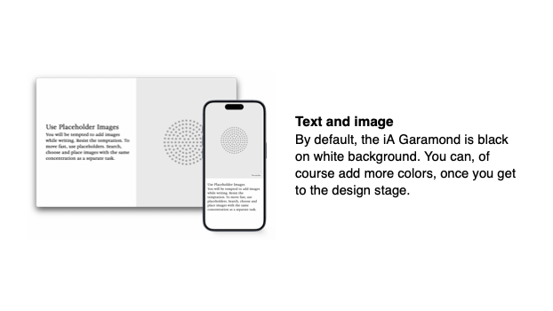
Text and image
By default, the iA Garamond is black on white background. You can, of course add more colors, once you get to the design stage.