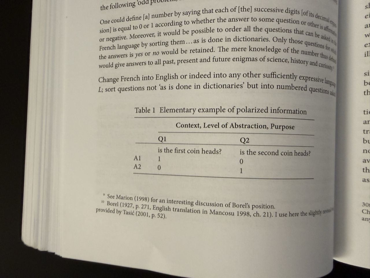
Oliver Reichenstein
Philosophy for Designers
Freiburg, September 10th 2025
1. Think
2. Make
3. Interact
1. THINK
Philosophical Systems and Information Architecture
In spite of its abstraction and (increasing) distance to practical reality, Philosophy is a great training ground for information architecture. Reading Kant's three critiques, we are forced to understand the monumental notional pyramids of his books.

Let's look at if from close.

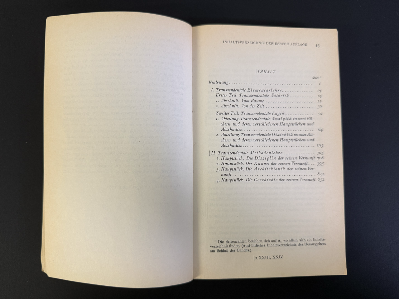
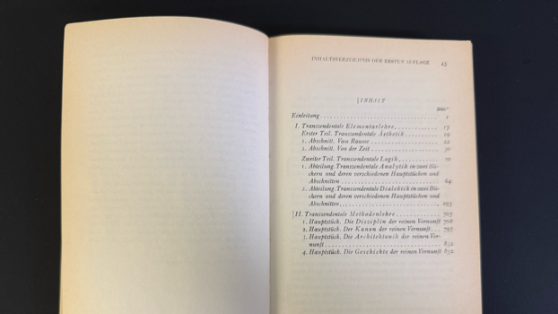
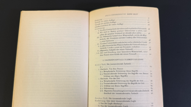
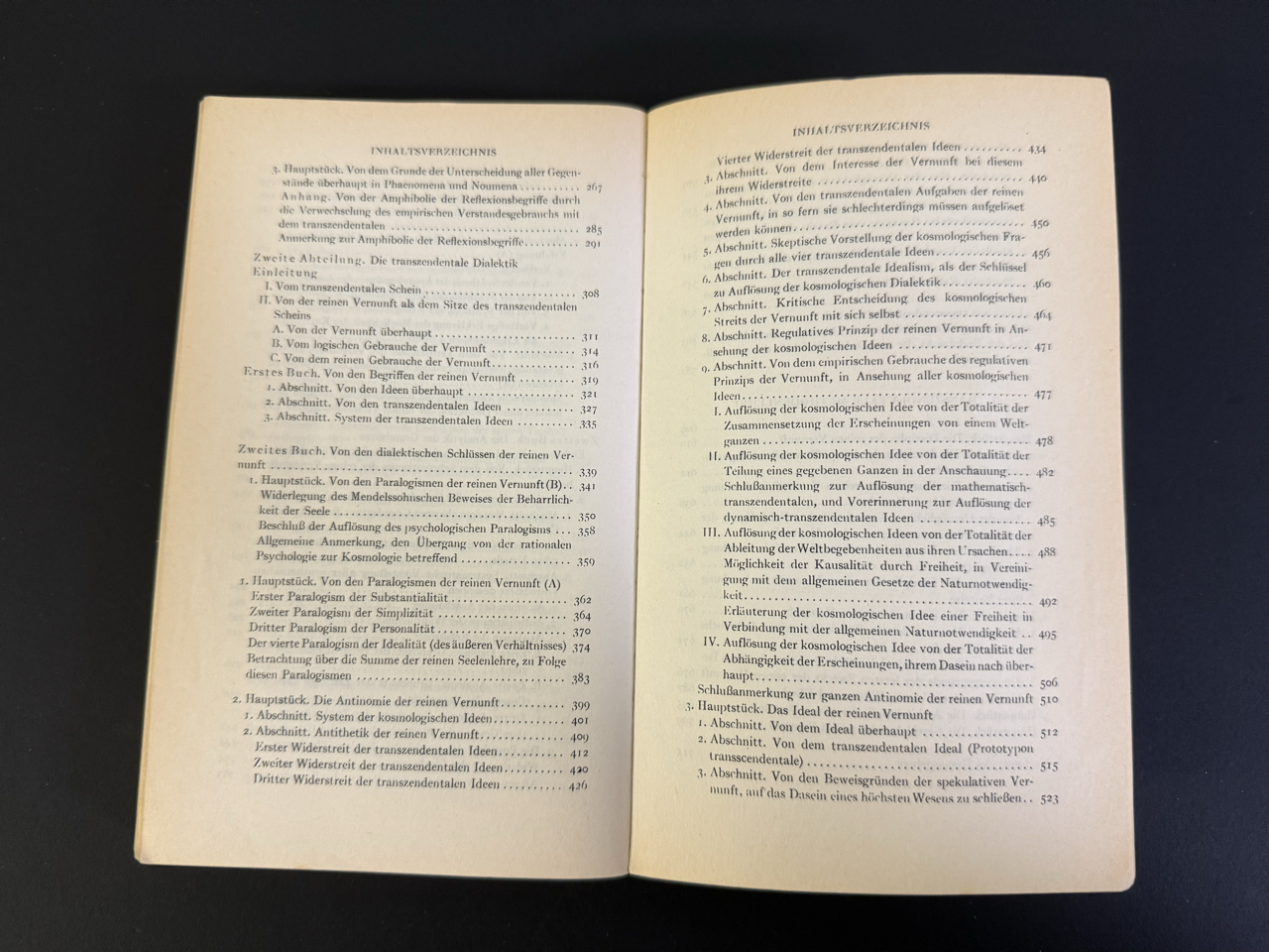
Page 43, The table of contents. A lot of redundacy. Everything is "Transzendental."

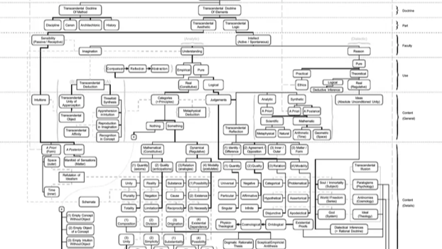
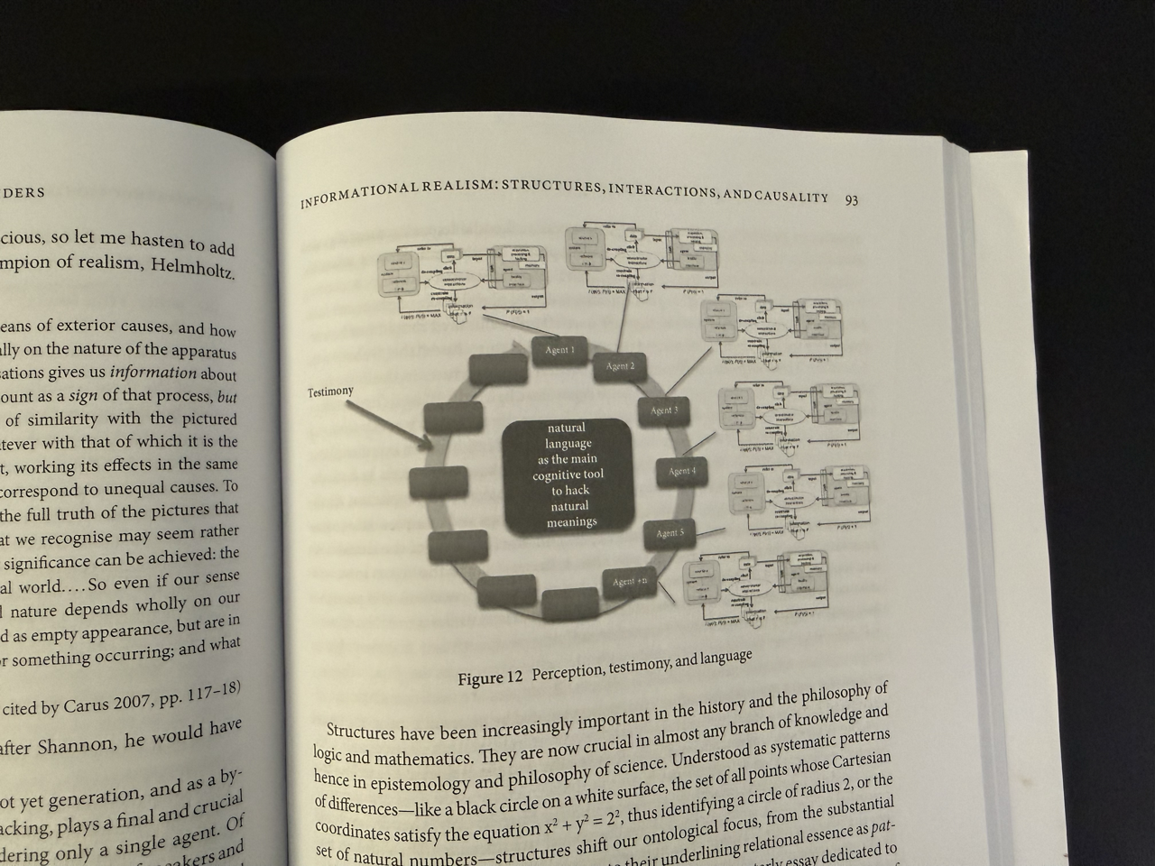
This is the full picture.

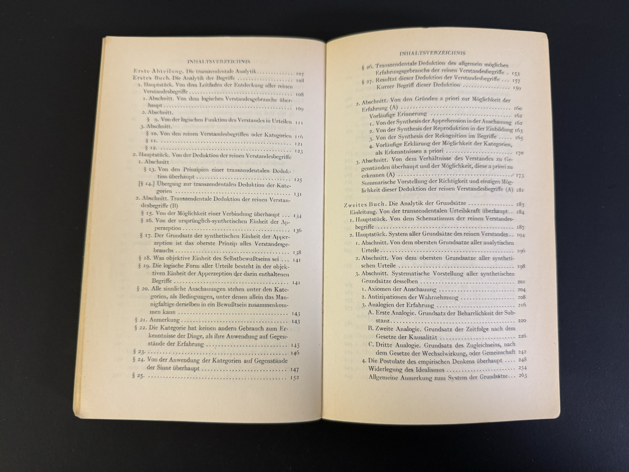
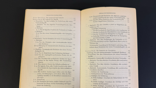
First division, first book, first main part, first section, paragraph one.
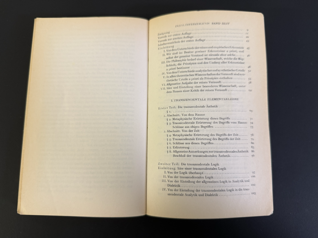
Wait, I have bought two books, but there are several divisions in each book and then again several books in each division?

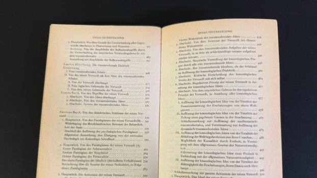
Second division with more books. And another introduction? Why?

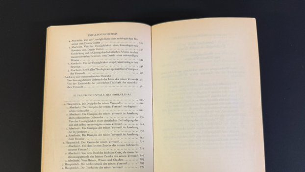
What is I. and what is II.? I bought two books right? But in these books there are more books that aren't books. Maybe Kant’s information architecture could use some help. It get's better though, because the critique of the pure reason is just the first of rthree critiques.

Now, since there are two more critiques, the whole Kantian information architecture looks somewhat like this.
And now you know why after studying Kant... making sitemaps for the website of an insurance company seemed like a piece of cake.
Phenomenology and User Experience
The original idea for iA Writer came from my philosophy professor, Dr. Gerhard Graf. As a pupil of Karl Jaspers and the lesser-known aesthetic theorist Heinrich Barth, he took a strong stand against writing with computers.

Dr. Graf saw himself very much in the tradition of the almost completely unknown Philosophy of Appearance of Professor Dr. Heinrich Barth (he doesn't even have a Wikipedia entry).
Unlike the main phenomenological tradition of Edmund Husserl's who focused on the phenomena, he very specifically thought about how things enter into appearance. This very moment where something is nothing and then appears was an infinite source of cosmic fascination to him.
Sounds abstract, but in the eyes of an experienced philosopher, appearance can becom3e hyperreal. One example of Gerhard Graf's reflection on appearances:
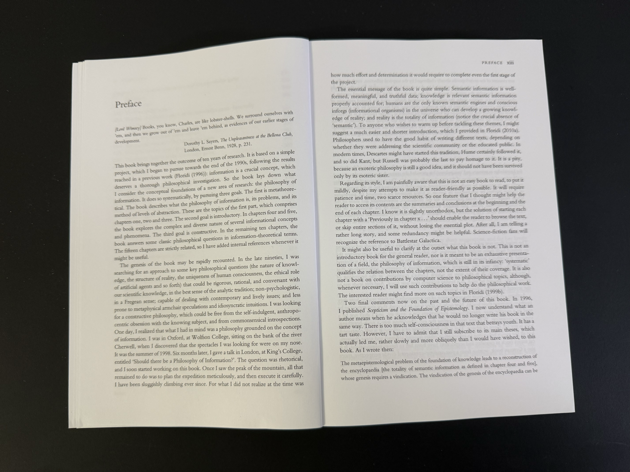
The problem of writing with computers was, among others, the usage of fonts used in books.
He said that it's detrimental to the process of writing a first draft if you use the printed form. Writing in a serifed font makes pupils believe that they are almost done before even starting, and instead of focusing on what they want to say, they focus on filling the page so it looks like published printed matter. Basically, all that text editors did was invite people to type letters that look like writing but end up as empty, meaningless shells. They rattle down a lot of characters and then start moving around stuff. But writing is not just symbols carrying meaning that somehow have to be brought into the right order. Meaningful language sounds like music.
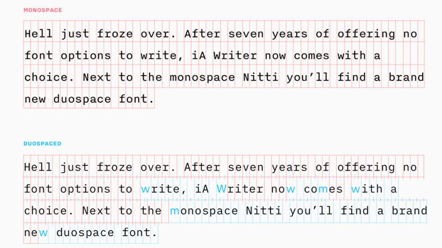
The only acceptable way to write with a computer was to use a typewriter font. The monospaced font gives us the feeling that we progress faster because it takes more space and stops us from wanting to fill the page. At the same time, it slows down the reading speed (being non-proportional) and makes every character count. Because when we write, every character matters; every letter, I as well as m, has the same importance. Every letter has the power to change the whole text, so we need to give each character we use the same importance.
Typewriters or handwriting force us to think before we write. Handwriting would do, but typewriters were indeed helpful for people with bad handwriting. Also, it is so painful to type and even more painful to correct mistakes on a mechanical typewriter that it really makes you think twice.
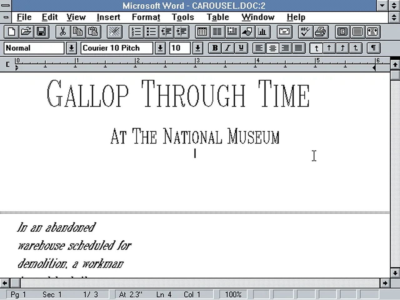
I took notes. 25 later, we came out with this product:

This is iA Writer, an app made for writing and only writing. It uses the typewriter's logic. All you can do with it is write. No Visual Basic Editor, no fonts, no bells, no whistles.
On top of that, we offer unique tools for writers.

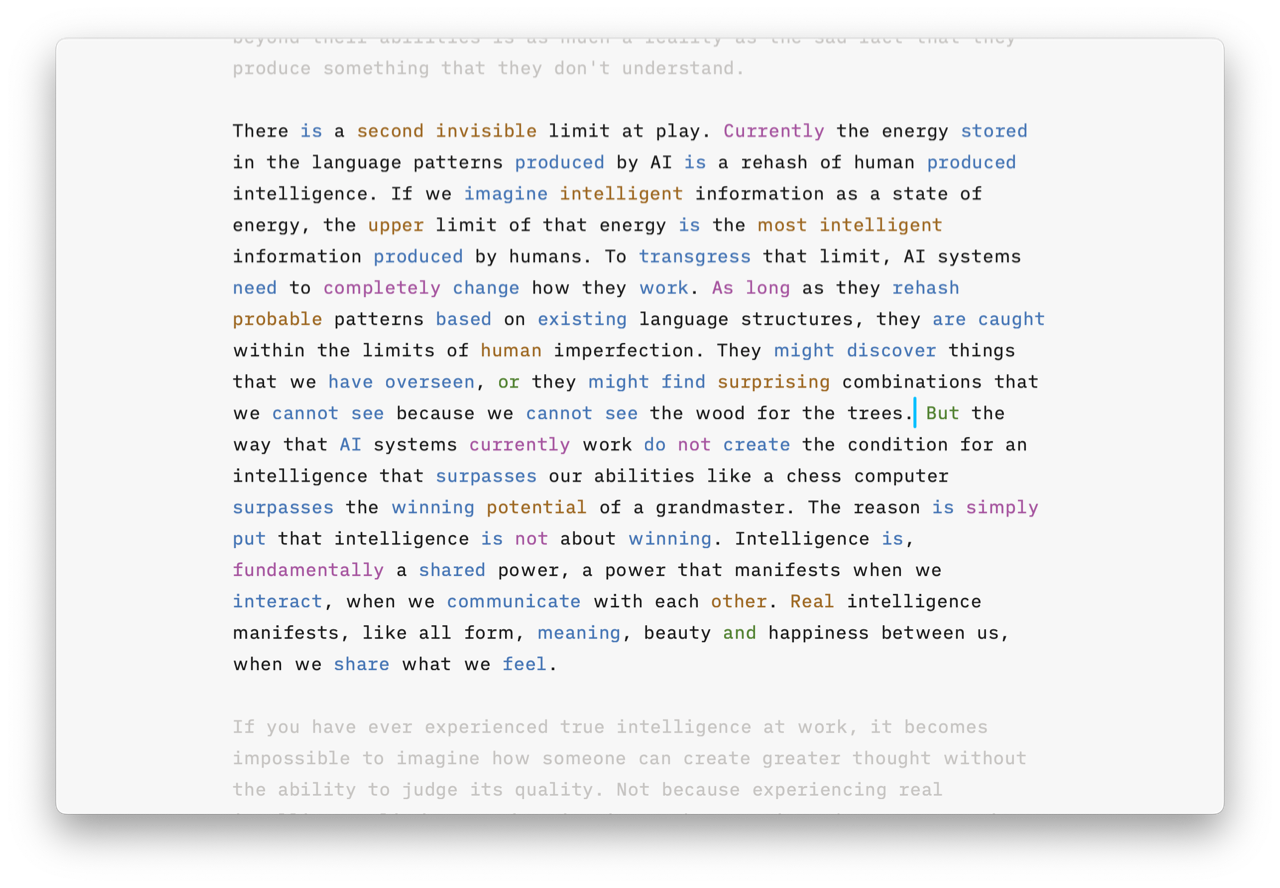
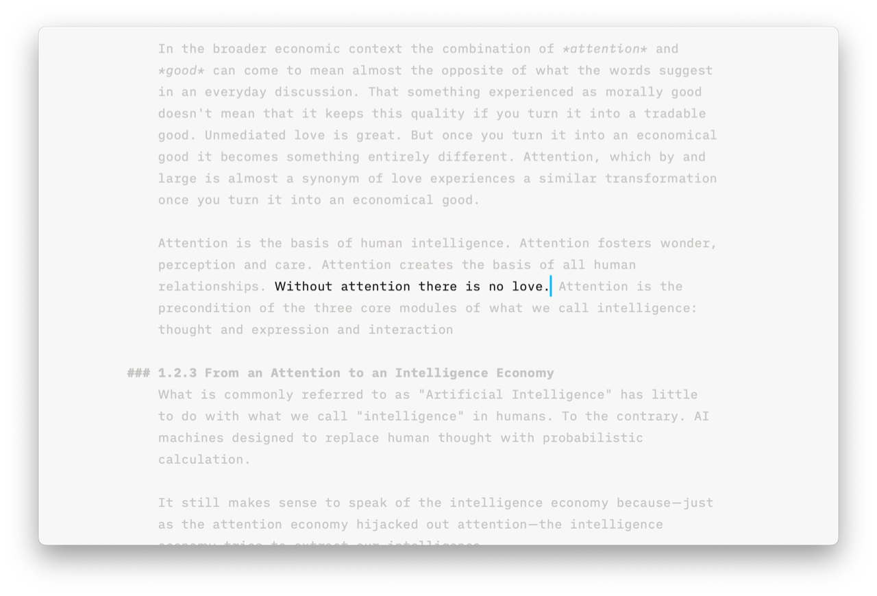
There is a syntax highlight that helps you spot syntactic weaknesses, illogical conjunctions, empty adjectives and adverbs, weak verbs, and repetitive nouns.

There’s a style check that shows you clichés and fillers, and the custom list of words that you personally dislike and thus decided not to use anymore, words like "actually" or "as a matter of fact".
Now, if you paid attention, you remember that Dr. Gerhard Graf said that the only sort of acceptable way to use a computer for writing was if you used a typewriter font. Sort of, because, as he underlined, typewriter fonts are kitsch. It's a crutch, not a solution. I took that as seriously.

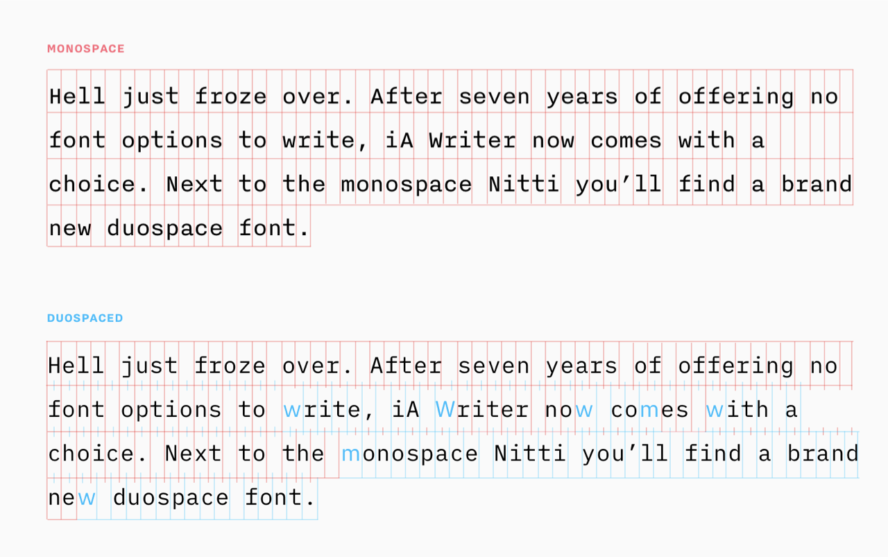
iA Writer has a custom-made font that gives every character equal weight. The above-mentioned virtues of monospaced fonts go back to a rather accidental necessity that all hammers need equal width. On screens, we can keep the same virtues without the compromise of squeezing Ms and Ws. In fact, the whole text images become more even as with double-spaced fonts, we eliminate the dark spots.

We didn’t just add different Ms and Ws; we reengineered the font to have variable widths, so we could offer a heavier weight and wider spacing at small sizes. The variable font allowed us to adjust the font for dark backgrounds (it needs to be lighter there because white radiates out on black).

Dr. Gerhard Graf was not the only inspiration for iA Writer. The kick to make the app came from my experience as a teacher at art school where I tried to teach how to write scientific treatises for art students. Instead of writing, they kept changing fonts, colors, margins, and line heights.
Getting upset with the inefficiency of teaching them an app that invited everything but writing, I talked to them about why they simply didn't want to write. They told me that writing was boring and that designing was fun.
They had a point, but Word was not a real design app either. In the back and forth with my students, I realized that, in fact, I did the same thing every time I opened Word. Instead of writing, I at least had to change the zoom level, but more often than not, I lost time on changing fonts, line height, and wasted more time on formatting than on thinking.
So I tried a typewriter, and my mind was blown. Finally, I could focus on what I wanted to say. I could focus because there was nothing else to do.
And, indeed, after a few minutes, writing with a typewriter, as painful as it was, was much more fun than changing fonts. And there was music. Padamm, padamm, pada-da-da-pamm.
How successful were with iA Writer? It's okay. We sold 3 million apps in 15 years. That sounds better than it is. But iA Writer pays its bills, so we can't complain.
Word is still the main writing tool, unfortunately.
Frankfurter Schule and Tech Bros
Theodor Wiesengrund Adorno is just like Kant, Hegel, and Heidegger were infamous for writing in an overcomplicated way. They didn't write weirdly because they were bad writers. They were afraid that their insights got into the wrong hands. They purposely wrote in a highly confusing, indirect way because they were worried that the so-called "culture industry" would use their writing to further commercialize philosophy.
Horkheimer and Adorno started writing the "Dialectic of the Enlightenment" during the war, and to them, it was clear that the Enlightenment had taken a wrong turn.
Both Auschwitz and capitalism were the consequence of a rationalization process that had gotten out of hand. The Enlightenment, they argued, has led to a culture where the human being is a mere number and not a living being.
This new overrationalized culture rejects anything that can't be measured, weighed, and counted. In other words, they reject beauty, justice, and truthfulness. Because all of these are ultimately human values that cannot be reduced to a mere number.
Claiming that anything can be scientifically defined led to an horrifying inhumanity that put in numbers what cannot be put into numbers and justified what cannot be justified in any way. We cannot measure love, art, and happiness. We cannot define race and calculate the right to live based on measuring the length of noses of a certain ethnicity.
To make sure that fascism and capitalism cannot take advantage of their thorough analysis, they wrote in an extremely cryptic way that they defined as a message in a bottle.
They didn't believe that at the time their writing could change anything, but they hoped that in the future, their message would find us like a message in a bottle.

As far as I am concerned, that bottle has now arrived. Adorno's critique of the culture industry hit me hard at the time.
The message was: Everything, all the music, all the movies, school and work, it's all bullshit to make a lot of money for stupid people that already have too much money. And ultimately this bulshitification turns us into batteries without heart and soul. And there was no escape. Because...
“Es gibt kein richtiges Leben im falschen” –T.W. Adorno, Minima Moralia
It felt like seeing the Matrix, but without Kung-Fu. It shocked me deeply, because misuc and movies I watched at the time were bullshit. In the end it seemed a bit exaggerated. I rationalized.
However, we are now again at a point where capitalism and fascism bond together trying to reestablish the very same absurdity, and if we look at Adorno and Horkheimer, I unfortunatelty have to agree much more with their analysis than I want to.
“Software is eating the world, now AI eats software” (Raphael Schaad, the developer of iA Writer 1.0)
The good news is that Word has finally found a competitor. Because Word makes writing so hard and depressing, people now lets AI write for them. Like it or not, it's inevitable.

After ChatGPT was introduced in 2022, practically every app now has AI built in. So we thought: If everyone does it, we should do the opposite.

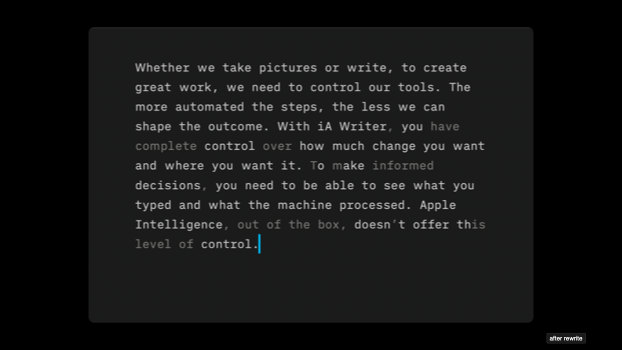
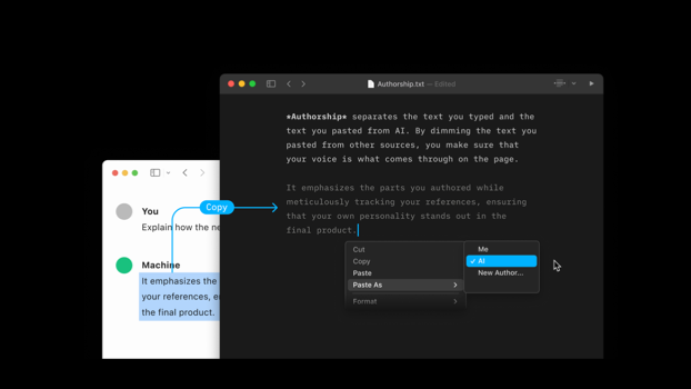
We decided to add an authorship feature that lets people track what they wrote and what they pasted from ChatGPT.
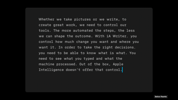
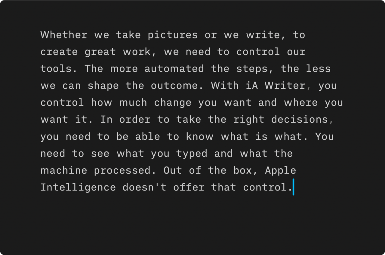
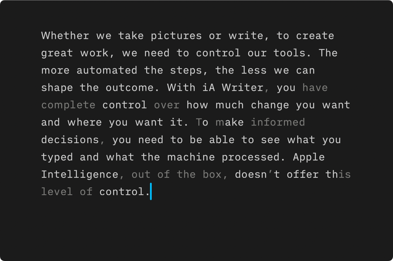
Mostly I use it for spell checking. It's not perfect. So even when spell checking, I want to make sure that I see what the machine changed.

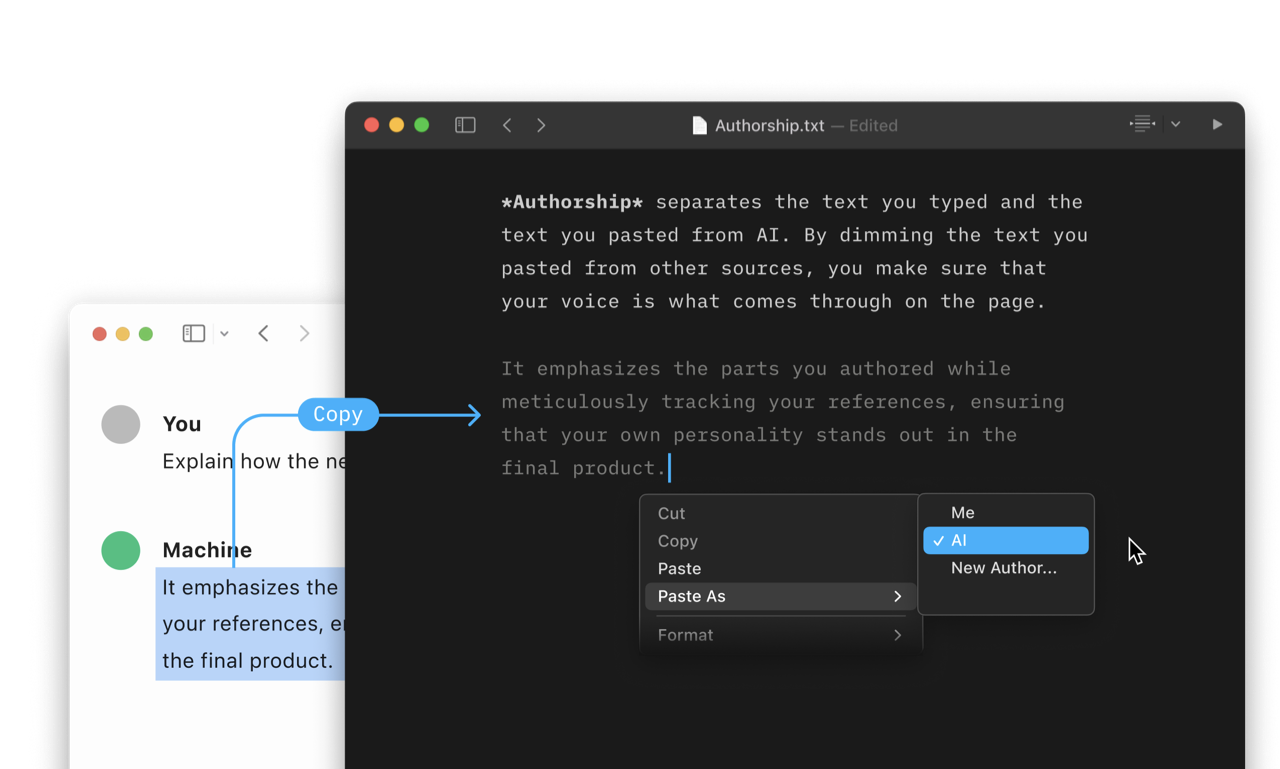
You can also use it to mark text that you pasted from elsewhere and then make it yours again overwrite it again.
All of this still works with plain text. (We write YAML tracking authorship in real time at the end)
Where's the philosophy here? You don't need a degree in philosophy to understand that pattern matching is not thinking. But it helps to think about the relationship between body and mind before claiming that "AI and HI is the same because our brain also just matches patterns." We're not just brains. We feel think, act and interact. We understand when we feel that what we think corresponds to what we feel when we act. And we can only be sure about what we feel and do when we interact with others.
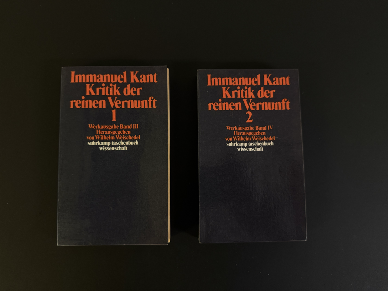
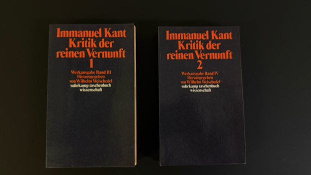
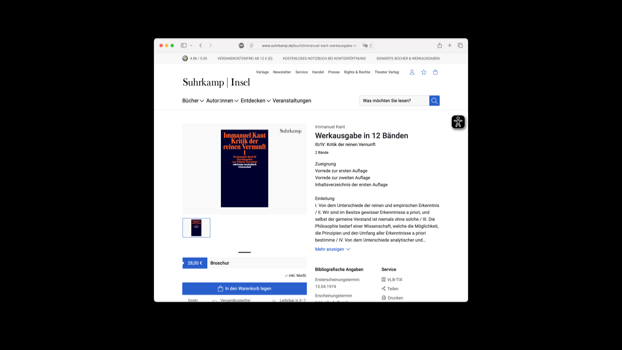
2. MAKE
If you want to sell philosophy to designers, you can't start by telling them to focus and just read a couple of deadly boring books.
No matter how important design may or may not be in this or the other way, there is no chance in hell that you get a designer to read the Critique of the Pure Reason without giving them some agency.
Rather than framing philosophy as a form of duty that designers need to get through to get better, we need to offer a sight on philosophy where designers can use their point of view to not just get an idea of what philosophy is all about, but maybe even a way to contribute to it, to redesign it.
Because this is what gets us excited. We see something and think: "Ha, this is not that great, but it could be ." And then you already have our attention, because in order to make something better, we first need to truly understand it.
Copywriting and Graphic Design
So to open this hairy topic, the following, let's lok at the graphic design and copywriting of The Critique.

The Critique of the Pure Reason by Immanuel Kant, in the Suhrkamp paperback edition, the version that most philosophy students will acquire if they ever buy the book.
Suhrkamp Wissenschaft is one of the main editions for philosophical books in Germany. It's such a standard that no one even thinks about questioning the design.
But since we're here, how does this age-old standard present itself to a designer's eye?
Dark Orange/Red on a dark blue background. Not exactly the perfect color contrast from an accessibility point of view, not exactly a very optimistic choice of color either. The type is tightly set, and lowercase "suhrkamp taschenbuch wissenschaft" tells me that the seventies had their hand in the design here.
All in all, it feels more like a warning than an invitation.
And then in terms of communication design... "Critique of the Pure Reason"... What does that even mean? That book title makes absolutely no sense. And it's not dark in a good way. It's not mysterious. Noone likes critique. And pure reason sounds so frightening that a critique seems superfluous. Noone wants pure reason, so why waste time criticizing something that no one wants or believes?
Book titles, one would think, should be clear, interesting, and inviting. This is the very opposite. Who walks into a bookstore, reads "Critique of the Pure Reason," and says: "Now that sounds interesting! I'll get this one. How much?"
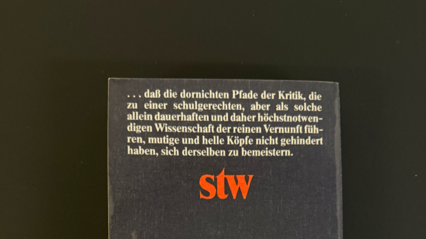
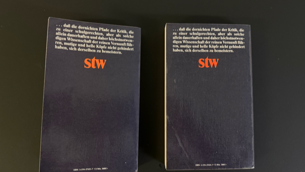
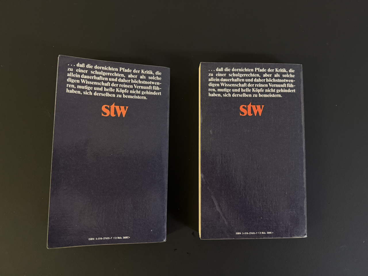
You may get lucky still, and a very boring or bored person would still pick it up and turn it around. What does it say on the back?
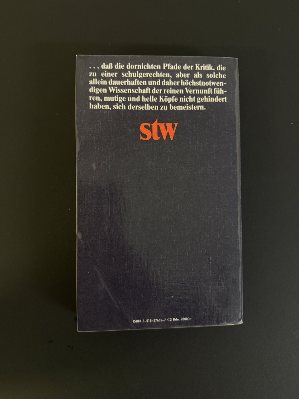
The backside is a more explicit warning. It starts with a conjunction that talks about "thorny paths of the critique." These two books are thorny paths. But they're “scolastically correct" and they are introducing an "enduring science" that supposedly is of the "highest necessity." It closes telling us that courageous and bright minds have not been hindered to master it.
At this point, most people would up. Who wants to read a thorny book? The only reason to read this is that we might want to prove that we're bright and courageous.

Also, it's not like the second volume has a warmer message. It's not clear who said that, and when we find out that these are Kant's own words, it feels a bit pompous and we wonder: What bright minds is he talking about? Who read it and what did they say exactly?
Typography

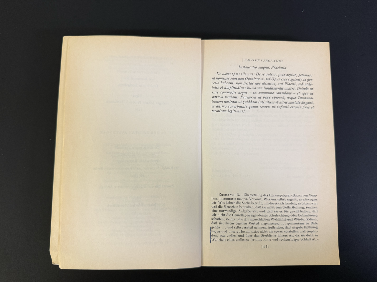
Knowledge is Power, France is Bacon, and Latin is set in Italics. More intimidation. Luckily, there's a translation.

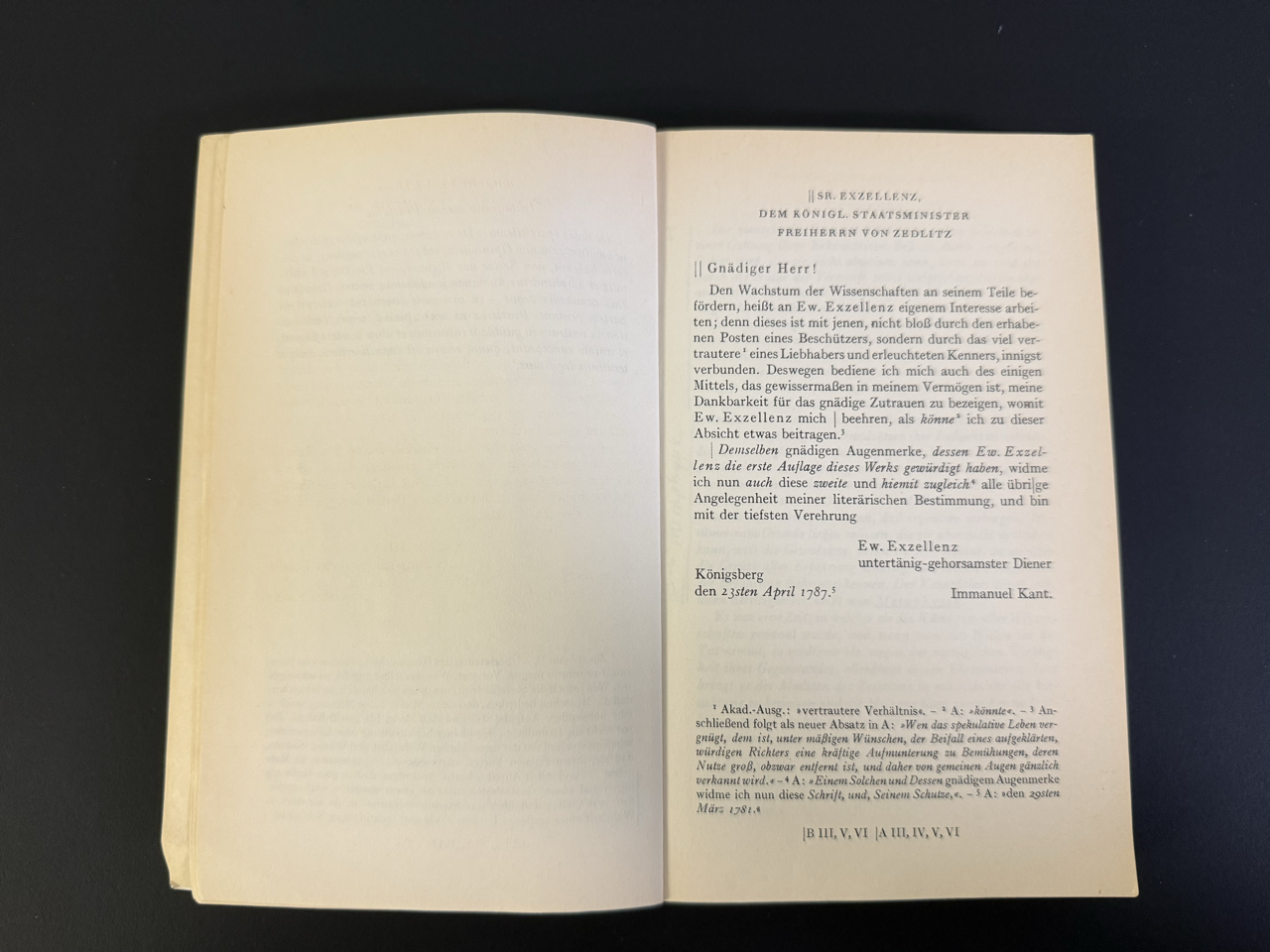
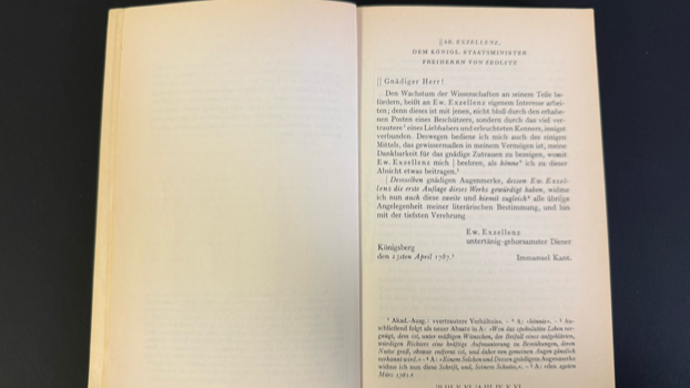
Are we getting started yet? No. Let's address the King first. It begins with:
Gnädiger Herr
and ends with
Untertänig gehorsamster Diener
(your) submissive, most obediant servant
Is this book addressed to a King, worse, even it's the royal minister of state. And Kant signs as "(your) submissive, most obediant servant." Where is the courage?

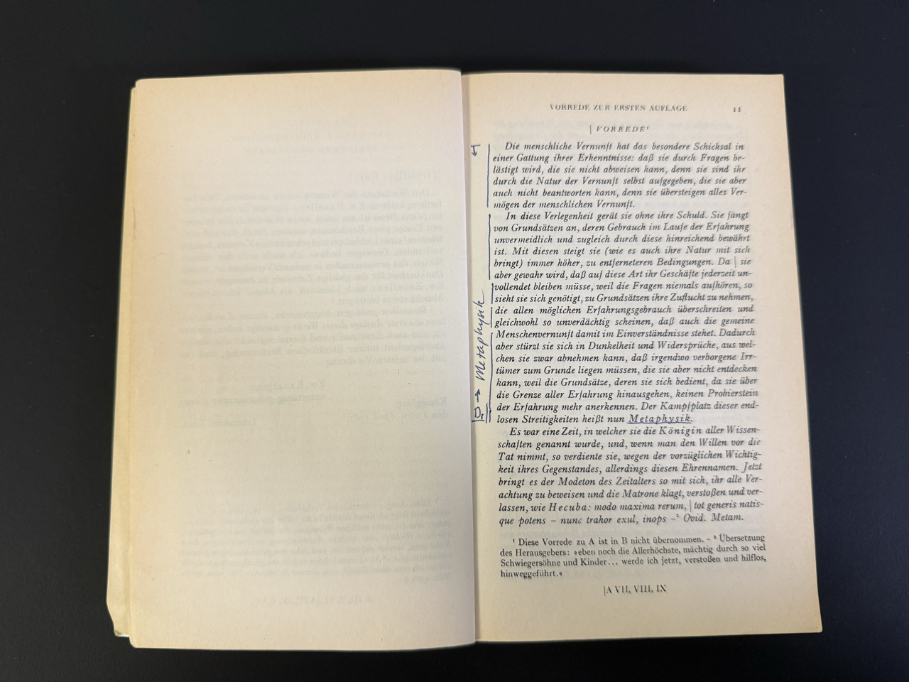
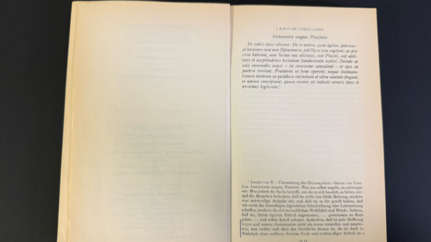
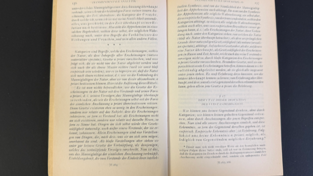
Starts on Page 11. Still in italics. We'll get regular soon. Right?

...italics, italics, italics, small italics...
And it still hasn't started.

Yep. Italics!

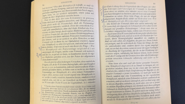
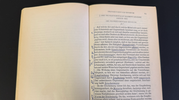
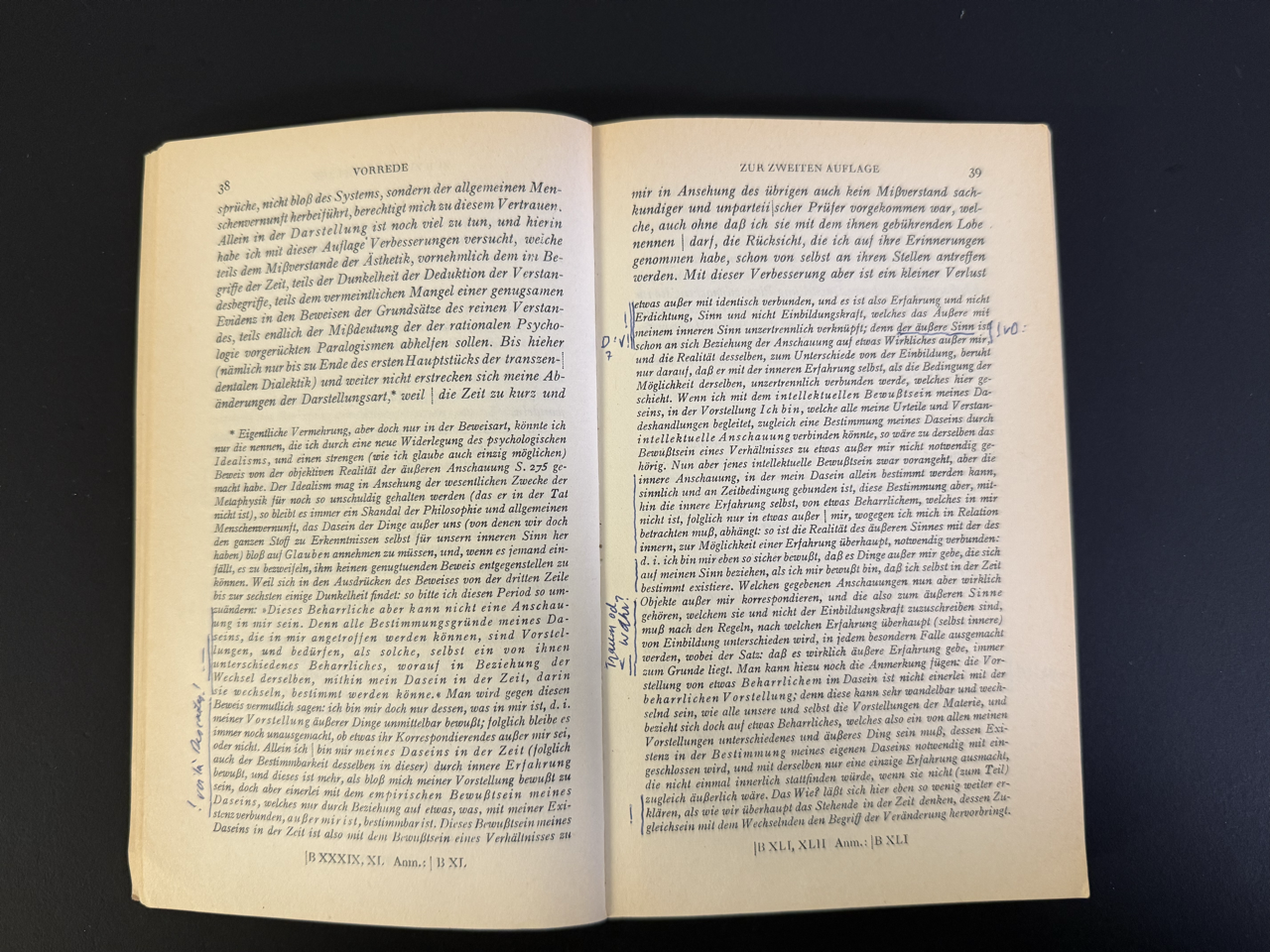
Page 69. Finally, we begin. Lots of definitions.

...and Italics!

Italics...

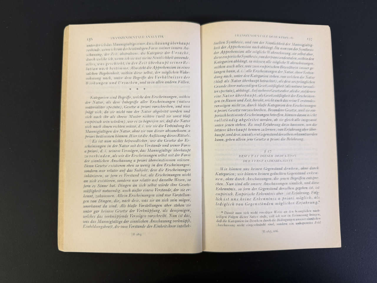
And in my first read, I gave up about here.
“It’s not fair!”
Now, one could say that this is not fair. It's a paperback. It's not that expensive anyways. It's part of a system of paperbacks. And it's old. There's a new design now. The Italics mark the second edition!
And Hey! Designers can learn a lot from Kant. Kant taught us 150 years before neuroscience that we only recognize what we expect. Reality is not out there for us to grab and understand forever.
It's a scientific book. It's not for pleasure. It's German. The German market is small. Suhrkamp needs to survive.
Right.

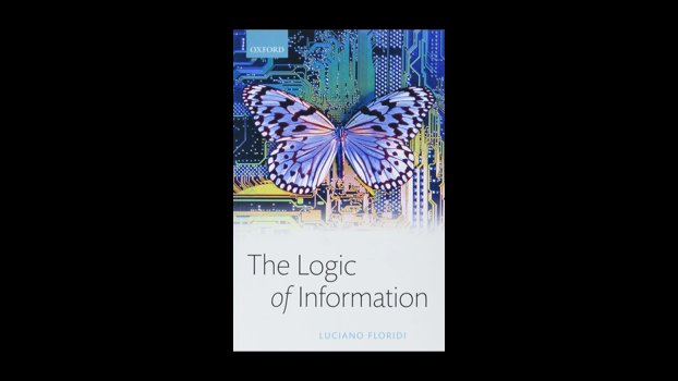
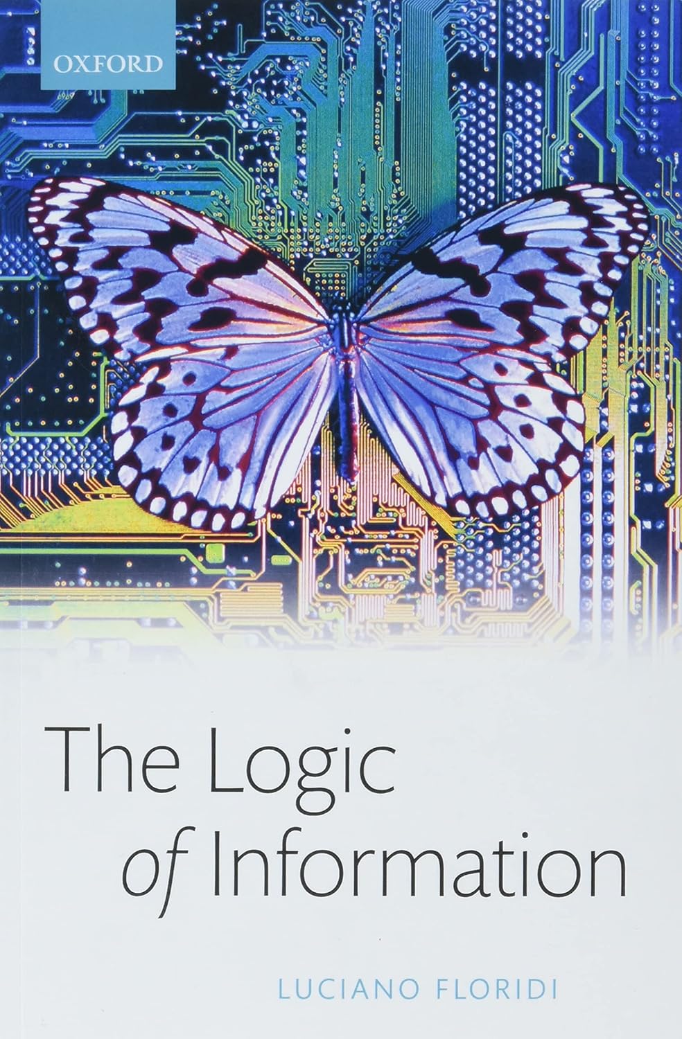
I wasn't sure if I should bring this old book, because people will say that it's better now. This is how the latest edition looks.
No updates?
Use of Imagery and Graphics
Let's look at a more contemporary book.

A circuit board and a butterfly. Two clichés that communicate that the author doesn't know much about visual communication. Ideally, picture and text should contribute to each other. The stock images are visually loud but say nothing. The circuit board is rainbow-colored; the butterfly almost monochrome. There's a slight fade on the bottom.
Waxed cover, light typeface; the “ of” is set in italics for no apparent reason. The Logic of information. Is it vocally emphasized? No. Is it visually emphasized to not be overread? Or is it just decoratively emphasized?
The title itself is cold and hard to understand. The Logic of Information. Well, some information is logical; some is not. There is no such thing as a general logic of all information, or is there? Maybe the Logic of Information means something like the rational structure that permeates all information?
Since the title is not as weird as The Critiquer of the Pure Reason, it may merit a second look. But without context, again, this title doesn't say much, and likely it won't make too many curious about what exactly it is about.

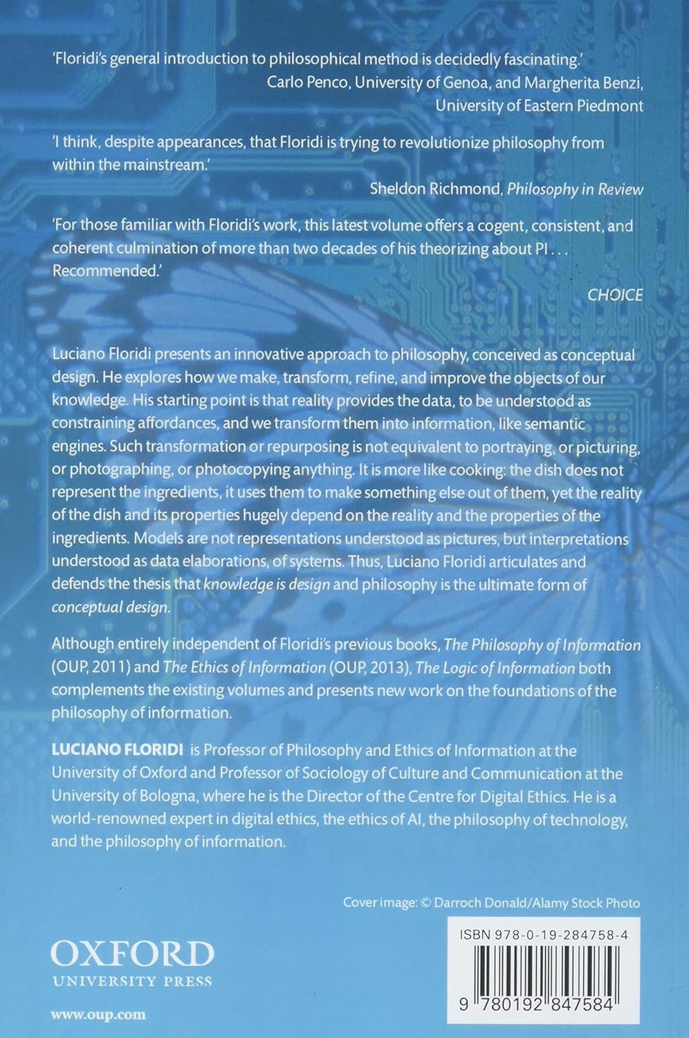
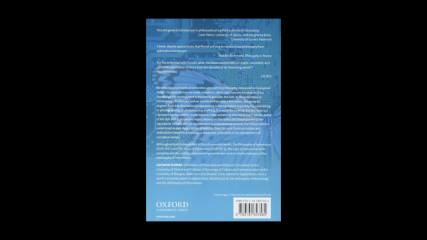
The backside is very wordy, and the contrast makes it hard to read what the book is about.
Someone we don't know at the University of Eastern Piedmont said that it's "fascinating."
The author is supposedly trying to revolutionize philosophy, and that "despite appearances." What appearances? The cheap, clichéd design of the cover? Or his otherwise modest appearance as a person?
The third person from CHOICE recommends it because it summarizes decades of PI, which looks like a typo, but it means "Philosophy of Information."
This is not design. It's a seeing test.
The main sales point is Oxford. It's probably good because Oxford and because Floridi is a professor there. Likely not his fault that the University Press has such low standards.

Long lines, and (the picture doesn't show) the overly bright white paper. It's weird how he quotes himself first, but I guess this is how it's done today.

Find the ten differences

More terrible graphics

Does this help or confuse even more?

Is this electricity or philosophy?

Unreadable and overcomplicated schematics

Do we need 3D here?

Ugly tables

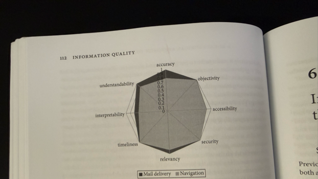
Sloppy spider charts

Dark grey tables

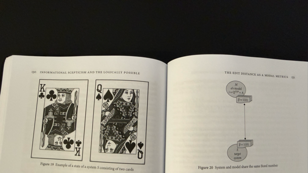
For those who have never seen a playing card.

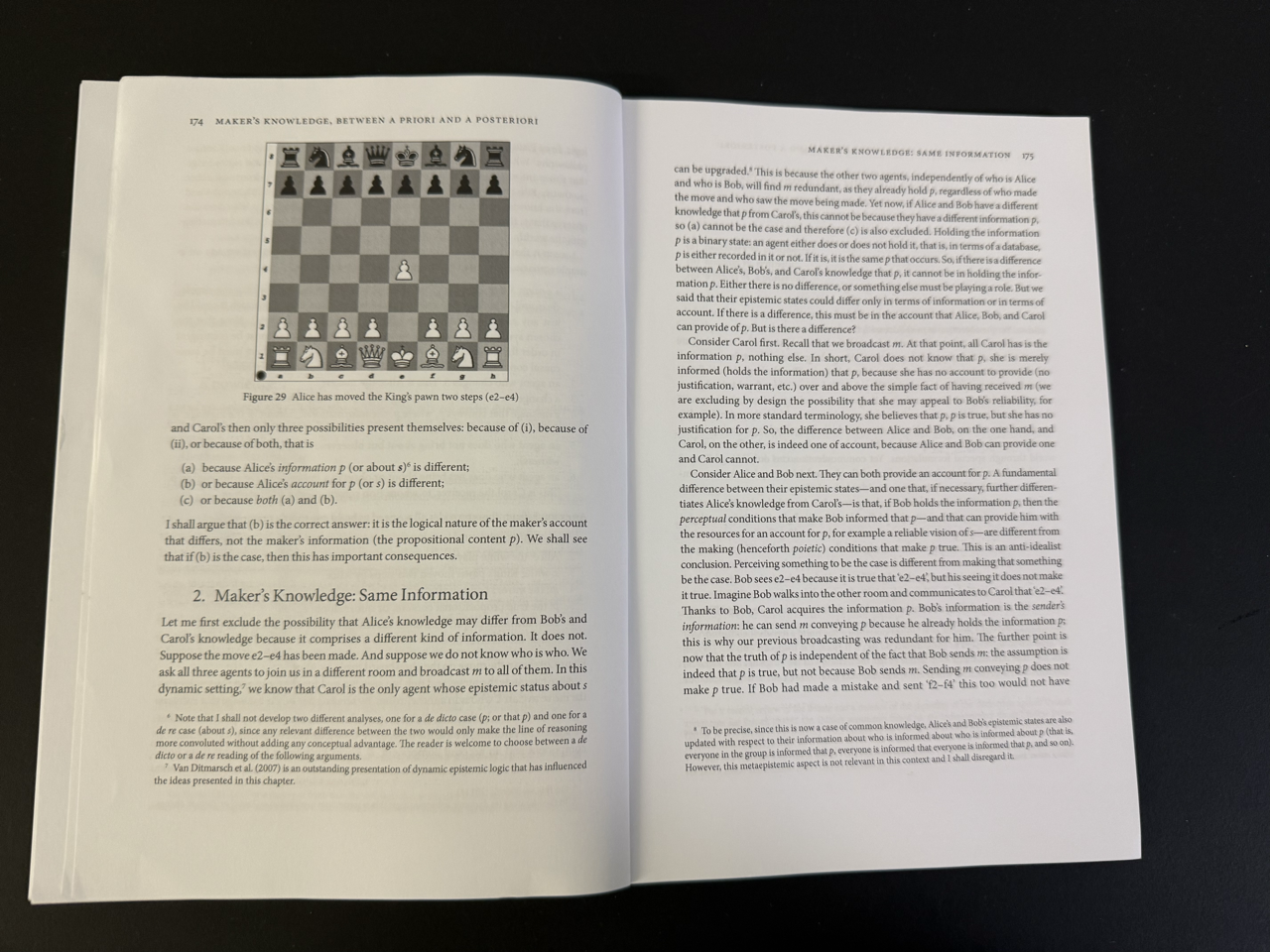
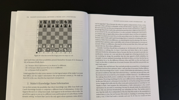
For those who don't know chess

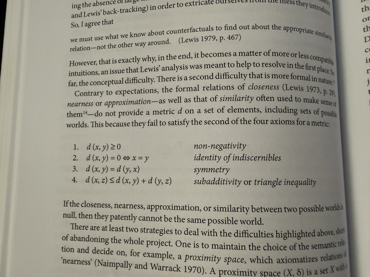
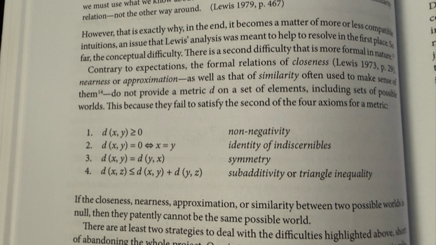
Overcomplicating simple ideas with logical formulas.
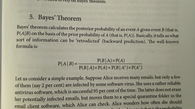
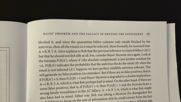
Bayes’ theorem

Hands up if you'd like to read and explain this...

And all of this is presented on a wave, not a plane.

You need to break it to read it without getting dizzy.
User Research, User Testing and User Feedback
The first design lesson for the freshly baked philosophy major was that thinking, talking, and writing, no matter how much sense they make to me, really, really do not mean much when your job is building things.
It seems like we don't understand anything before we touch it. We need to make to understand.
And before thinking too far, we need to ask the people for hwom and with whom we think. We need to think with them before we design for them. And we need to ask them while we design if what we do is what they want. And we need to ask people after we launch if what we think we did is really what we did.
Now, this might not be that surprising to you as designers and developers. But for someone that did 10 years of philosophy, the uselessness of my critically pure reason came back as a hard concrete slap in the face.
I had trouble believing just how useful it is to talk to those we work for. And sometimes I still doubt the very basic rule of UX.
Asking people what they want us to do and then do what they need? They don't know what they need! They do know better what pains them, they just may not know all the possible solutions.
Asking them for their opinions while we work and then chaning stuff after we're done? We'll just lose time. Maybe, but we'll lose much more time if we move in the wrong direction. And if we know that it's the right direction we can move more enthusiatically.
But changing everything all the time becuase people have opinions? People halways have opinions! We are pros, we know. Designers that think they know better because they see the product from inside fall into the same trap as philosophers that only think for themselves.
It's hard to overstate just how much philosophers believe that if they only think hard enough, their thinking reaches reality. And it's even harder to overstate just how wrong and far from reality they are in that insane belief.
Knowing how to make things
If you work as a designer or developer, or better, even if you work in construction, you know what making means.
Discussing concepts, selling concepts, and presenting ideas, we can build the most convincing concept, logic, and vision, but it's all words until we build the damn thing. We know and we understand, and we have done almost nothing.
Experiencing the impact of making things, even if it's just a website, is a very healthy experience for a young person that has been at school for twenty years.
When I started to make websites, I was again and again taken aback by how wrong my perfectly logical concepts were once we started putting them into Photoshop.
And once again, we were taken aback just how much we lacked understanding of what we designed when we put a reasonably sound photoshop design into code.
So we went back to the drawing board, fixed the designs and then fixed the code until we thought it works, and then tested and again, users told us it's crap.
And we did that until we thought that we can't improve it much anymore without going backrupt and launched.
And again, we found that it's not what we thought it was.
Maker’s Knowledge
There is a tiny, hardly ever mentioned philosophical tradition called Maker's Knowledge that claims that we only ever understand what we make. We do not know the reality of what we reflect unless we realize our concepts with our hands.
It's not a very popular tradition as it questions 2500 years of mainstream philosophy. Philosophy has been very engaged in dialogue, and Socrates himself wasn't getting tired of talking about craftsmanship, explaining his concepts, but since Plato, philosophy has been looking down on craftsmanship as something dirty and impure.
In short, Maker's Knowledge boils down to the radical notion that thinking is only a preparation for true understanding. Thought shapes and channels emotion for us to take action. And only through the action do we truly understand what it is that we felt, thought, and did. Only what is made is real, and only what we made is fully real to us.
“Verum ipsum factum.”
“Truth itself is made.”
Giambattista Vico shortens the thought down to
This is extremely difficult to translate, but just as with deciphering what philosophy is, you can catch a glimpse if you turn the sentence on its head.
Truth is made. Meaning: Truth is artificial. Turned on its head, that means that what we make is true. Whether we do it well or not is another question.
In other words, we could learn from philosophy that concepts are weak, that we need fast prototyping, and that we only truly know what we did after launch when we see how people use our products. But ironically, when it comes to what is true and what isn't, it's philosophy that can learn from design as much as the other way around.
3. INTERACT
As designers, we know all too well that making is not enough either. A lot of what we make is just a sketch and one more prototype. We think and sketch and then make; we make a first, second, 100th version until we can make something real.
And as much as I admire Vico for going fully frontal against 2,000 years of philosophical tradition that believed that reality can be comprehended through thought alone, he doesn't go far enough.
Designers know that just making things is not enough. We need to make remake and let others use what we make to know if what we did is what we want it to be.
And often what we think we made is something completely different. Usually it just doesnt work. Sometimes it works, and sometimes we built something that works but it's not what we thought it is.
Making Presentations
The philosophy behind our second app goes back to antiquity. We felt dissatisfied with PowerPoint and Keynote in a similar way we felt dissatisfied by Word.
“It’s a design app, and not a good one”
Asking ourselves what the idea, essence, and form of a true presentation app is, we asked what a presentation in essence is.
Our blueprint was not the typewriter but the good old speech. According to the ancient canon of rhetoric, a good speech is made in five steps.
- Idea
- Structure
- Message
- Memory
- Action
PowerPoint doesn't help with any of those. It just lets you design. Idea, structure, speech, message, memory, and action are all jumbled together and split into slides that we endlessly fiddle and rearrange.

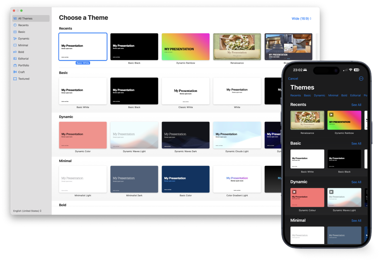
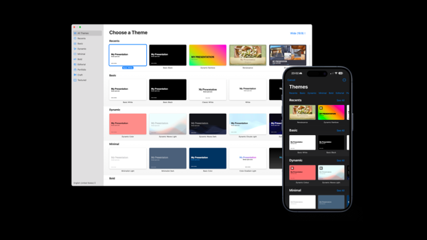
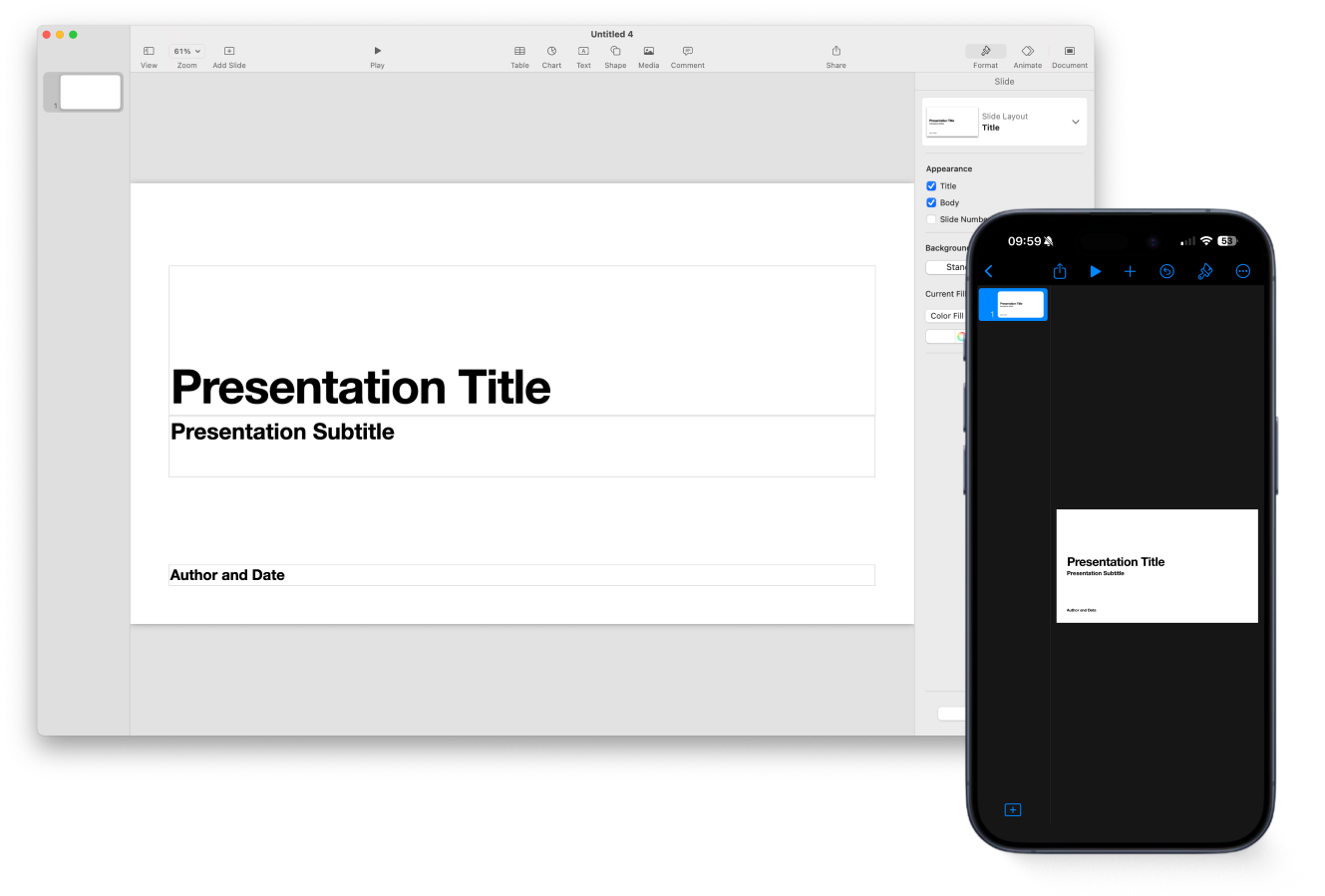
In Keynote, the first step is picking a design. That’s like choosing a costume before you know the role. It’s backwards. Until you have content, design is just a distraction.
They have a fixed aspect ratio and are completely unusable on a phone.

Ironically, the best template to work with is the black and white no-design template. Because it lets you focus. But if you later try to switch themes, you pay the price: text shifts, layouts break, images don’t fit, and you get stuck pixel-pushing slides back into place.
You cannot make or look at a presentation on the most used digital device. It's an endless pinch and re-pinch game.

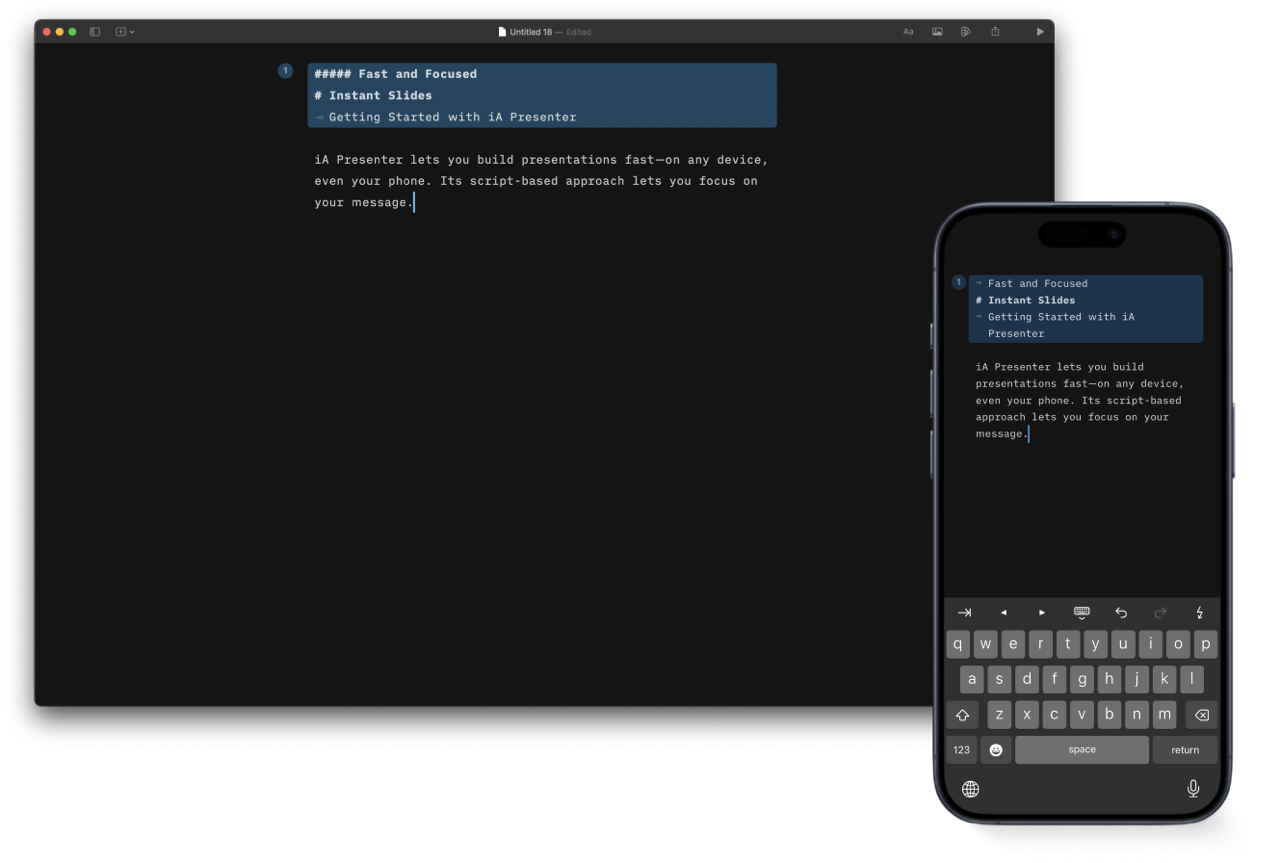
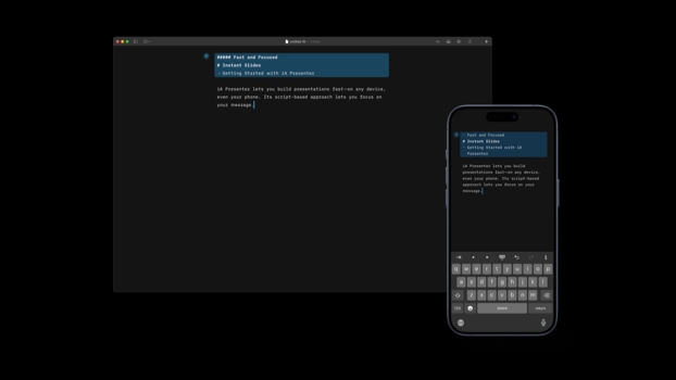
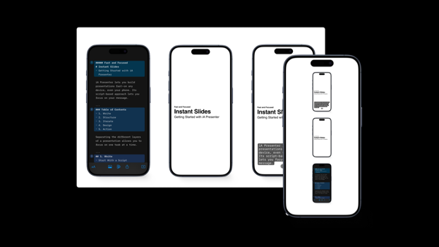
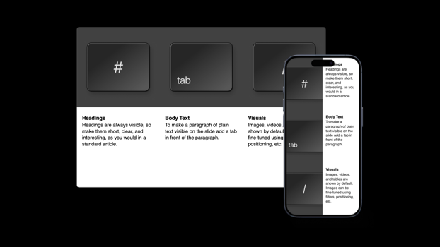
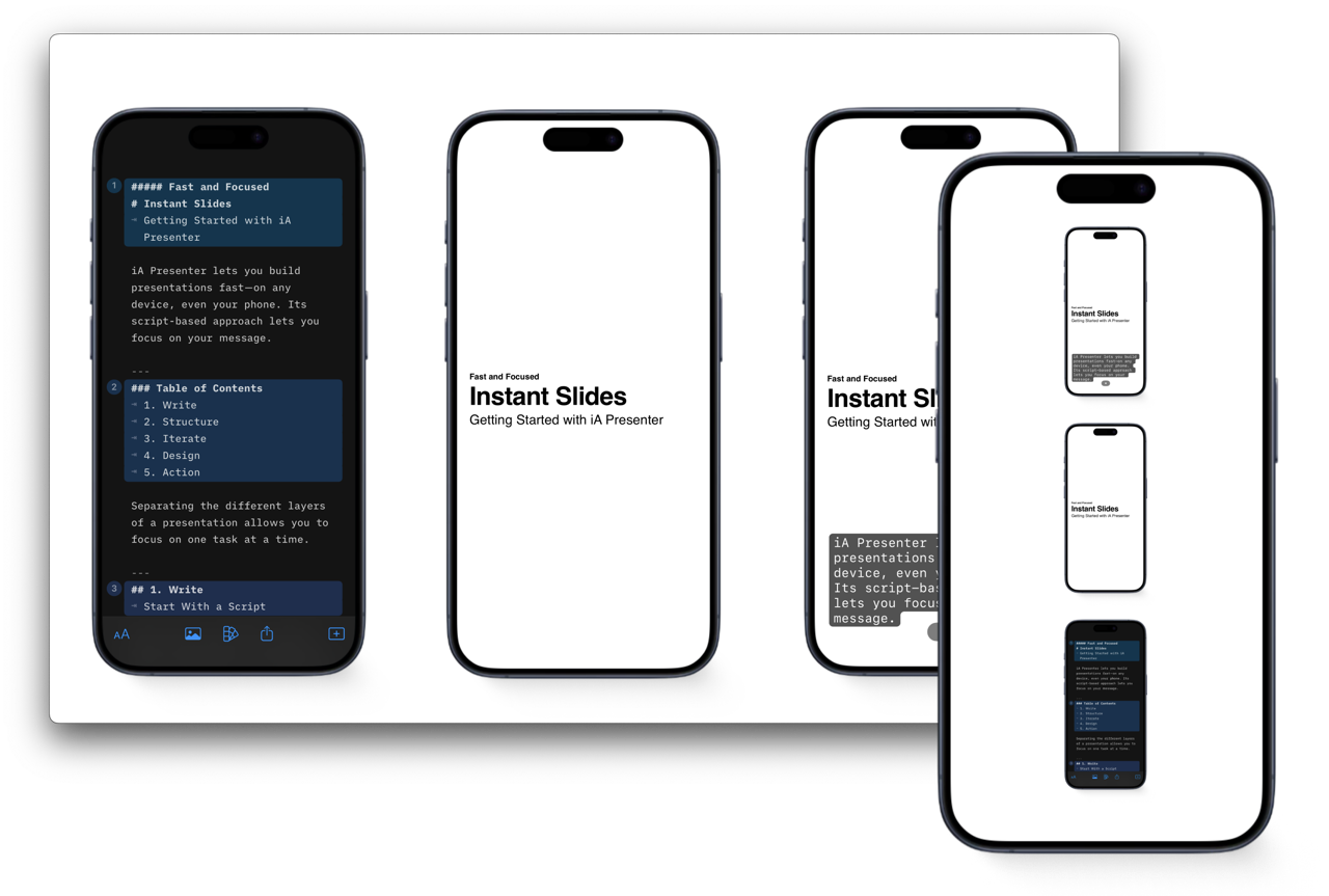
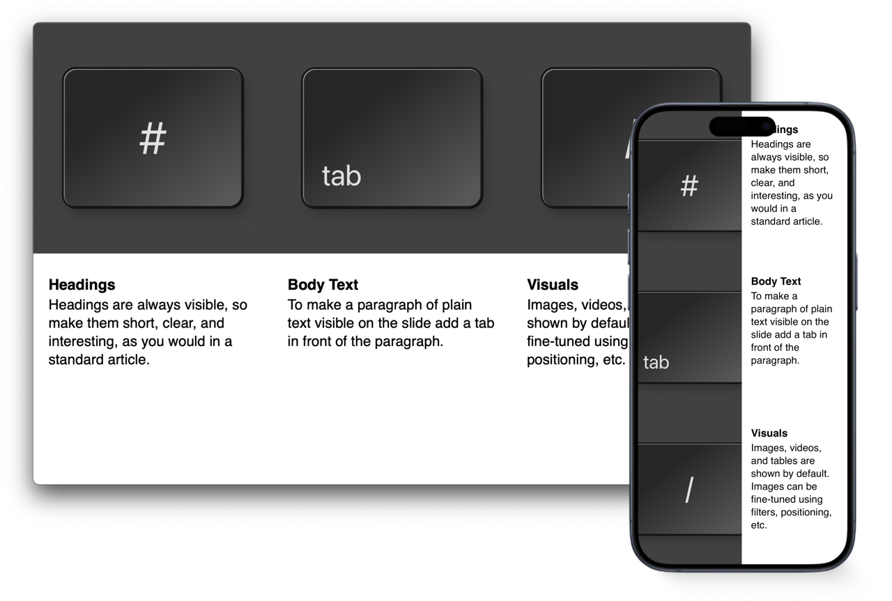
In iA Presenter, you start with your script, not with decoration. The default is plain white. No wasted time picking colors or fonts. Just focus on your story.
You can do that on a phone.

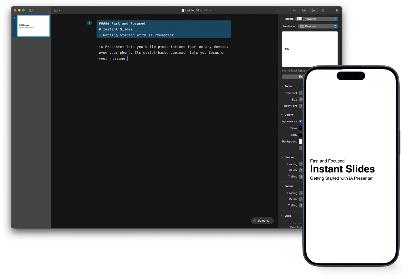
Black and white is still the default because loud design distracts when you’re still figuring out what to say. Once the story is solid, you can change the look in seconds without breaking anything.
And here's the kicker: All slides are responsive.

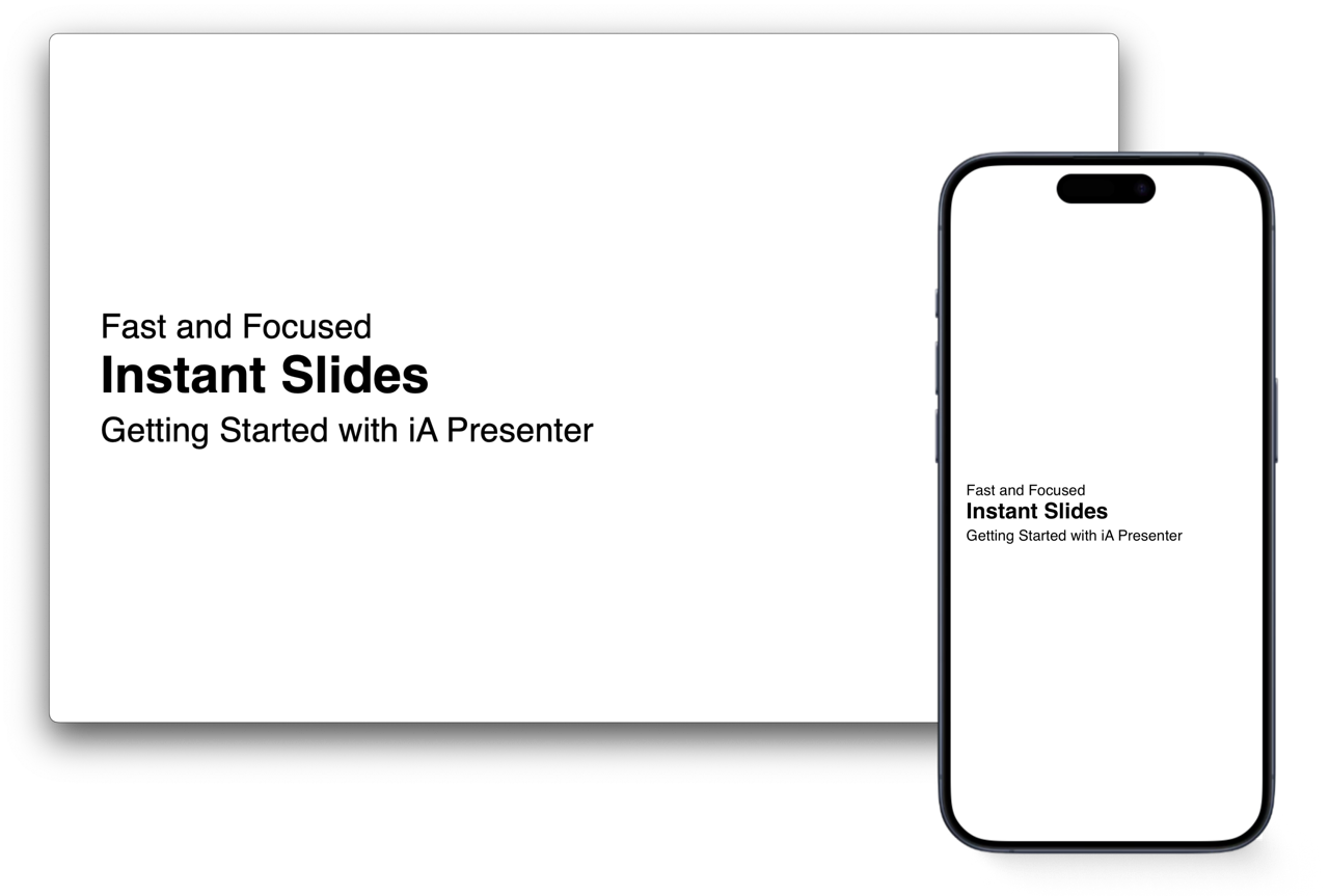
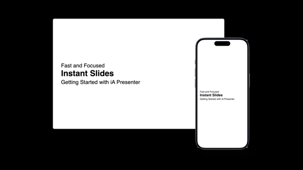
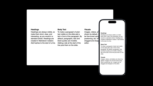
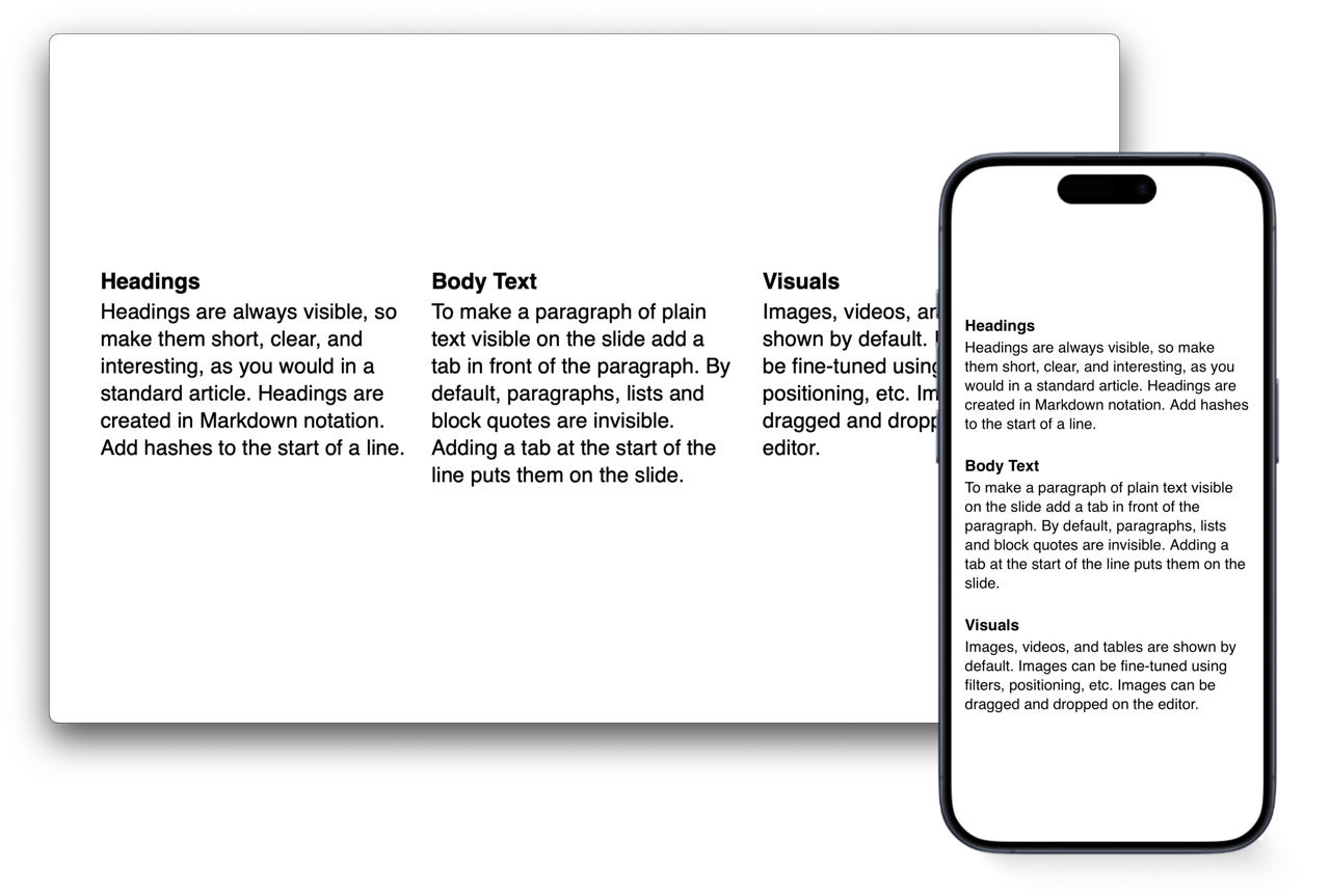
Title Slide: Similar to the black-and-white themes available in PowerPoint, Google Slides, and Keynote, but with improved typography.

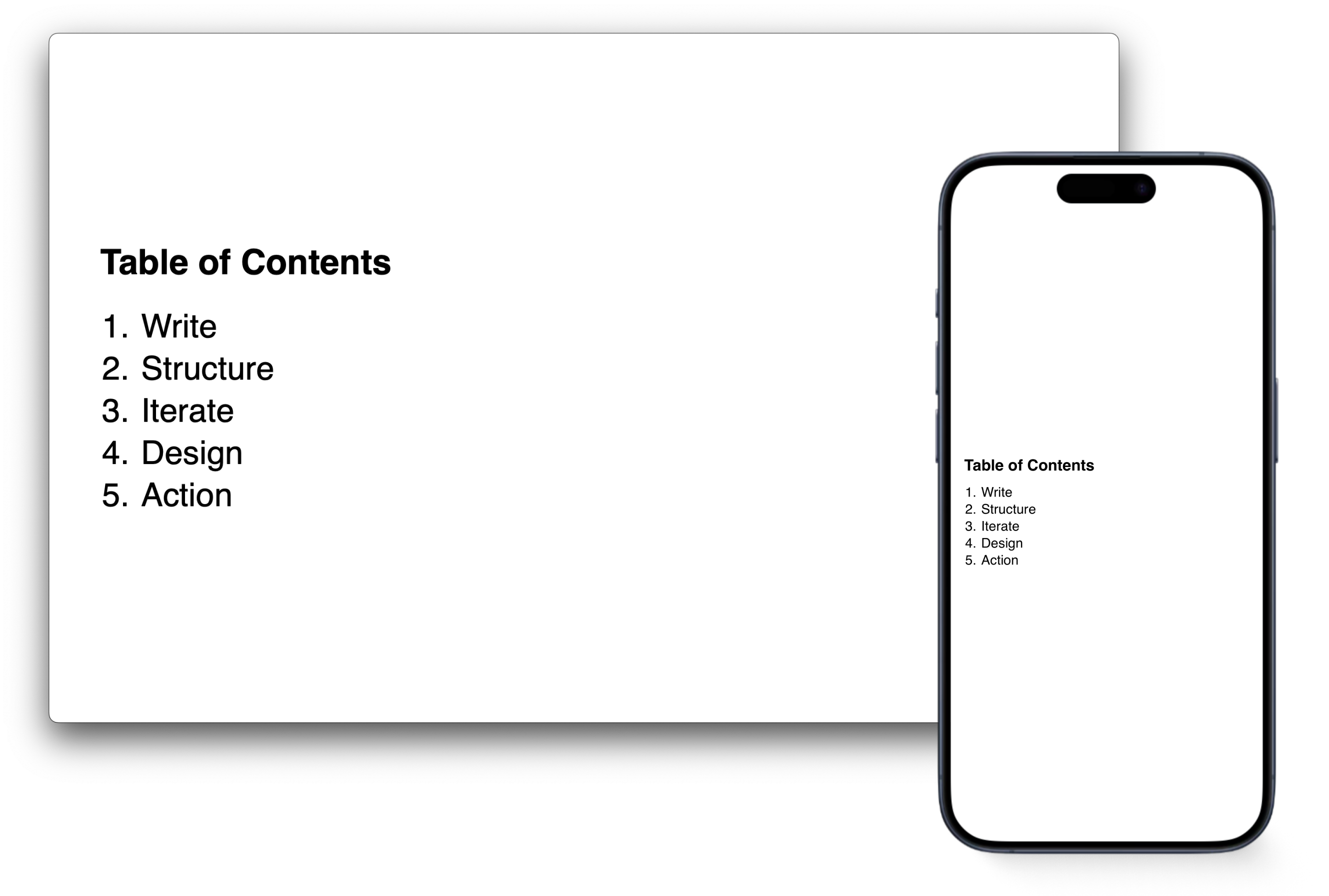
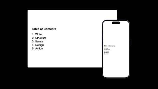
Table of Contents: Vertically centered text blocks for visual balance. There will be more control for vertical centering in a later version.

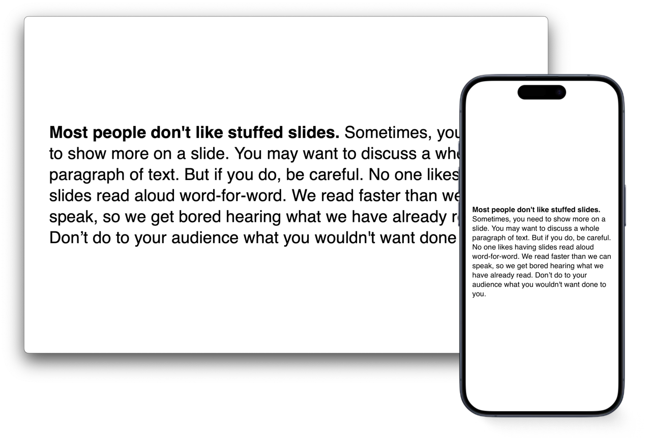
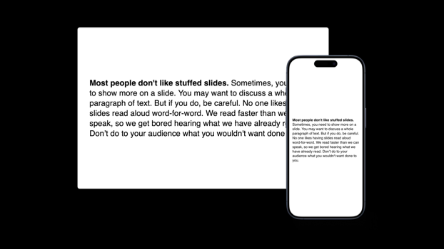
Textslide: The default text size has been scaled down for scalability, but you can now adjust title sizes.

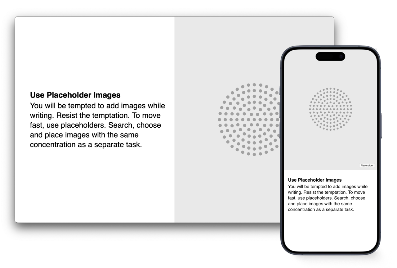
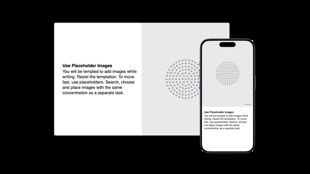
Text and Image: There is also a two-column layout for text and image only. Again, the text is vertically centered by default.

Three Columns Images: Upon popular demand, iA Presenter now aligns three elements, text, images, or mixed, in three columns by default.

Three Columns Text: Seems easy, but finding the right vertical logic was quite hard in a liquid layout with different text block sizes.

Mixed Mosaic: Useful for comparisons where you mix images and text.
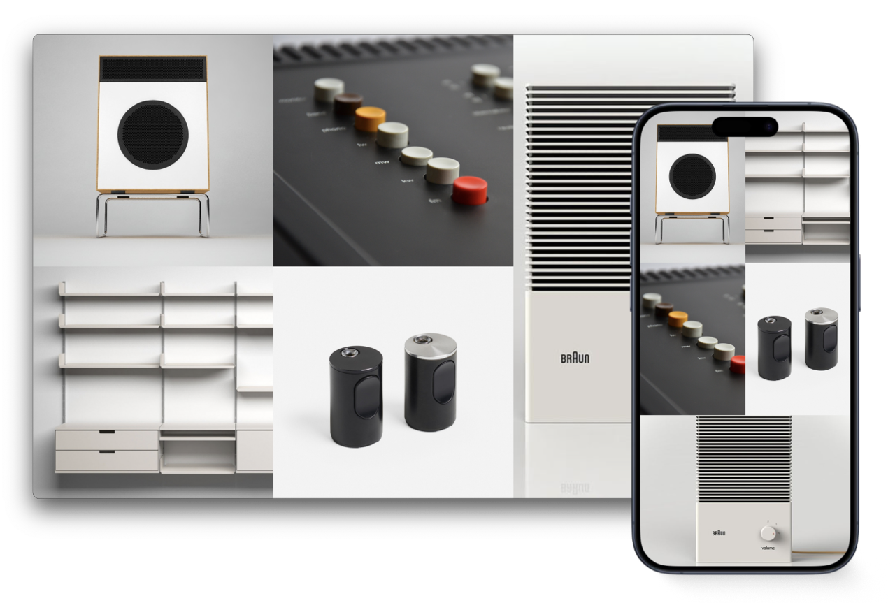
Image Mosaic: Automatized, if you use more than four elements (not encouraged).
And what was philosophical about it? Well, we focused on essence and worked with classical texts, and one can argue that we were fighting for meaning in a world of trash, but in fact, mostly, at this point, our whole method is philosophical. We design in dialogue, we develop in dialogue, we test the shit out of our apps, we use them ourselves, and we talk to people. We reject all pressure and take the insane stand that it's ready when we feel that it's ready.
Stoicism and User Feedback
But then, once it's really out, our strongest philosophical muscle is needed: Stoicism.
Because this is where it's at:
Once you realize that thought is just a tool that helps us make, and that only by making we truly understand what we thought, you are ready to face the truth.

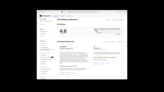
As designers, we know that there's unfair feedback. App Store reviews are a perfect training ground for Stoicism. Moving through 1-star comments is like passing the seven chambers of the Shaolin. But ironically, the more one-sided, trollish, and aggressive the feedback, the more useful they are.
If you say things with the intention to hurt someone, you're just an asshole. If you spend all your energy to troll and bring someone down because that makes you good, you are helping us improve though. Tracking down bugs can be extremely difficult.
Someone that tracks down your weakest spot is in some way doing very valuable work. It would be preferable to not have all asshole comments in public, but most of the time, people are being honest, and our Stoicism and philosophical training in changing perspectives can help us to take their point of view, face the truth, and improve our products.
Facing the Truth
The truth of what iA Presenter is not between "it's a beta" and "it's great." The truth is that what we set out to do is not what we managed to do.
We set out to make a presentation tool for businesses that helps them making meaningful, engaging presentations that focus on the message, and all of that in a fast and focused, efficient way. Focus on what you want to say. Then add pictures. Fast, focused and efficient.
But unfortunately there is no need for fast and focused presentations in most companies. Bullshit tools serve the bullshit business circus better than presentation tool that let us focus on the message. Middle and lower managers want to pretend to work. Procrastination masking as business serves them well. It kills time and allows them to pretend to know what they don't know.
PowerPoint is successful not because Microsoft is evil and clever, but because it feeds a need.
The truth is also that there was agroup of people who wanted and needed our tool. Teachers don't need to kill time and pretend to be busy. Pretending to know what they don't know doesn't advance their carreer.
The truth was that we built a tool for educators not business people. That hurts a bit, not just because we were wrong but because teachers don't easily buy 80 dollar software.

And then we realized...

That the same was true for our first app. It's not a business tool. But it's close to perfect for schools. It took 15 years to understand whom we work for. Thinking takes time. Making takes time. Interacting takes time. The truth can take a lot of time.
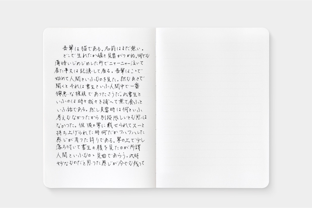
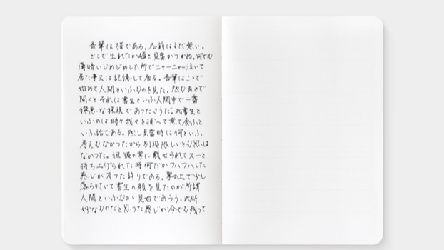
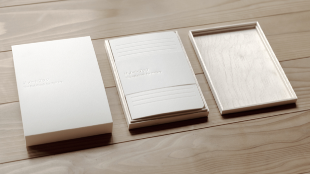
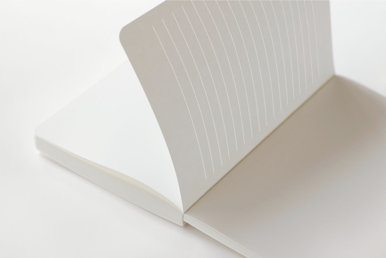
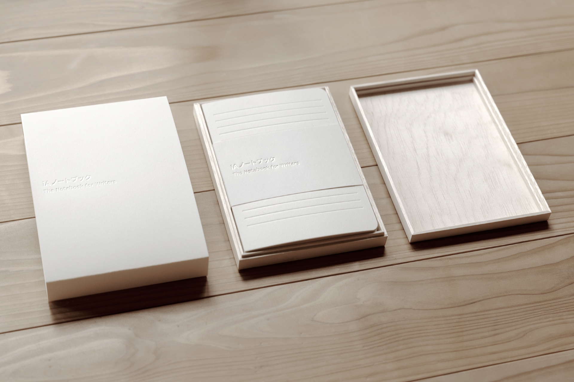
Conclusion
1. We only understand what we make.
Ideas are born out of wonder. Wondering makes us think. Philosophy has worked hard analyzing how abstract ideas come into existence and turn into concrete form. Philosophy is rich in its analysis of how existence enters into appearance and how we relate to the world.
From the great philosophical systems created by Plato, Aristotle, and Kant, we can learn how to shape and order notions and we learn to take different perspectives. The late Wittgenstein can teach us further how language works in different contexts.
Phenomenology will help us focus on what we really perceive and observe our perception in slow motion.
We cannot comprehend reality through thought alone. Thought prepares us for physical action. And only through physical action can we comprehend. Whether we create an object, cut hair, or teach. We all make things when we work. We all shape matter, we all design, and we design better if we learn to think from the perspective of those whom we address our actions to.
Maker's Knowledge teaches us that we can understand, comprehend-handing only what we make. But understanding doesn't end there.
Philosophy has done a lousy job for everything beyond the individual that makes something. Aesthetics end with art. Design is hardly present. There's some new literature, but philosophers don't make much. They write, they speak, some paint, some play the cello. That's why they don't have much to say beyond art, with the exception of those who didn't shay away from using their hands to work.
Socrates, Wittgenstein, and it pains me to admit it, Heidegger.
2. Reality is shared.
Reality doesn't exist outside our mind, and it doesn't exist inside our mind either. We build reality by acting and interacting with others. We share reality through language, and like language, it's something we share.
Philosophers tend to take a solitary position of the individual reflecting on their relationship with nature. And they do that diligently, carefully, tirelessly. If you want to learn how to think, read philosophy.
It also extends its solitary view through a rich spectrum of ethical theories that can help us in various situations.
Without being eclectic and choosing what suits our needs best, we can be Epicurean with our friends, Kantian at work, Aristotelian in our family, and Stoic with App Store comments.
Reading philosophy is the greatest training in changing perspectives one could think of. Reading different philosophers teaches us to understand and accept different perspectives and to switch between them. A crucial talent for any designer.
But there is a point where philosophy abandons us. There is a lot beyond Maker's Knowledge that philosophers ignore because they, in fact, rarely make things other than speeches and texts. And this is where philosophers can learn from designers.
From a designer's perspective, most philosophical books, treatises, and speeches are based on amateurish, sloppy designs. Rather than thinking about their use cases, asking their target audience, testing their ideas, they publish notebooks. In the production of their notebooks, they ruin the product completely by editing it into a spaghetti code that no one understands, no one reads, and no one cares about.
This is a shame, especially since designers could use more philosophical reflection. The world is badly designed because designers follow orders instead of serving humanity. It's not that we don't know that we bury the world in trash. We just don't know what to do about it.
In spite of the practical global failure of our profession, we know things that philosophers ignore. We know what happens beyond maker's knowledge.
Design teaches us that we don't know if anything we feel, think, say, sketch, or even make is what we think it is or want it to be until someone else interacts with what we made and talks to us about how they experienced our product.
It doesn't matter how well we think we did what we did. We need to let other people use what we did and listen to what they say.
Sharing our knowledge with philosophers could do wonders. We know how irritations turn into abstract ideas, we know how abstract ideas become concrete products through thought, sketching, testing, and feedback cycles. We know that reality is not a matter of thinking straight. Reality happens between people.
And we know exactly how.
3. Truth itself is made, shared, and perpetually remade through interaction.
In a time where everyone obsesses about artificial intelligence and how it may surpass us, forces us to rethink what natural intelligence is.
The creative process shows very clearly that intelligence is not just a matter of how smart we are or how cleverly we combine words that prepare action. Sketching out a great idea doesn't make it real either. Even making, physically or digitally, is not quite enough to really know; you need to face people that use what you made and interact with them.
Human intelligence becomes real between two human bodies, two human minds through interaction. It becomes real through what we do, together, working together. Intelligence cannot happen inside a machine. It is not what happens inside each of our minds either; it becomes real through interaction.
Intelligence is how we work together. It doesn't matter how clever, right, or even innovative you are. If no one understands, no one listens, and no one interacts with you through what you do, it's all for naught. It doesn't matter what or how much you think, if you are alone, you do not know for sure that you exist.
One more thing


