


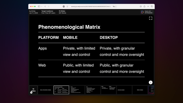
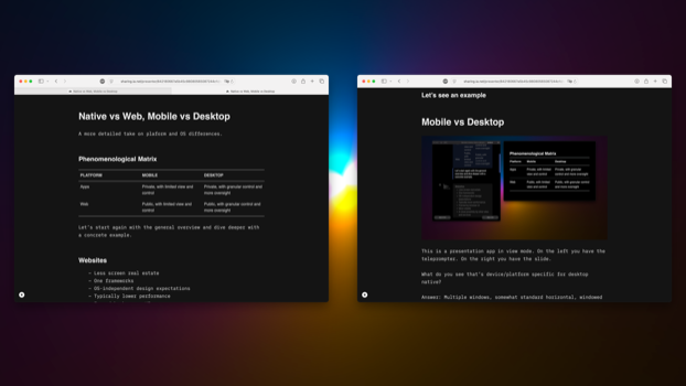
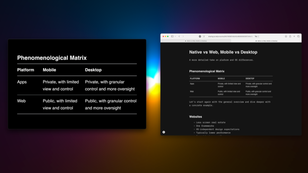


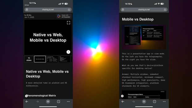

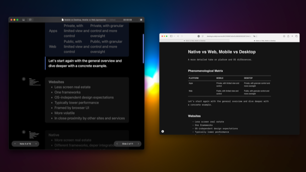


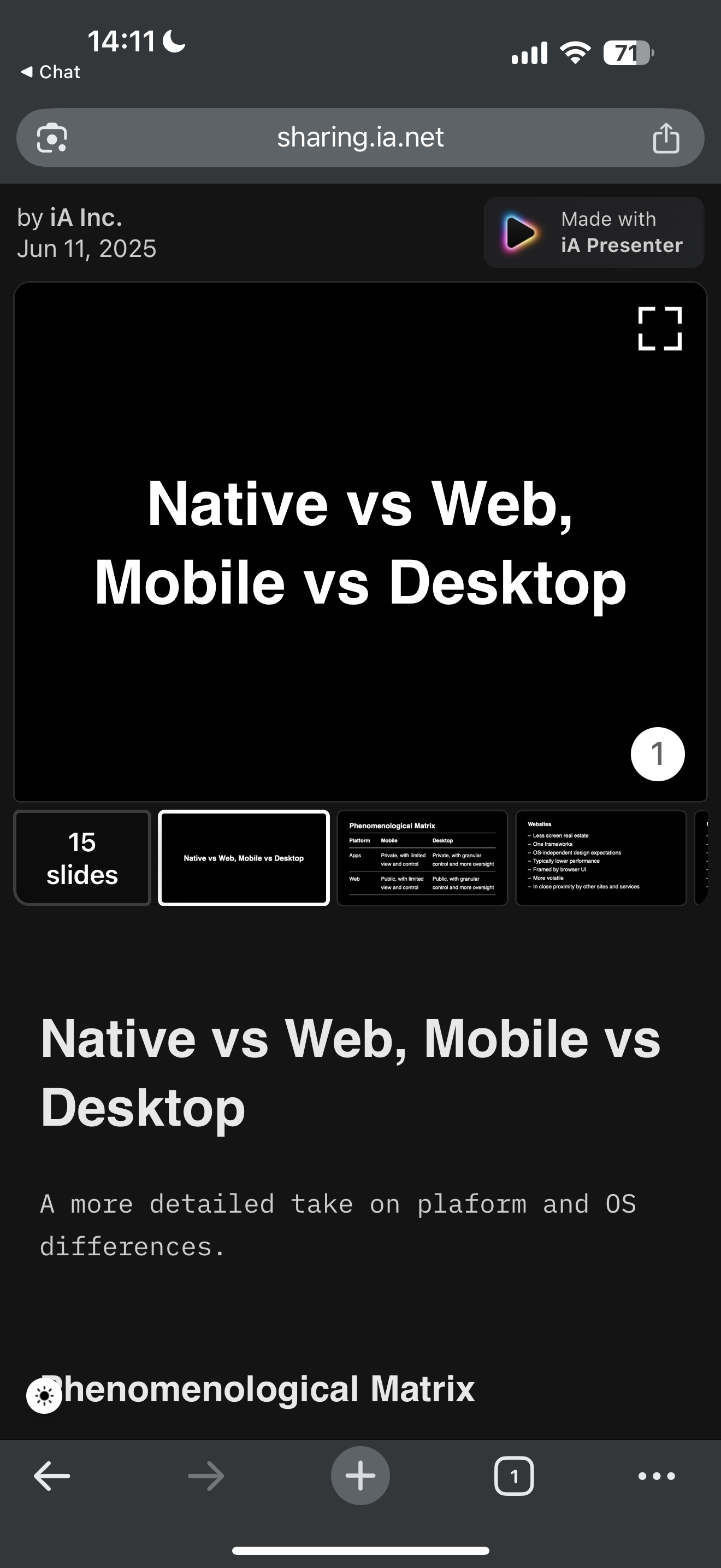
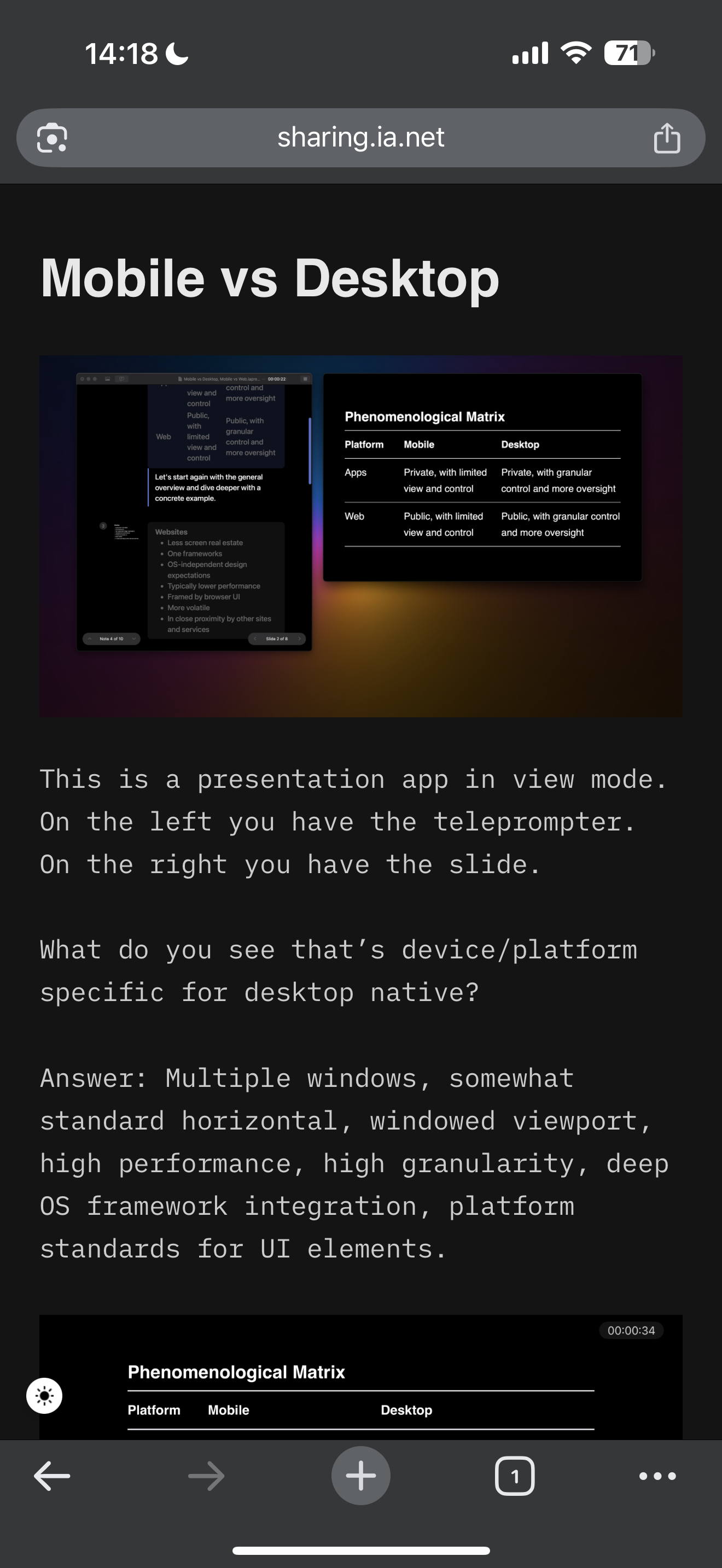
This is a presentation app in view mode. On the left, you have the teleprompter. On the right, you have the slide.
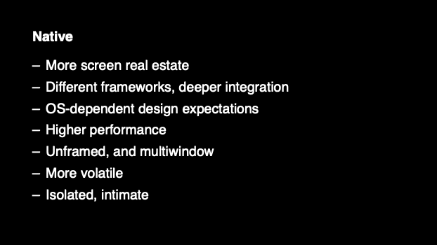
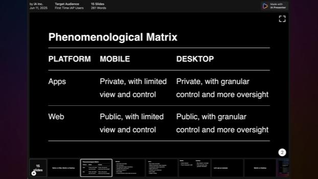
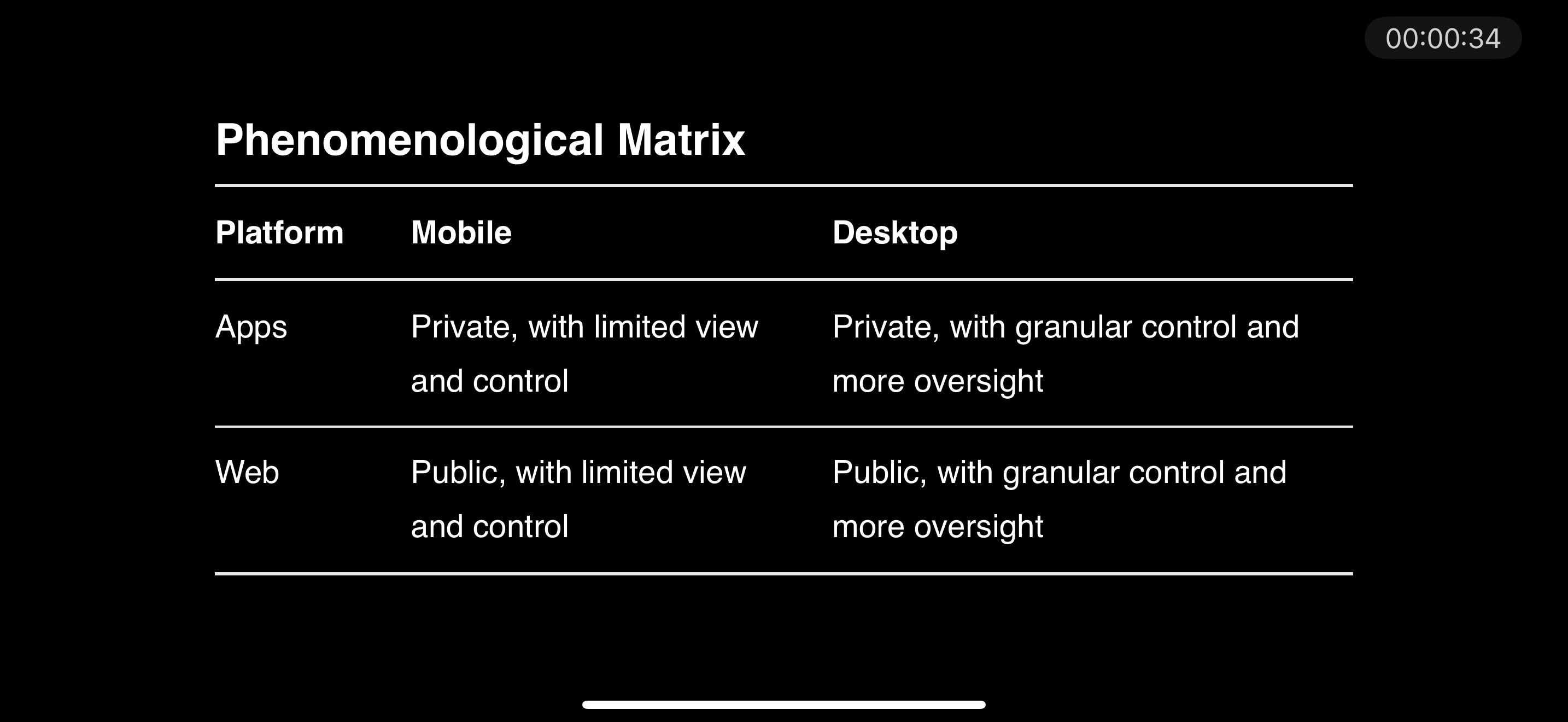
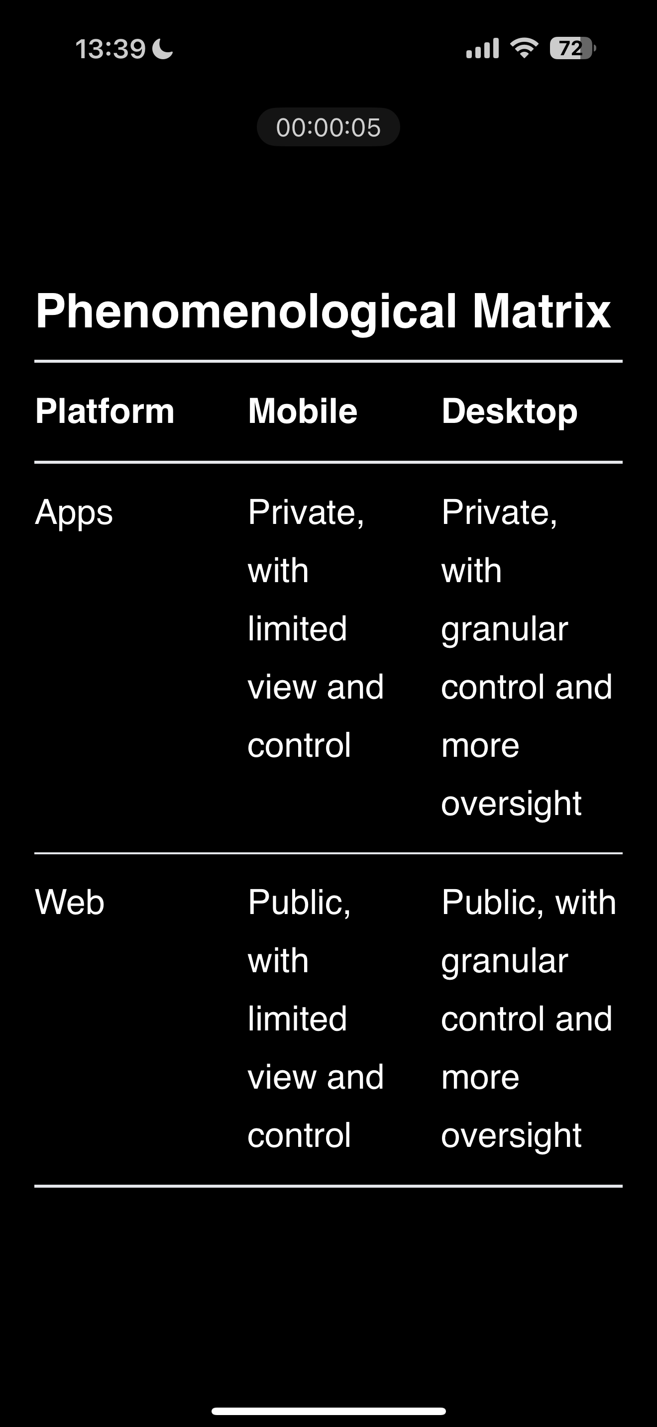
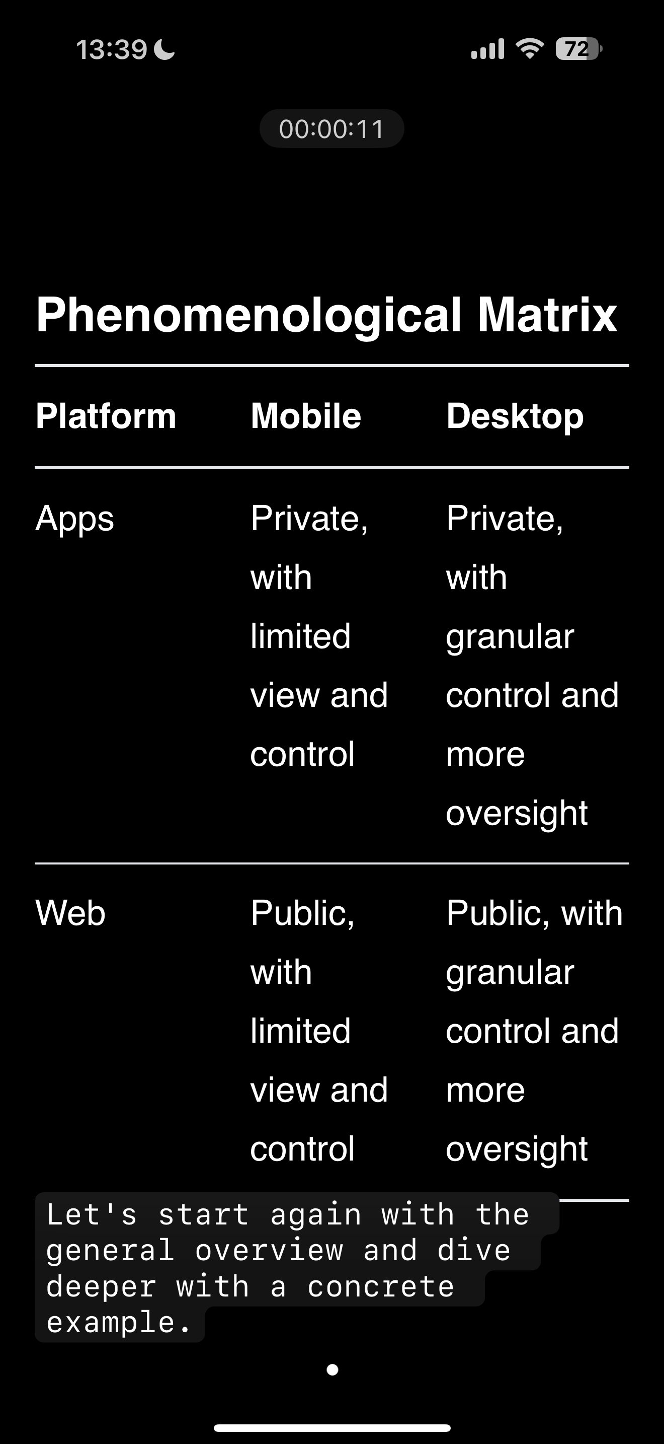
What do you see that’s device/platform specific for desktop native?
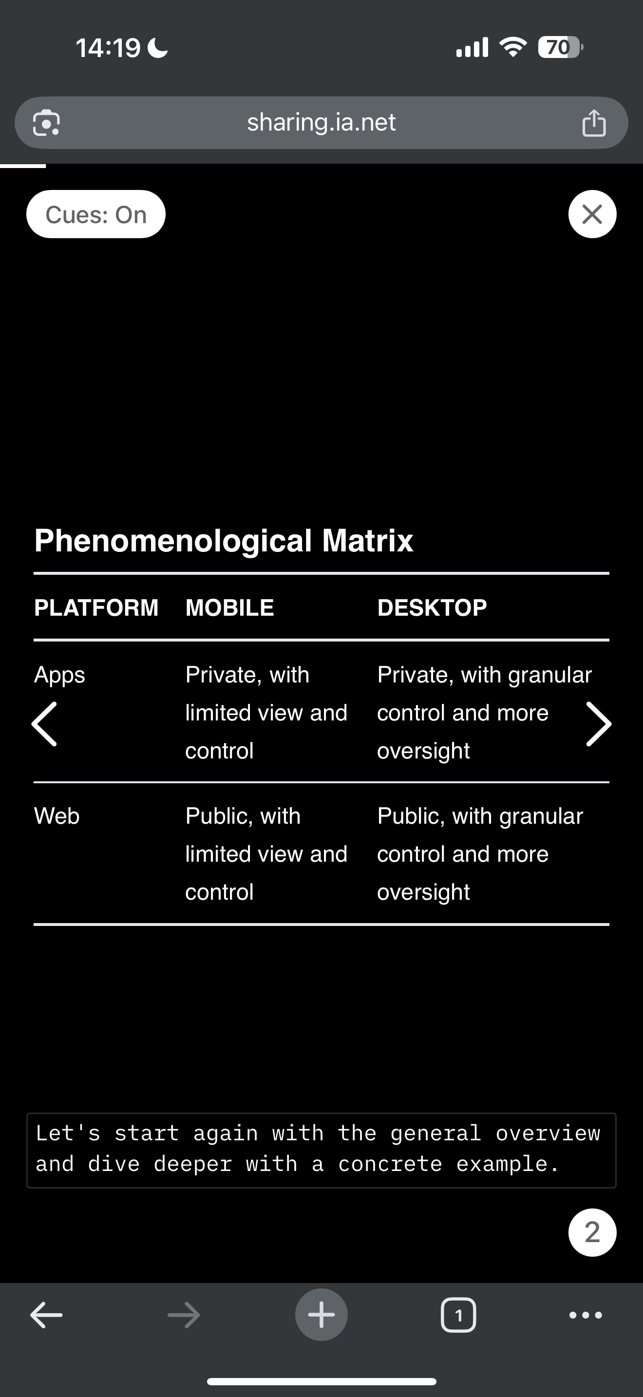
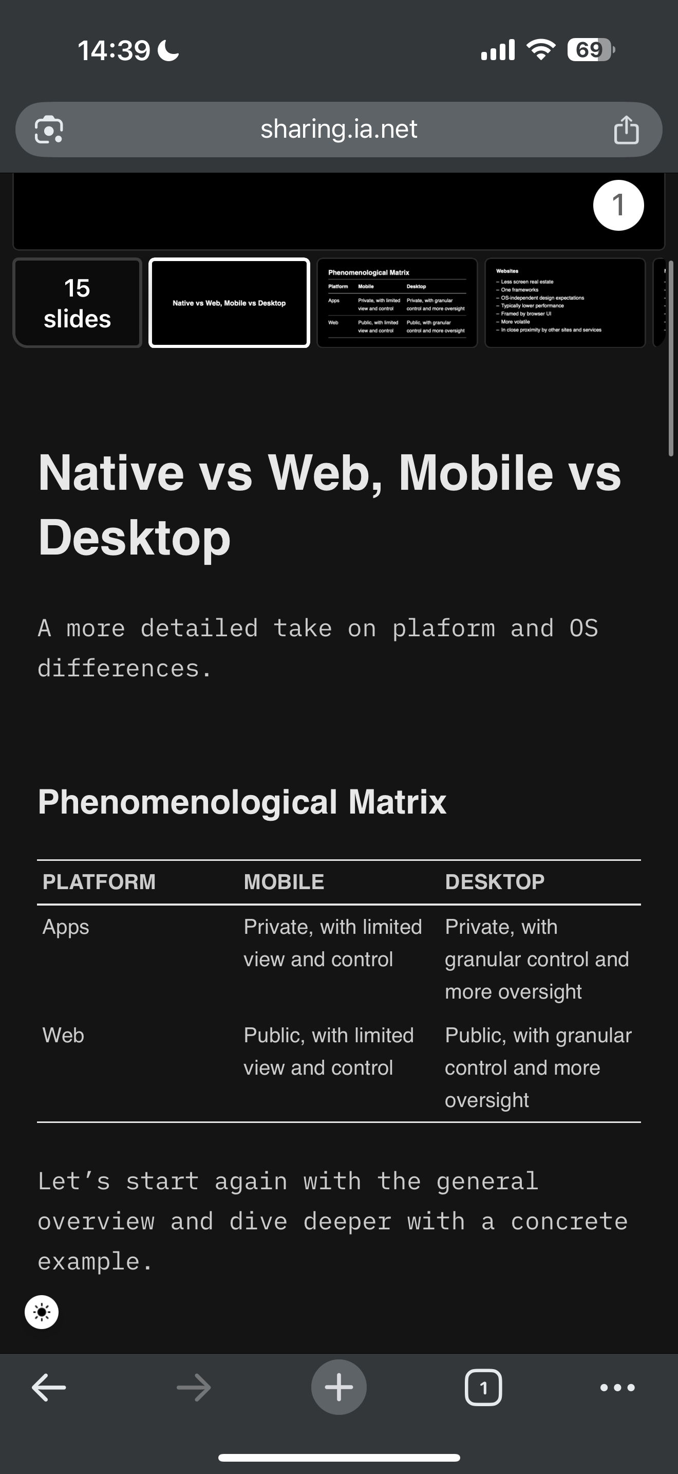
Answer: Multiple windows, somewhat standard horizontal, windowed viewport, high performance, high granularity, deep OS framework integration, platform standards for UI elements.
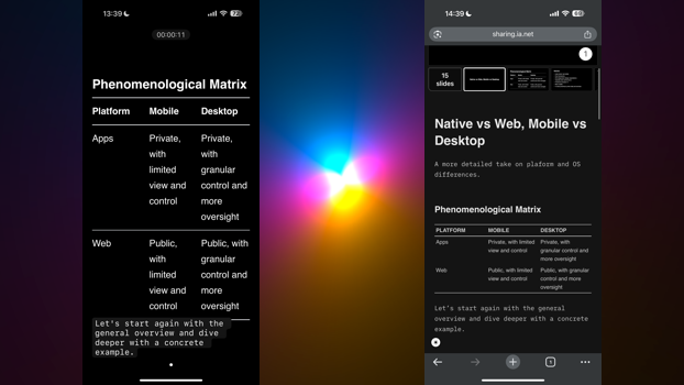
This is how it looks on a phone. Well, actually, this is not how it looks on a phone by default.
Because the default orientation is portrait mode:
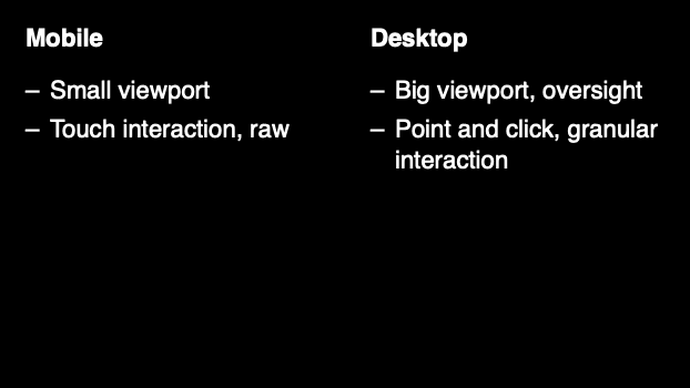
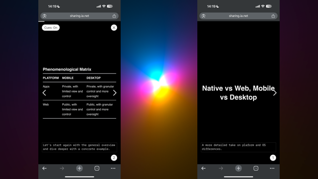
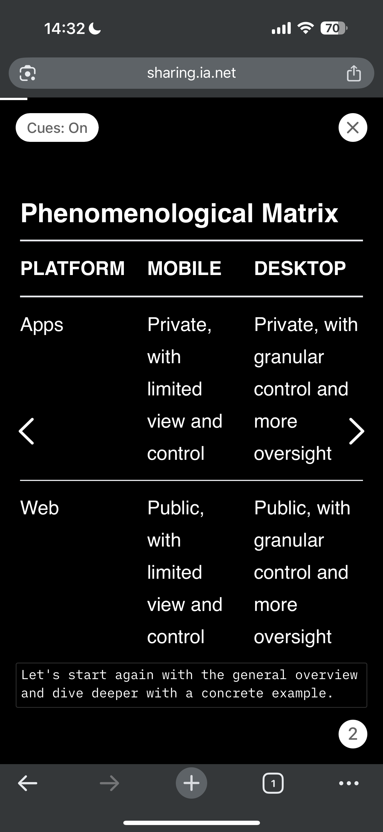
Let’s compare: As you can see, now, there is only one window, so where do we put the teleprompter?


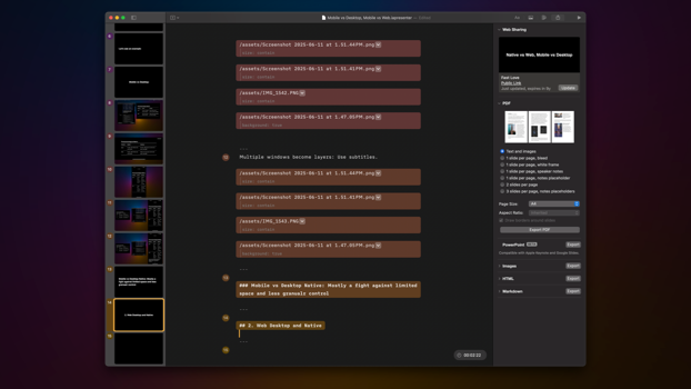
Multiple windows on desktop become layers on mobile. Instead of a separate teleprompter window, we use subtitles.

A Presenter has a Websharing function. Doing Webdesign for 25 years, I thought that this would be easy to implement.
Just do something like this:

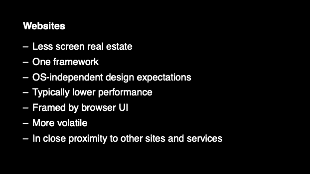
Do you notice what is missing? When we design Websites, we usually forget about Chrome. But for the interaction model, it is essential to see the site embedded in the Window. The chrome of a native App is fundamentally different from a Webapp.
It’s not just that the keyboard is mapped to the browser. Browser windows are more often resized than productive native app windows. The context is entirely different. People can come to a Website from anywhere. If you share a presentation, the site needs to explain that it is a presentation and not a blog or similar.
A native app was consciously installed. The user already knows how it works. You can tie somewhat of a learning curve to a native app.
A Website can be visited more or less by chance. It needs to explain itself and be understood immediately.

Not only do people on the Web come from outside, on different browsers, with different viewports, and different expectations. Web users have a very low tolerance for obscurity and custom design. And the competition is often just a click away. It is much harder to keep people’s attention in a browser than in a native window.

Technically, on the Web, you can go full screen and offer cues. But who goes full screen with a browser-free willingly?

The Web has a low tolerance for non-custom design. Usable is what people are used to. While this is true for any platform, native apps are a bit more tolerant when it comes to new, funky patterns. The Web doesn’t like any funky stuff. Unless you’re one of the big ones (YouTube, Facebook, TikTok). It wants the most simple, fastest format:


We started off with the slides, but people perceived it as a weird Flash-like website that hijacks scrolling and is just plain weird. So we had to add a bunch of explanations and default to the article view.
Eventually, we ended up offering both a fullscreen slide version and a plaintext version with images that look very much like a regular website.
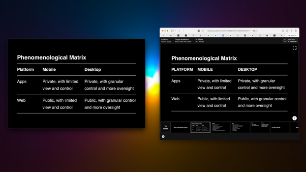
Our Web version does not look like a scaled-down version, but that’s because Desktop Web is a scaled-up Mobile version. We had to design the mobile view first, and then the Desktop design.
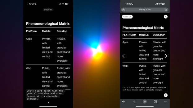
It has a slide view. But you can clearly see how much space is used by the chrome.
As you can see, the website also required that we add thumbnails, because as a user coming from out-selle it wasn’t directly clear that this top slide was in fact one out of many slides.
The full-screen static slide ends up surrounded by tabs and Chrome in a responsive window. Since we don’t use multiple windows in a browser, what used to be a teleprompter in the end turned into an article view.
This is how crazy different Web and Native are. Let’s compare mobile.
By default, we show the article mode with images. On Mobile, this is even more important to minimize any thinking and finding out because of the deadly combo of limited overview and the fear of being in an unsafe place. People’s attention span and patience is even lower than in a Desktop browser.
There is a lot more to say about this screen, but what you can see at first sight is that on Web Mobile you need to show more affordances. While in a native app you can get away with a gesture (tap shows and hides cues), on mobile Web you need to minimize gestures and offer affordances whenever possible. The affordance elements get in the way, so we hide them after some time.