Maker’s Knowledge and the Present of Time
By Oliver Reichenstein, iA Inc.
Summary: The talk presents Maker’s Knowledge, a philosophical concept introduced by Giambattista Vico, which suggests that true understanding comes from making, not just thinking.
Vico’s idea challenges the Cartesian tradition of prioritizing thought over creation, arguing that we can only fully comprehend what we actively create. This shift in perspective has far-reaching implications for how we approach science, education, technology, and even our economy that is infatuated with numbers rather than tangible reality.
In the context of product management, Maker’s Knowledge shows that quality is directly tied to the time invested in both understanding and creating a product.
Time invested in crafting thoughtful, well-designed products is not wasted. It is “present” in the product. Just like carefully crafted little product details show that the maker cared for us more than just functionally required, our time invested becomes a “present of time” for customers.
By taking the time to understand and refine a product, businesses can provide a superior experience, saving users time and creating a more meaningful connection between maker and consumer. This philosophy counters the modern industrial push for fast, cheap, and disposable goods.
The talk illustrates the verum factum approach with real-world examples from iA Inc., where abandoning strict deadlines and focusing entirely on quality has led to the development of products like the iA Writer and iA Presenter, as well as a new type of notebook.
These products, developed through slow, iterative processes, exemplify how the investment of time results in better, longer-lasting products that customers appreciate and value. While creating high-quality, innovative products takes time, the results are worth it.
The presence of time in the creation process is what makes products feel more real and meaningful, both to the maker and the user.
This approach not only leads to better business outcomes in terms of customer loyalty and satisfaction but also aligns with a more human, thoughtful approach to creation in general. It works, but it is not as profitable as fast, cheap and disposable.
1. Maker’s Knowledge
The following talk has three parts:
First, I’d like to talk about a little-known philosophical secret called Maker’s Knowledge. Maker’s Knowledge means that we can only fully understand what we make and we succeed in making quality things only if we know what we do. This is why quality takes time, especially when we try to innovate.
While Maker’s Knowledge is little known, it’s in fact quite a big deal as it puts the so-called Cartesian tradition into question that puts thinking before existence. According to Vico, it’s not “I think therefore I am”, but “I make therefore I am”. Consequentially it undermines how we approach natural and human science, education, technology, the economy, and our modern life.
The second part shows how a business can put Vico’s Maker’s Knowledge into practice. I’ll talk about how product quality is intrinsically tied to the time that we invest in the cycle of making and understanding. Quality is the extra time we invest to make our customers happy. That invested extra time is not lost but a gift to our customers.
The more time we invest into our product, the better it works. And the better it works, the more time the customer saves while using the product. Offering the present of time we allow our customers to save time, to enjoy themselves as they use it, in other words: to have a good time when they use our products.
Finally, I’d like to show what happened with our design and development, embracing Maker’s Knowledge, abandoning deadlines, and fully focusing on quality. I’ll show that with two digital and an old-fashioned tangible product.
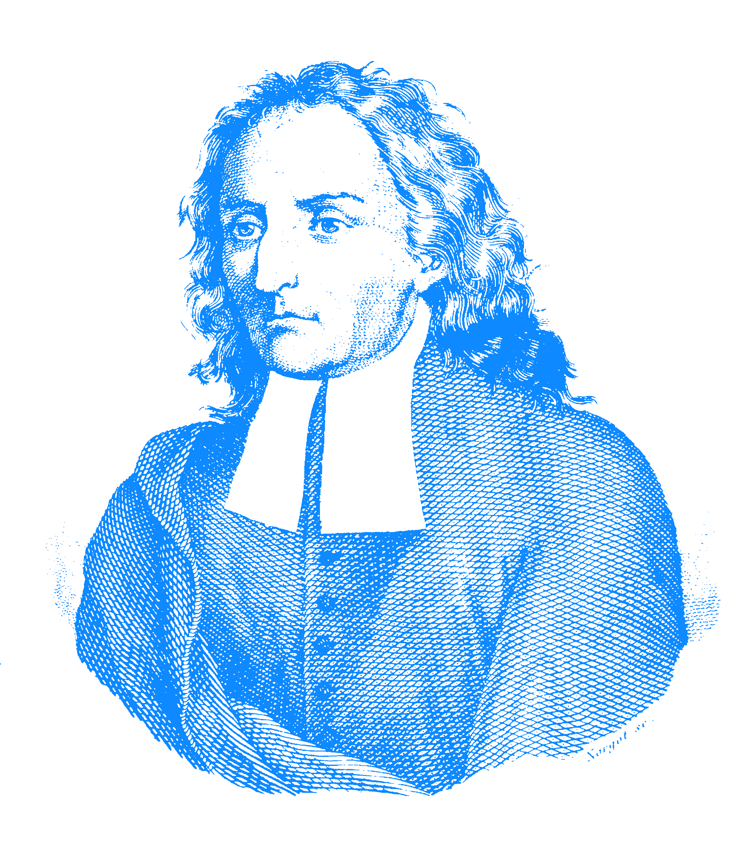
This is the Italian Philosopher Giambattista Vico (1668–1744). You may have heard his name before. But even if you studied philosophy, chances are you don’t know exactly what he said.
Great idea, bad execution
It’s not your fault. It’s Vico’s fault. He had a great idea, but like so many philosophers he executed it badly. Almost no one understood what he was trying to achieve.
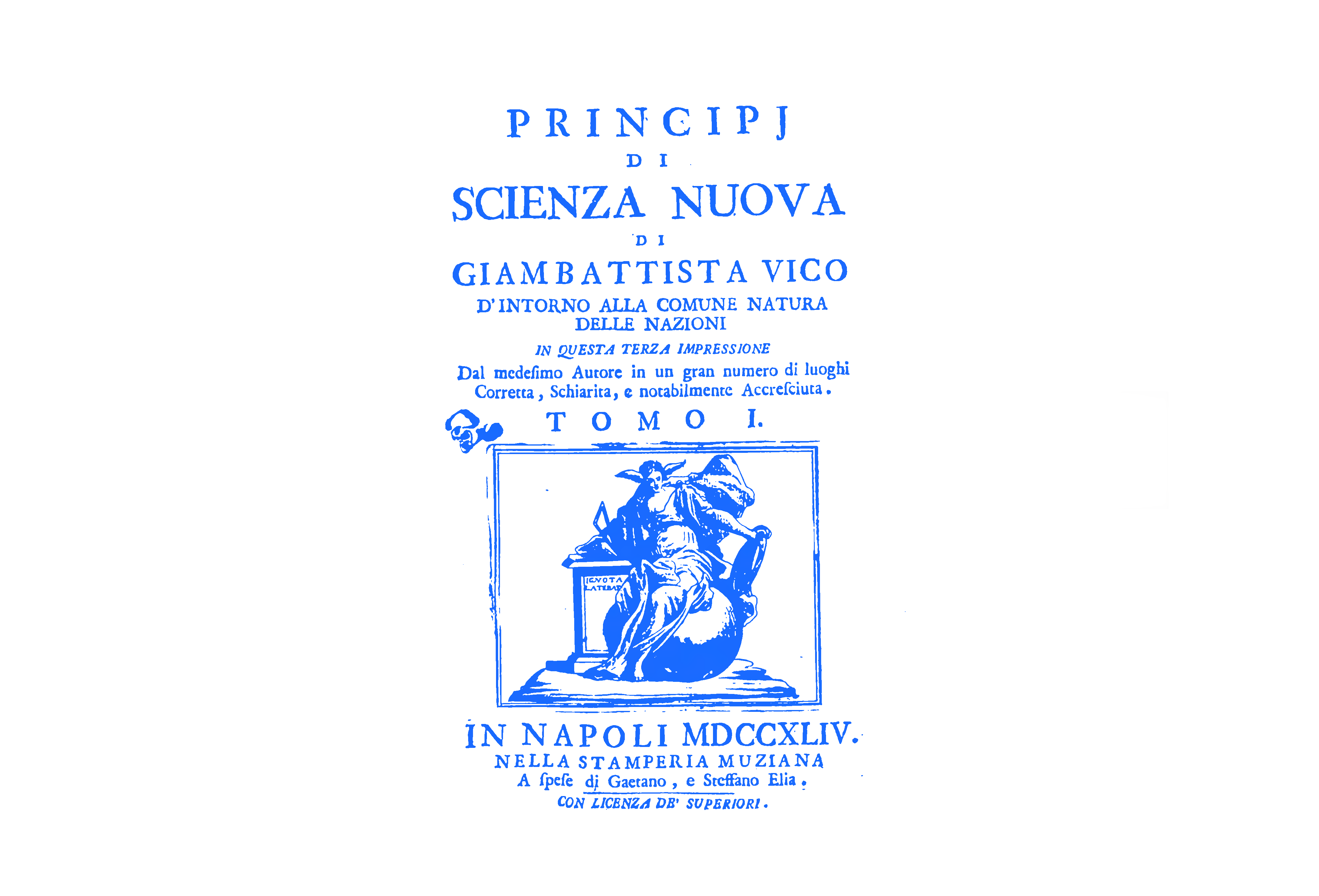
The packaging of his product was all right. The typography, the illustrations, and the bookbinding were neither especially good nor especially bad. The naming was great. The title of his main oeuvre Principi di Scienza Nuova, was spot on, it encapsulated his main idea, but the book did not deliver what it promised.
He promised the principle of a new science and he had the core idea for it in his hands for decades, but while he was writing the opus magnus, he got distracted by religion, history, mythology, and philology and messed it all up.
It may not be fair to call his book boring, but it was dark, twisted, and not even closely as entertaining as he may have thought. It’s such a shame. The difficult form it took in the end directly contradicts the very simple original idea. Vico’s original idea could have been the Pizza Margherita of Philosophy. A simple dish that everybody loves and enjoys. Instead, he made an Anglo-Saxon tripe stew with sauerkraut in a hot chocolate sauce.
Verum Factum
Luckily, the New Science was not a complete failure. His core idea of Maker’s Knowledge or as he calls it verum ipsum factum was so strong that it has since then had several breakthroughs. It also helped that it was in one of his earlier writings (De Antiquissima Italorum Sapientia) and that, in fact, it is not that hard to explain.
Verum ipsum factum means that we can only fully understand what we make. We only know what we make. So to really know a thing we need to make that thing. And while, at first, this may sound a bit exaggerated, he meant “versum ipsum factum” in both a radical and refreshing way. Let’s look at some examples by taking a short walk around Naples in the 17th century, to see the world through Vico’s eyes:
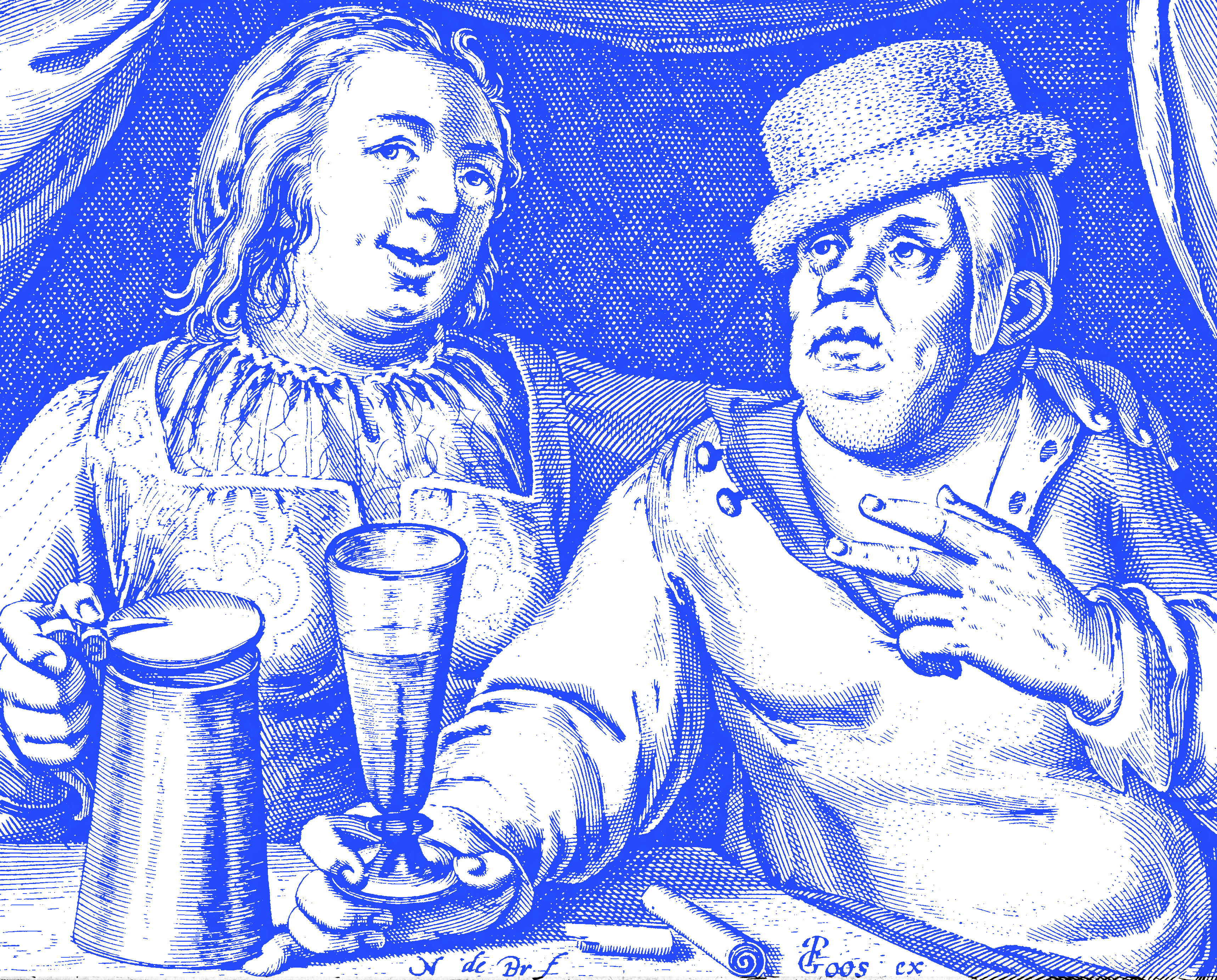
[Italian accent] If you drink a lot of beer, you know beer. But to truly understand beer, you have to…
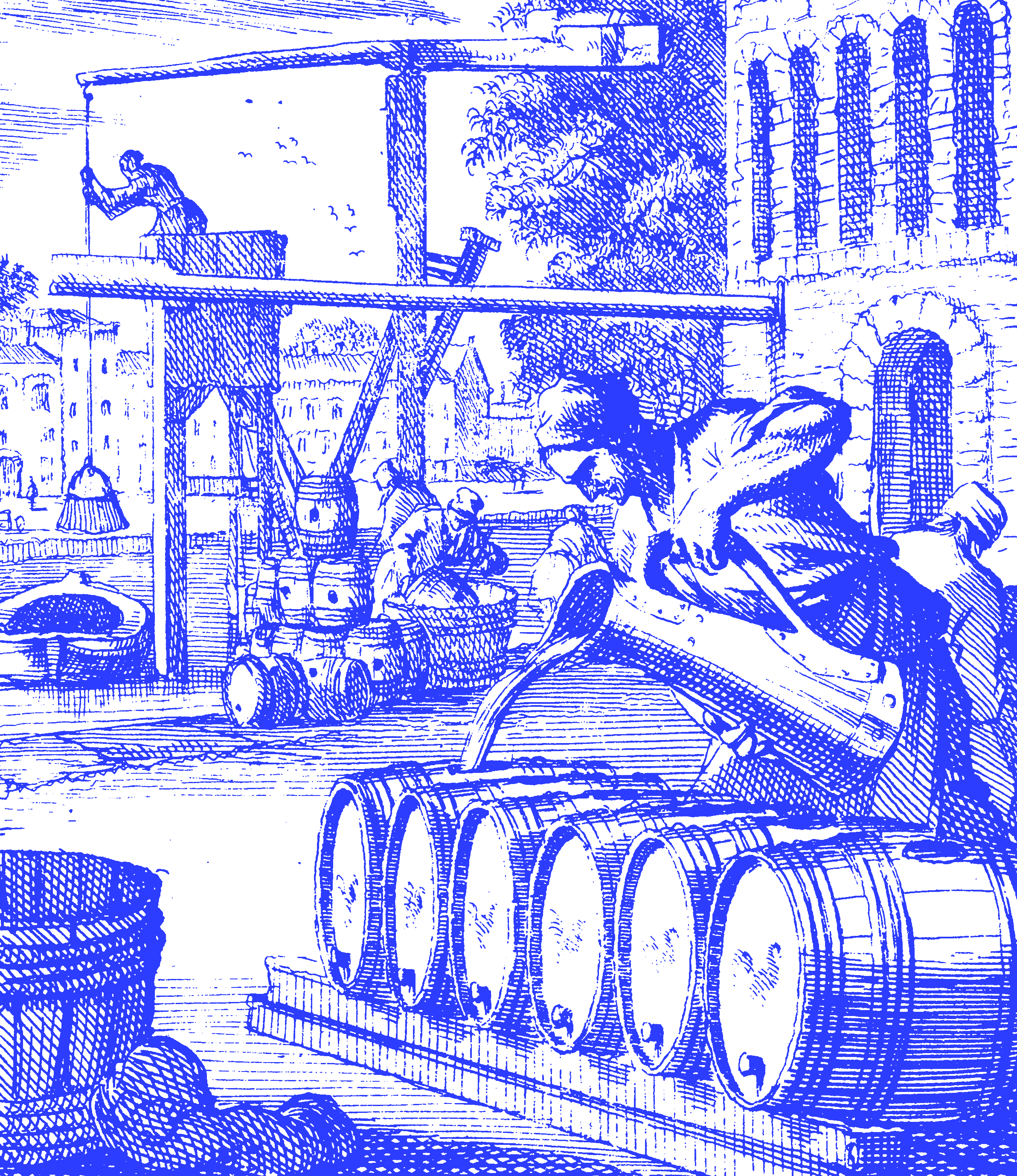
…brew it yourself.
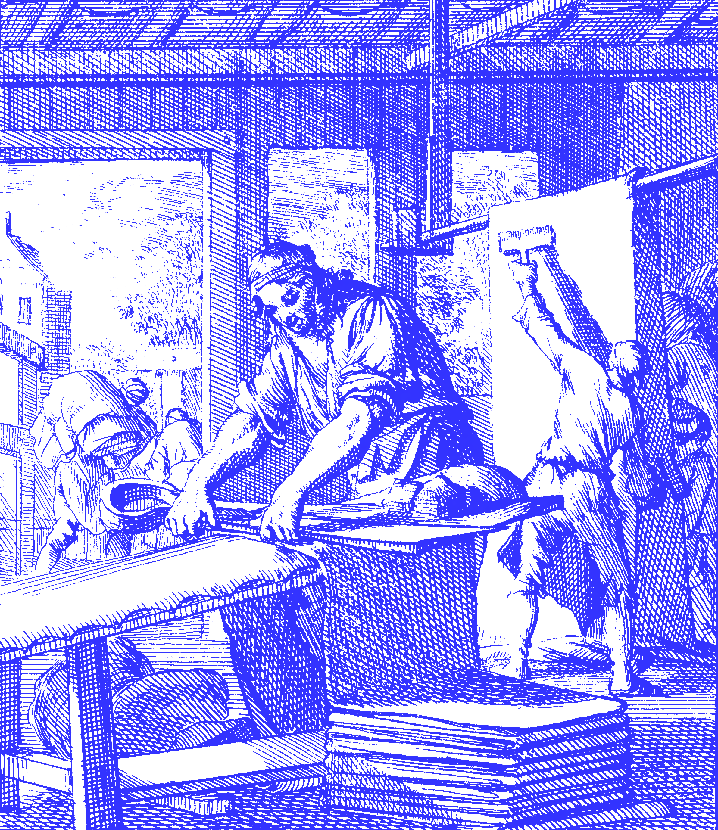
To understand leather, you have to tan it.
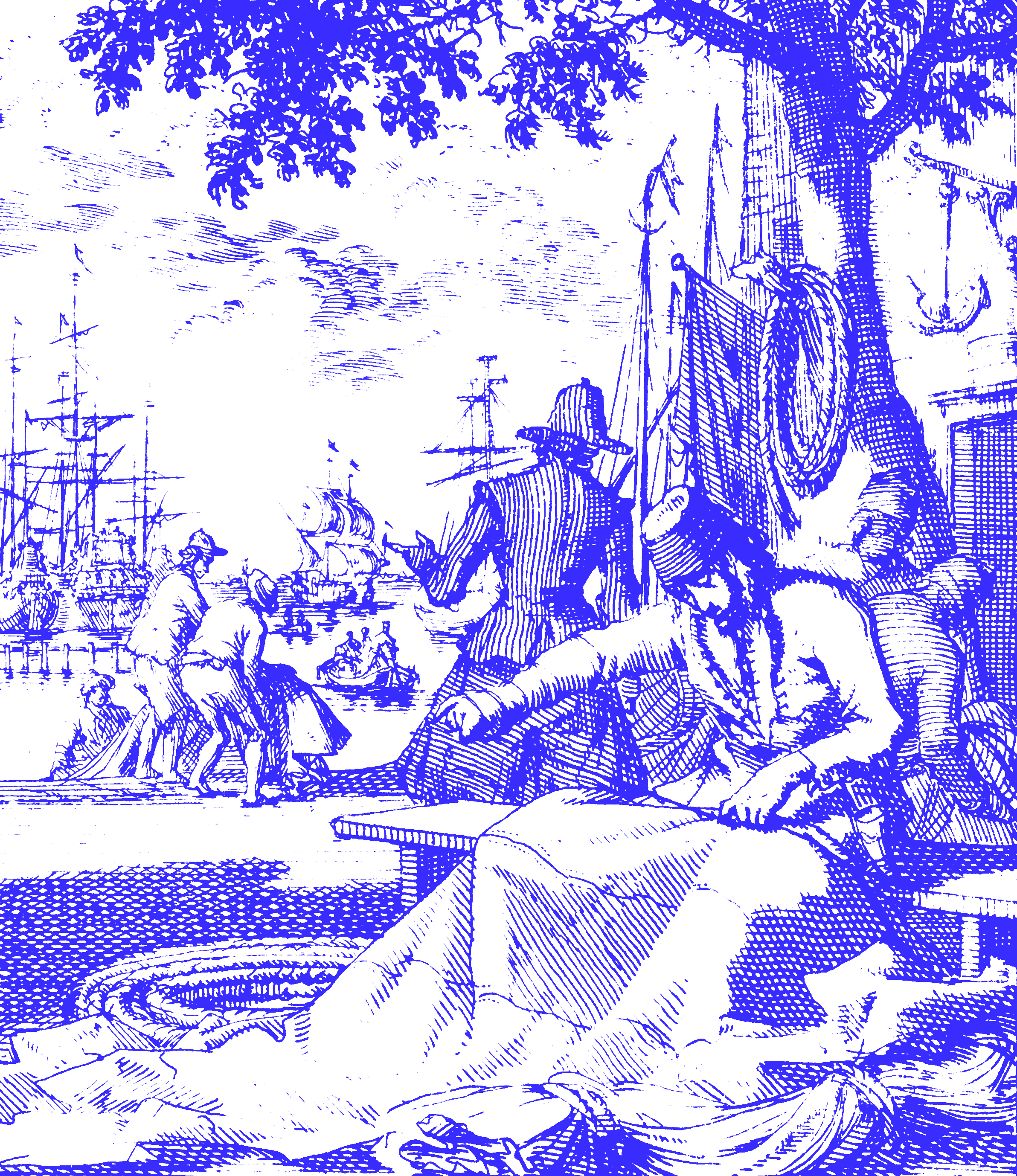
To understand ropes, you have to twist them with your own hands.
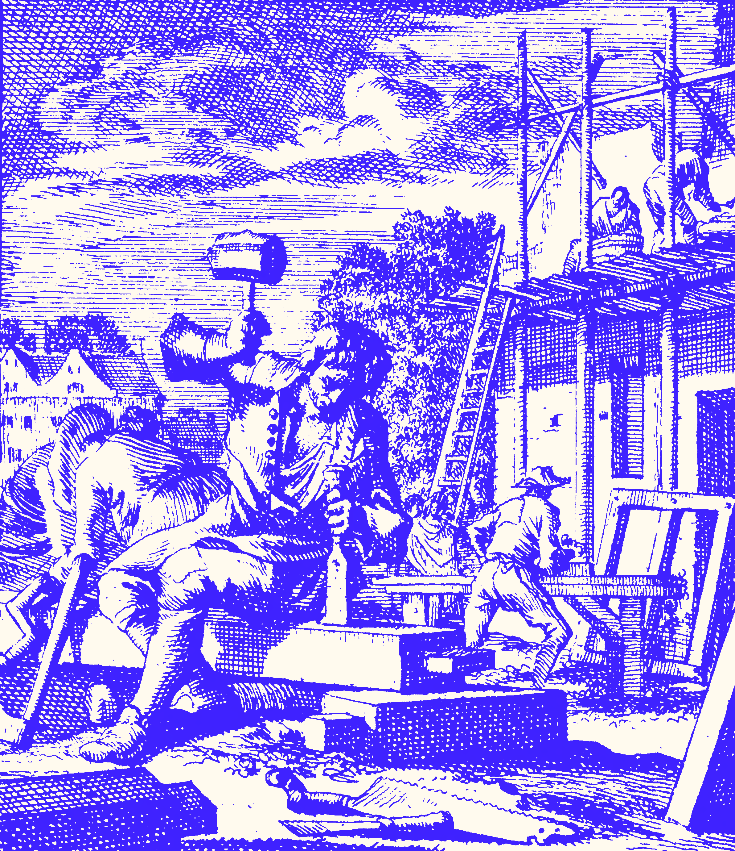
To understand wooden structures, you must get to work with hammers and saws and work the wood.
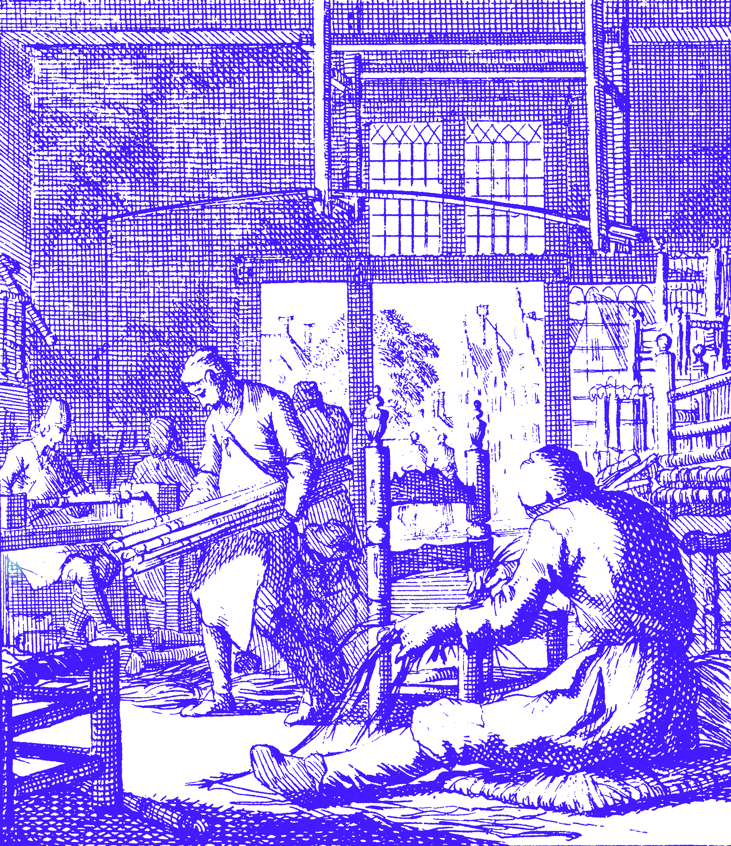
To understand chairs, you have to build them.
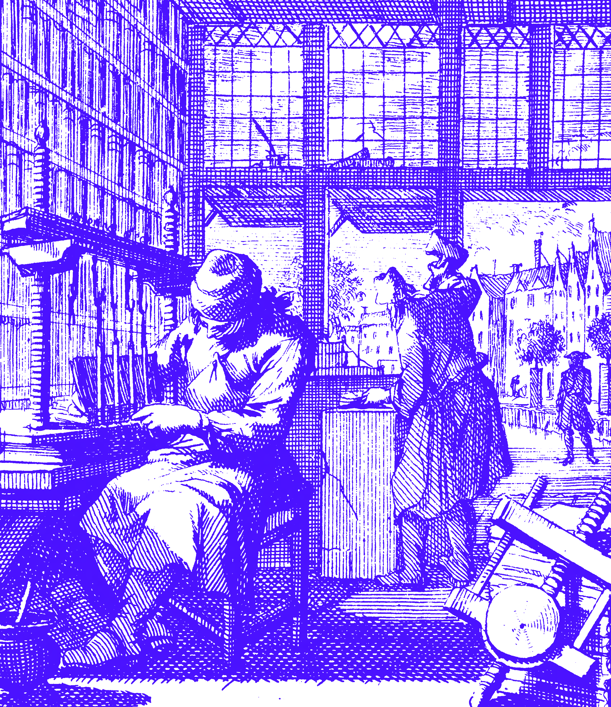
How much do you know about the physical reality of books compared to a bookbinder?
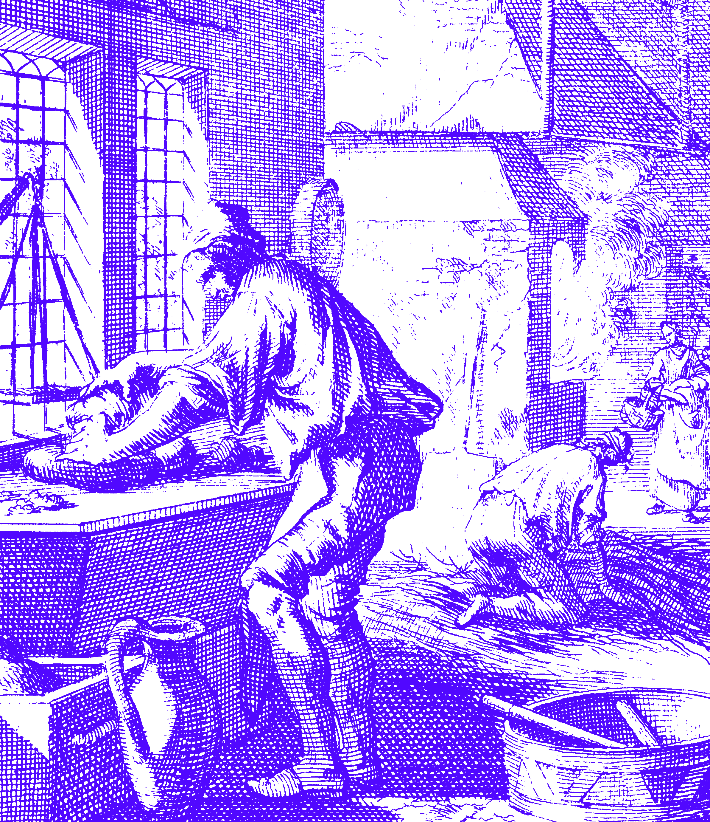
If you bake bread, you understand it better than just eating it. You get the main idea, right? But here’s the catch: If knowing requires making, how can we understand nature?
Natural Science as “Remaking Nature”
According to Vico, nature was made by God. And he might be right, but it’s easy to get lost when involving God, both in his and our time. He could have elaborated on another great point that would have made his product much more successful: Scientific experiments get us closer to reality because they get us to recreate reality.
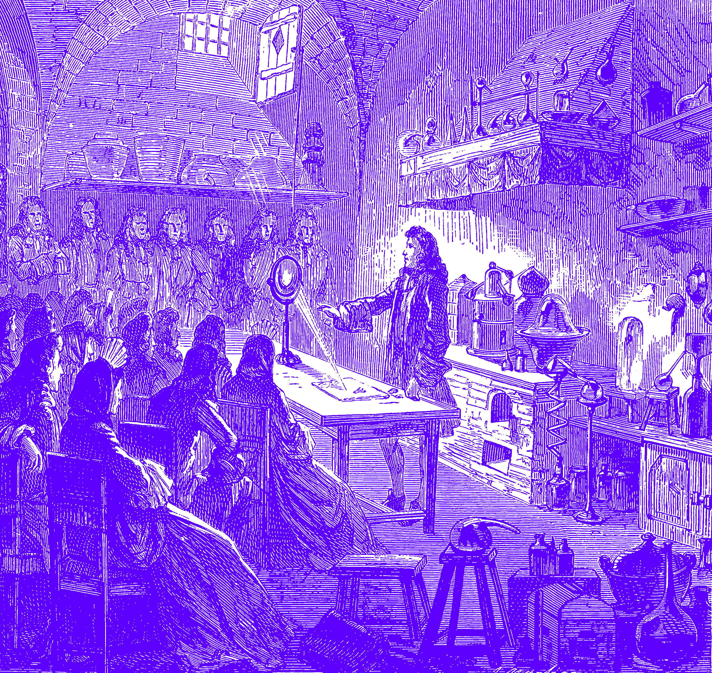
With Vico, we can argue the real or realizing value of scientific experiments lies not in confirming our theories, but in rebuilding nature.
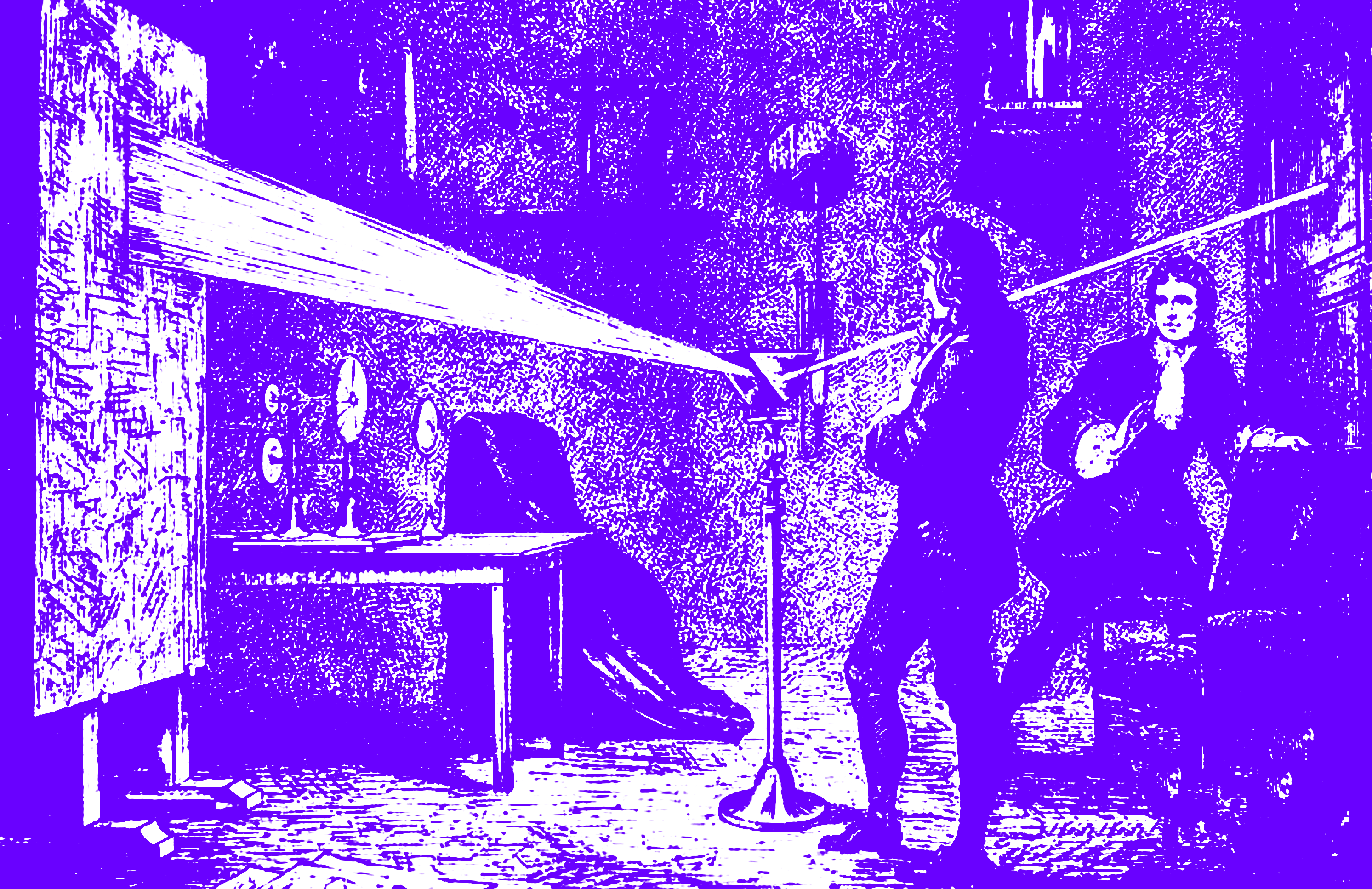
Newton’s prism experiment rebuilds the reality of white light. The vacuum tube experiment that proves gravity with a feather and a lead ball falling at the same speed when you suck the air out of the glass tubes? It’s a model of a world without air to make us experience pure gravity.
The silent admiration we felt for the science teachers, that built those cool models was more than well deserved. Making these models—or better: let us build these models, make, touch, and see their effect—is at least as instructive as measuring the results.
By making tangible scientific models we recreate the world. And this—not the mathematical verification—makes us understand it. The more tangible the experiments are, the better we understand the world we reconstructed through them.
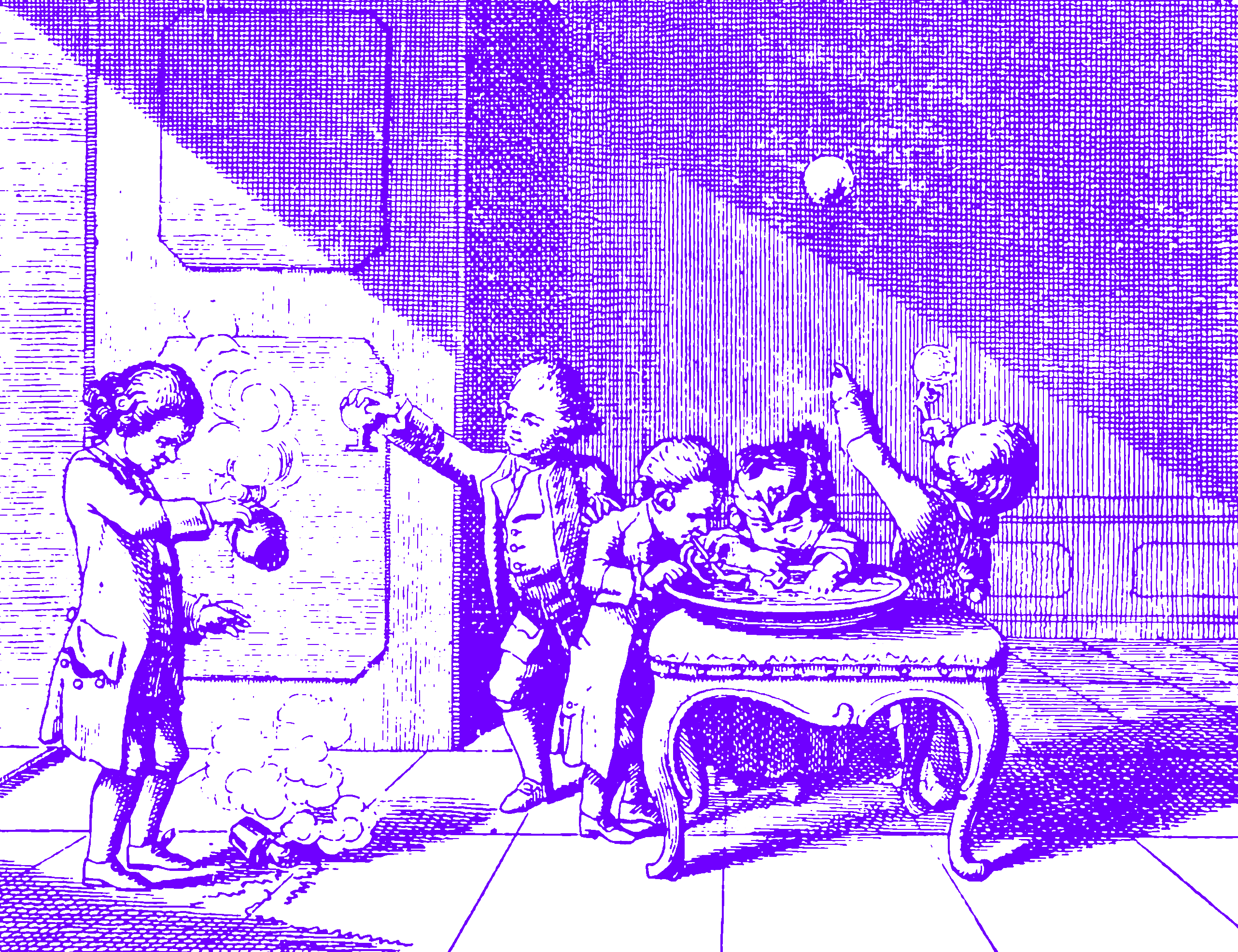
Making and breaking is how kids learn. We learn languages by speaking, not by starting with grammar.
If you want to learn to dance, you have to start moving your behind.
2. The Present of Time
By making, we truly understand. To make quality products, we need to know what we are doing, and we need to do… to know what we are doing. And all that takes time.
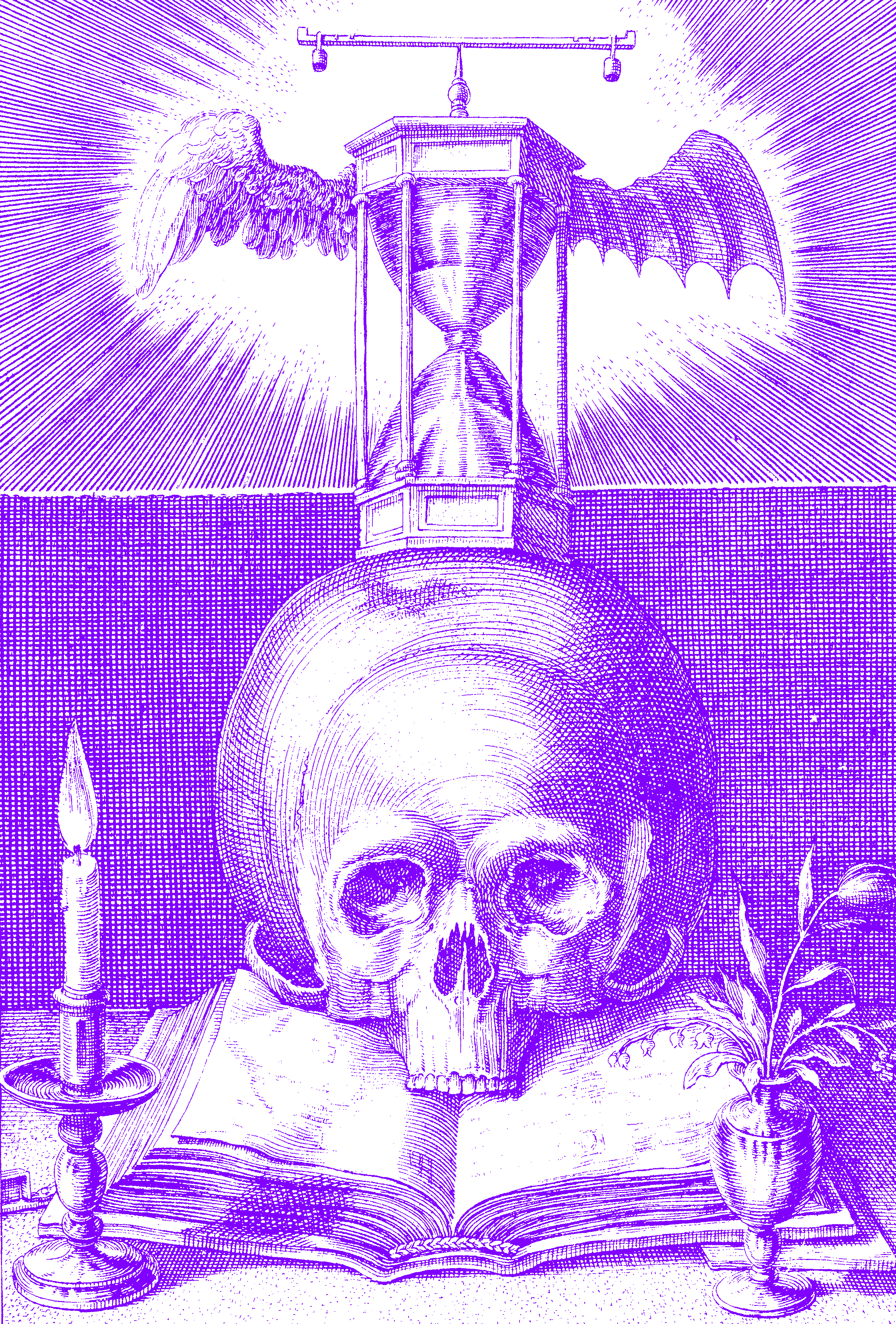
Things made truthfully, with know-how, feel more real. This is why fast-made, poorly understood products feel… fake.
To make good things, you need to understand them first.
Creating a truthful product requires full understanding, a back-and-forth between making and thinking which, again, takes time.
And time is expensive. We build better what we understand, but understanding takes time and money. Learning means failing, and failing until we make it work.
To understand things, you need to make them.
And from all kinds of learning that we may encounter, innovation is the hardest, slowest, most expensive type of learning. Innovation requires that we learn not just to rebuild existing things, but that we create new things. By innovating, we are in the dark. We extend the world.
Innovation is expensive. It moves forward in tiny steps. Innovating means moving and failing in tiny tiny steps, to create something subliminally different that, initially, no one understands because… it’s new.
Quality and innovation are slow and expensive because they are tiny things that come at the cost of long cycles of big repetitive failures. You can’t innovate without failing. You can’t fail without pain.
Thinking takes time
Our industry resists this simple truth. It wants fast, high-quality, painless innovation. It promises the new but, in fact, it prioritizes speed and profit over quality and innovation.
We went so far down that road that today, a lot of products are designed to break on purpose. The German word “Sollbruchstelle” refers to intentional weak points designed for profit, leading to waste. And we have come to accept that as normal. That’s why the back of the iPhone is made of glass. It’s not because of “the antenna.”
As consumers, we accept the cheap and the fake. We also know that the faster the development, the bigger the mountain of trash we all leave behind. It’s upsetting how corrupt we have become, but products have become so cheap that we happily buy them. Fast fashion like Ikea, Shein are depressingly successful.
What if…?
We know why and how fast products are wrong, but we make and buy them anyway. Luckily we are not exactly against quality products just yet…

We know and still accept the simple logic that quality is good and that good is expensive, even though luxury brands have completely undermined that notion by offering cheap crap for increasingly high prices.

Italian prosecutors found out that Dior paid $57 to produce bags retailing for $2,780. Dior is not the only luxury brand selling air.
TREND
There is hope, however dangerous that hope may turn out to be in the end. There is hope that this is a trend.
END
Just a trend that, as the word implies, eventually will end.
COUNTER TREND
But why wait? Every trend asks for a countertrend. If faster, faker, and cheaper really is as wrong as it seems, what if we tried the radical opposite?
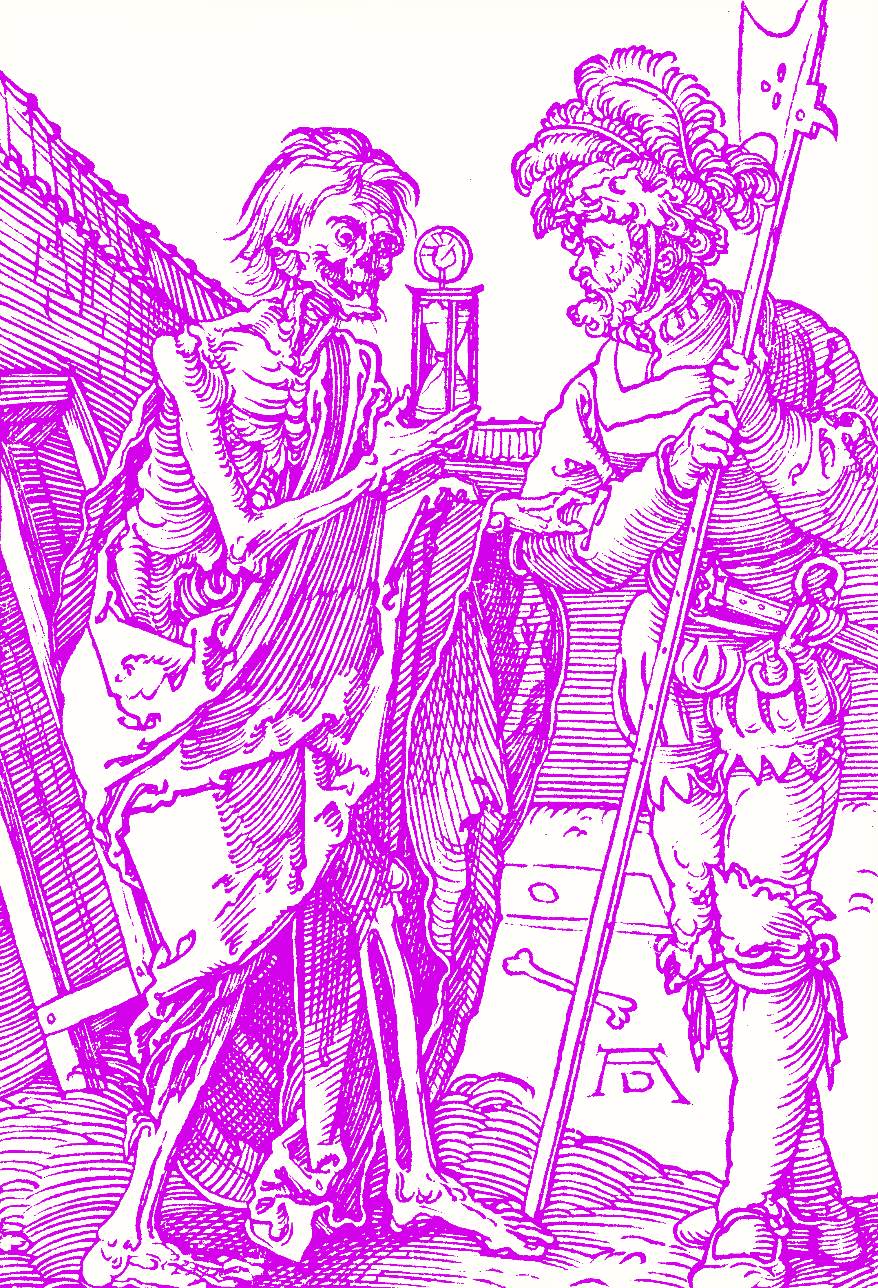
What if we started to ignore time and fully focus on quality? It’s a bit scary, but it’s not that far-fetched. The old logic is still intact. Quality products last longer, and people say they are willing to pay more for them. There must be money to be made with the opposite of fast and cheap and fake.
3. Examples
We worked as a design agency before making our own products. When we started, we simply imitated big companies with their timelines, deadlines, MPs, KPIs, and air-tight roadmaps. Working with the clients, for the most part, we found these deadlines not just unnecessary but counterproductive. What if we worked without them on our own products?
Roadmaps, yes, but no timelines. Build what’s required and launch when ready. What would happen? Let me first explain what products we are talking about and then show you what came out of it in the eight years since then.
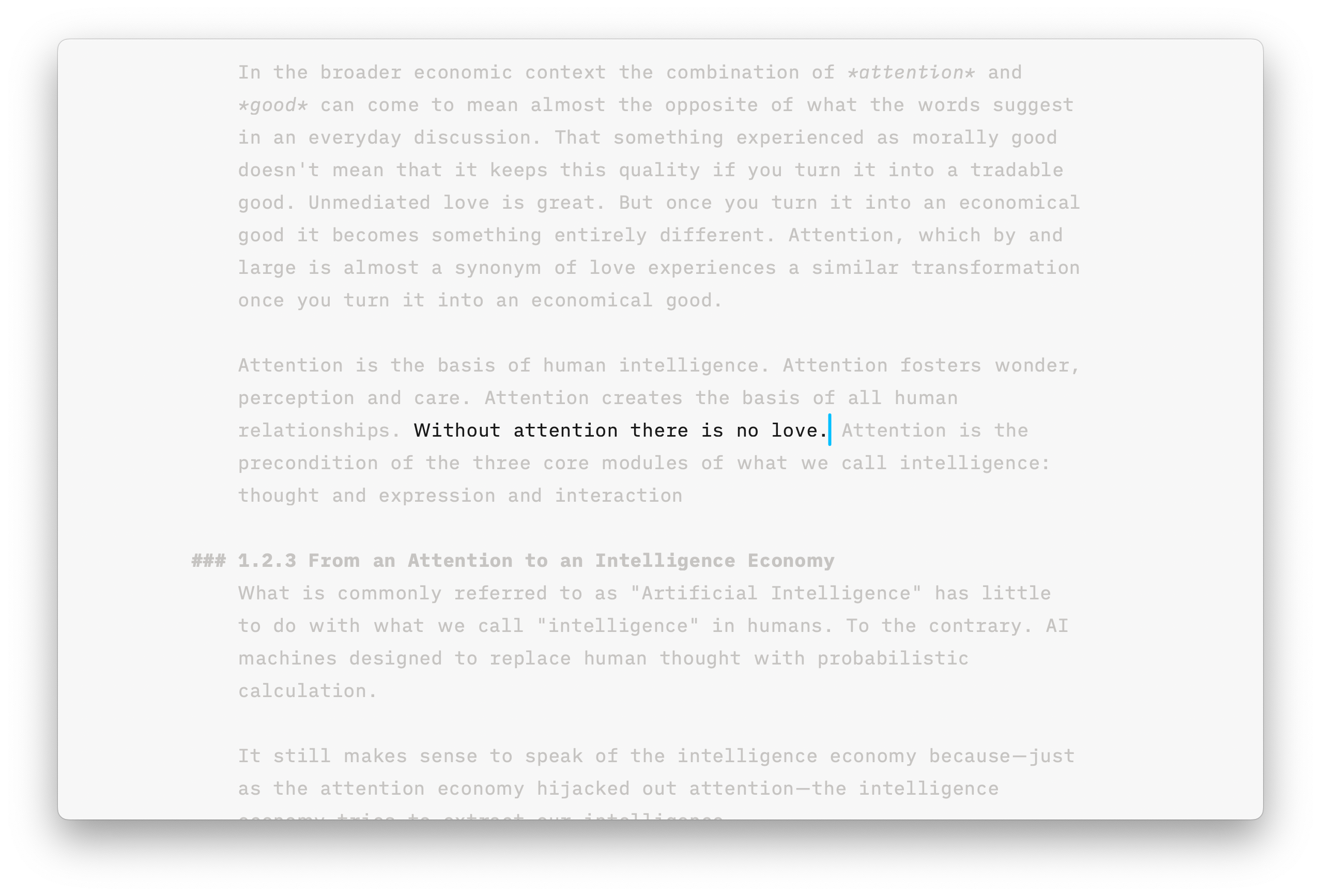
iA Writer is a writing app for people who just want to write.

It’s the opposite of Word, which does everything but doesn’t excel at writing. This is how it looks if a class full of pupils uses Word.

This is the same class using iA Writer. As you can see [go back and forth between this and the previous slide] iA Writer focuses on writing, allowing users to focus on translating thoughts into words. We’ve sold a million copies and paid its bills. After eight years, we tried a new approach. Here’s some of the stuff we built since then:
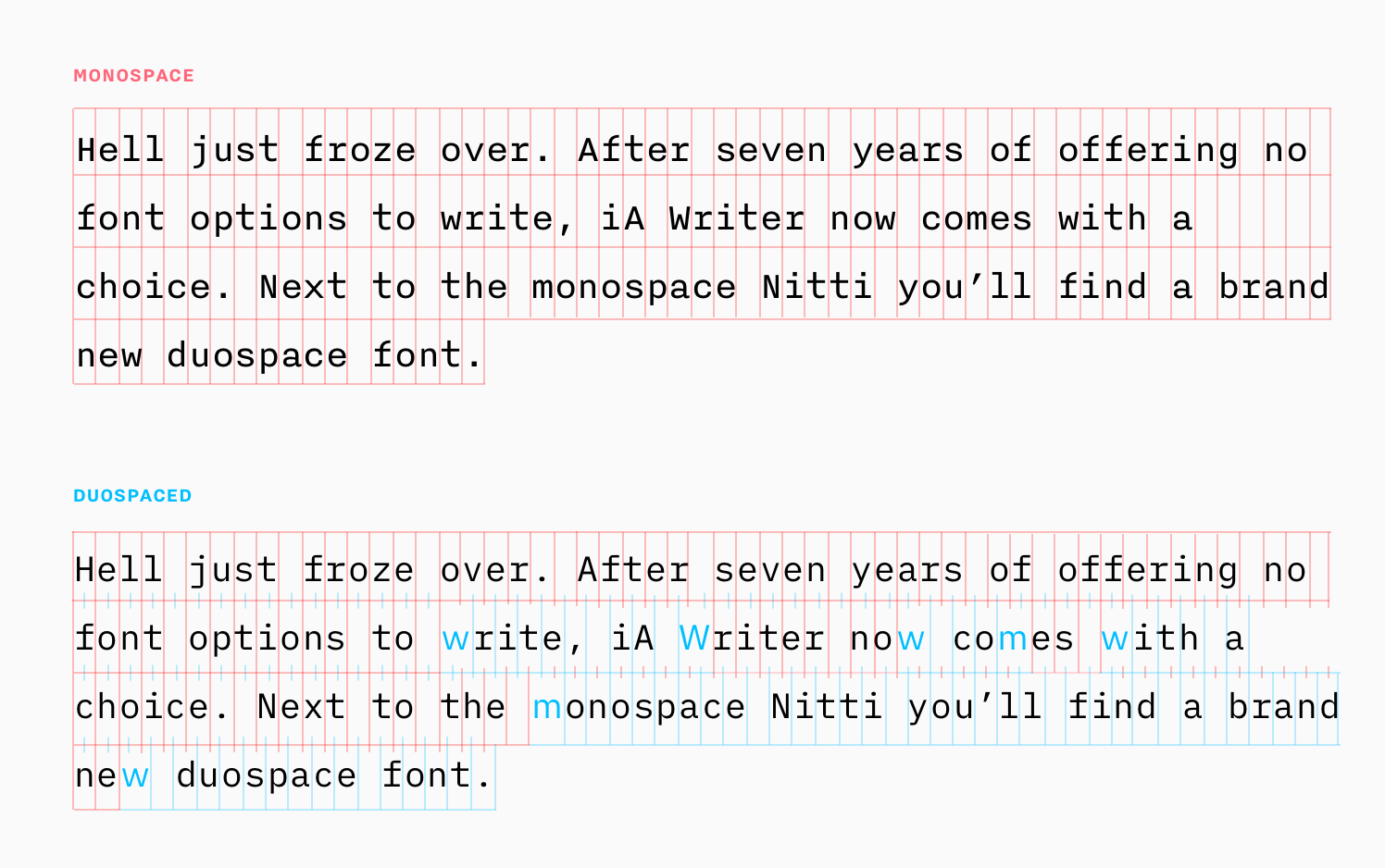
We made our own fonts because we care about typography. We wanted a monospace with a wider w and m to have a better grey value. I can explain why, but the clock is ticking… :-)
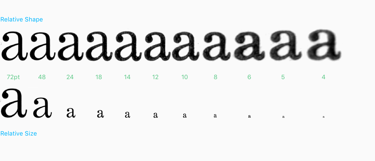
Okay, this is important though: One reason why we made our own fonts was that… most digital fonts don’t offer traditional gradings and width, which is needed for a good performance of smaller and bigger sizes. This is classic typography stuff that you may not care about but appreciate when someone else spends their time on it.
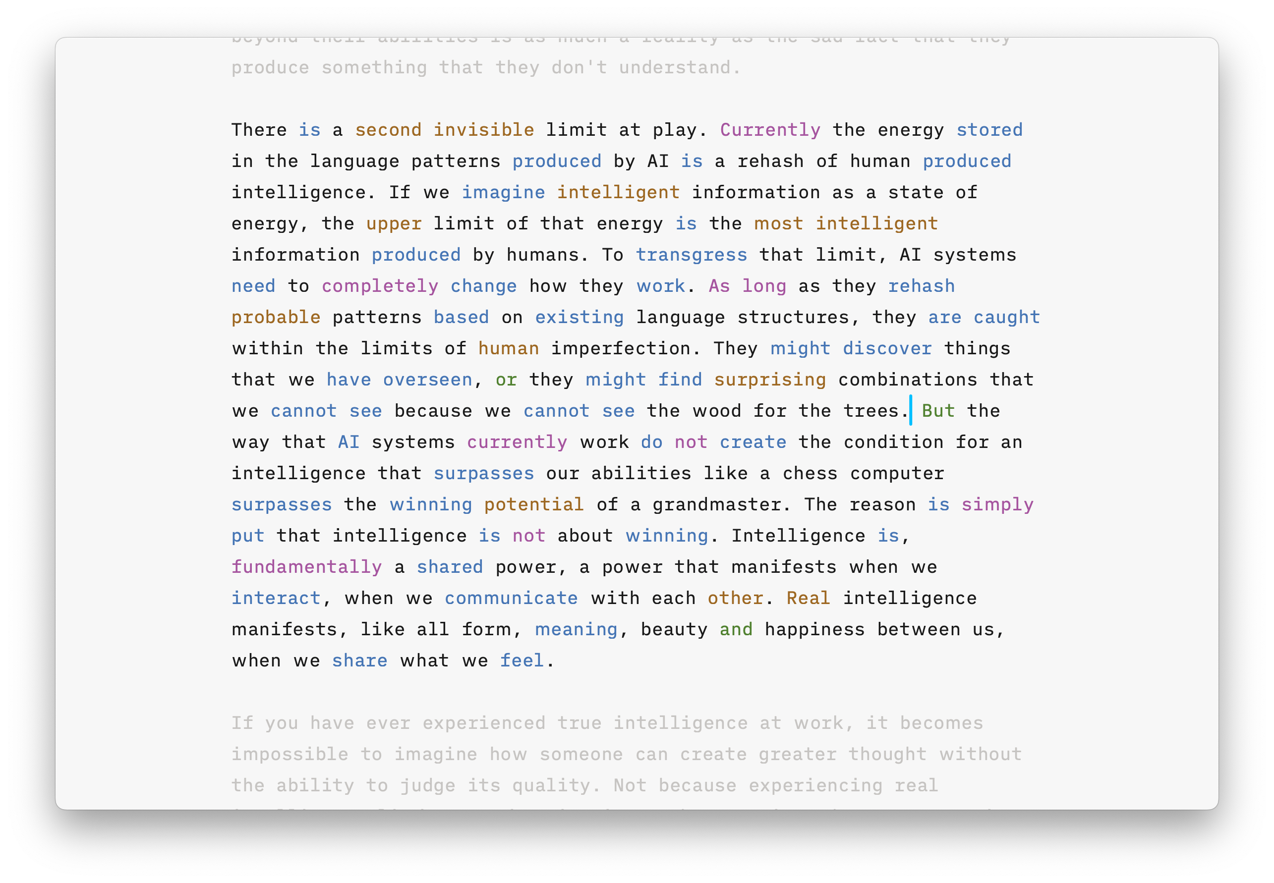
We also built features like parts-of-speech highlighting to help find lazy adjectives, empty adverbs, and…
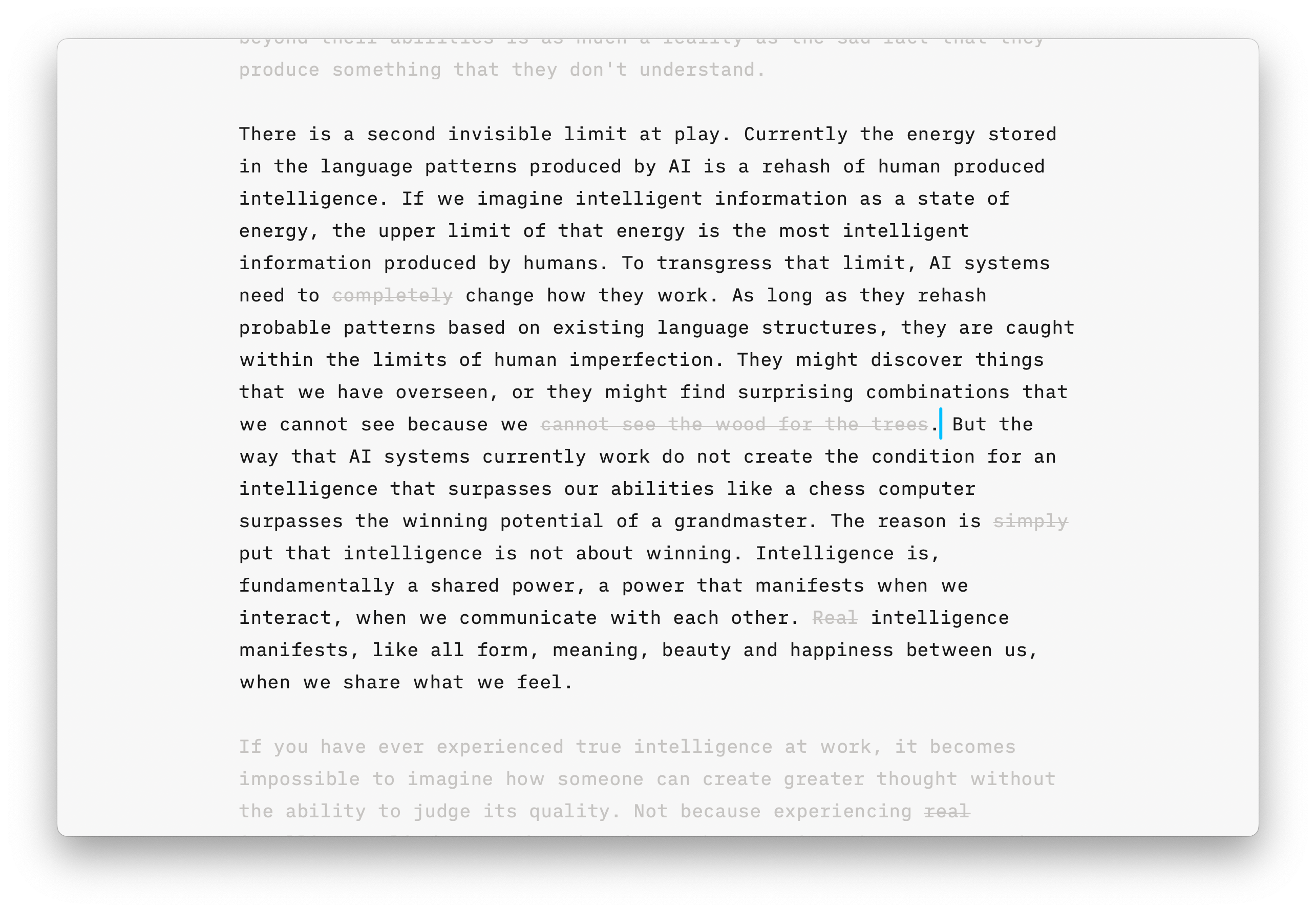
…clichés. Again, you may not care that much, but professional writers love that we spend so much time on it because it saves them a lot of time.
Details say: “Hello, we thought about you!”
We spent a lot of time on minuscule details. Details show that you care. People notice that you thought about them when they see that you took care of the little things. And they know that all that time you invest in little things ends up saving their time.
Sometimes we needed to take bigger steps and invest more time to save our customers even more time.
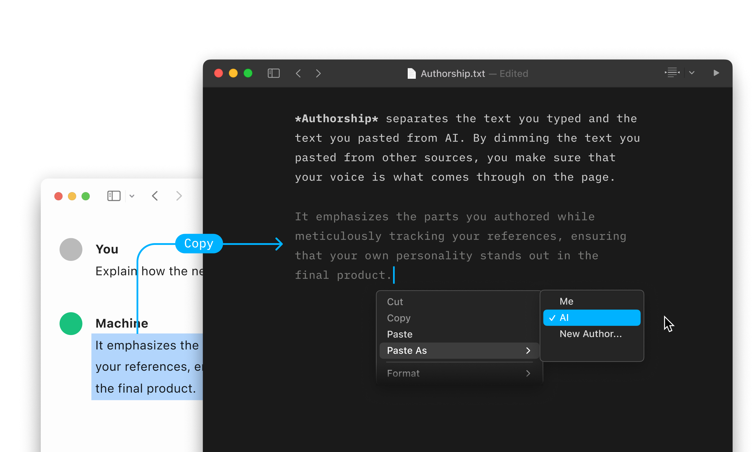
Two years ago, ChatGPT came out. Every other app became a ChatGPT wrapper, but we spent nine months building an authorship feature to distinguish your writing from what you paste. One of the problems with using AI is that at some point you don’t remember what you wrote and what you pasted. And that makes you feel lost… in time.
Presenter: An app for preparing and presenting presentations
Five years ago, we started building a presentation app that lets you focus ion what yiou want to say and adapts its layout automatically to the screen. Visuals are a help, not to core. The design is minimal, beautiful and automatic. Presentations adapt tho the screen they are looked at. No more pinching and guessing what that packed slide means.
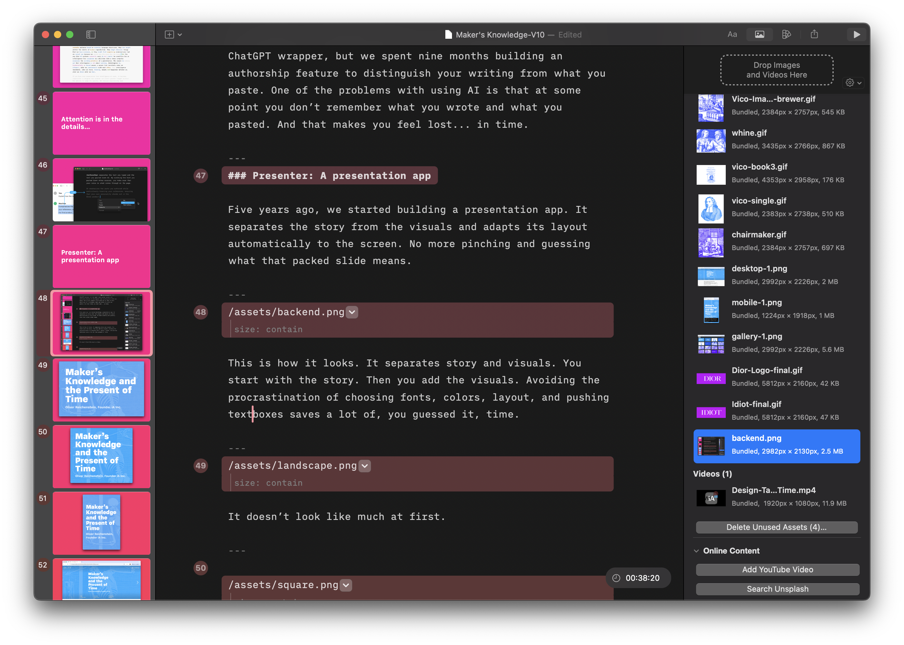
This is how it looks. It separates story and visuals. You start with the story. Then you add the visuals. Avoiding the procrastination of choosing fonts, colors, layout, and pushing textboxes saves a lot of, you guessed it, time.
It doesn’t look like much at first.
The layout is dynamic. Just like your Website. It adapts to screen size. Unlike Google and everybody else, you can use your custom fonts with a custom template.
You can look at it on a phone, on a tablet and on a regular computer without black bars, distortion or zooming in and out.
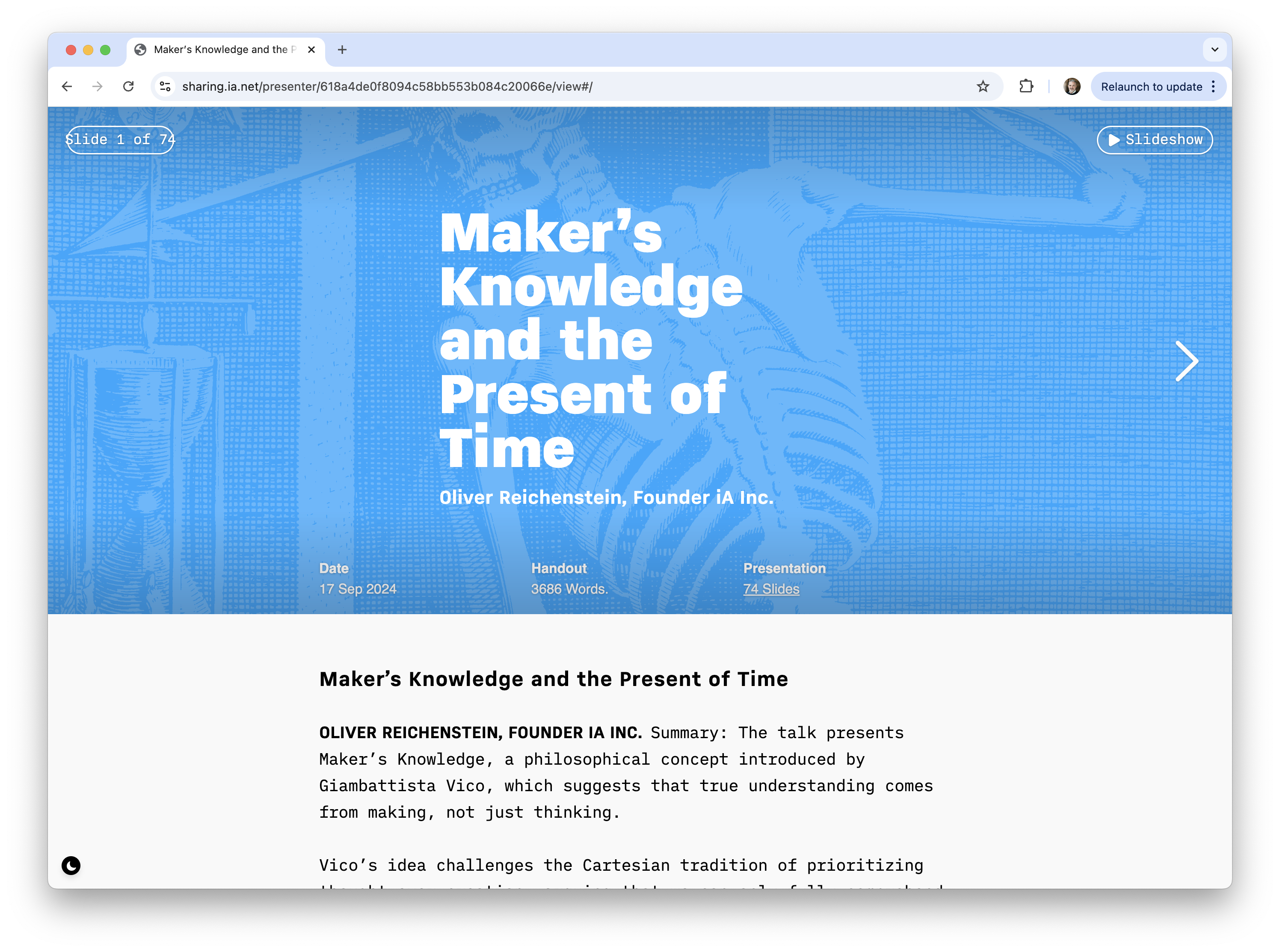
It differentiates between what you show and what you say. So you can send people a text handout. It looks and works like a Website with text and images. This is nice because it saves your audience a lot of… [whisper: time]
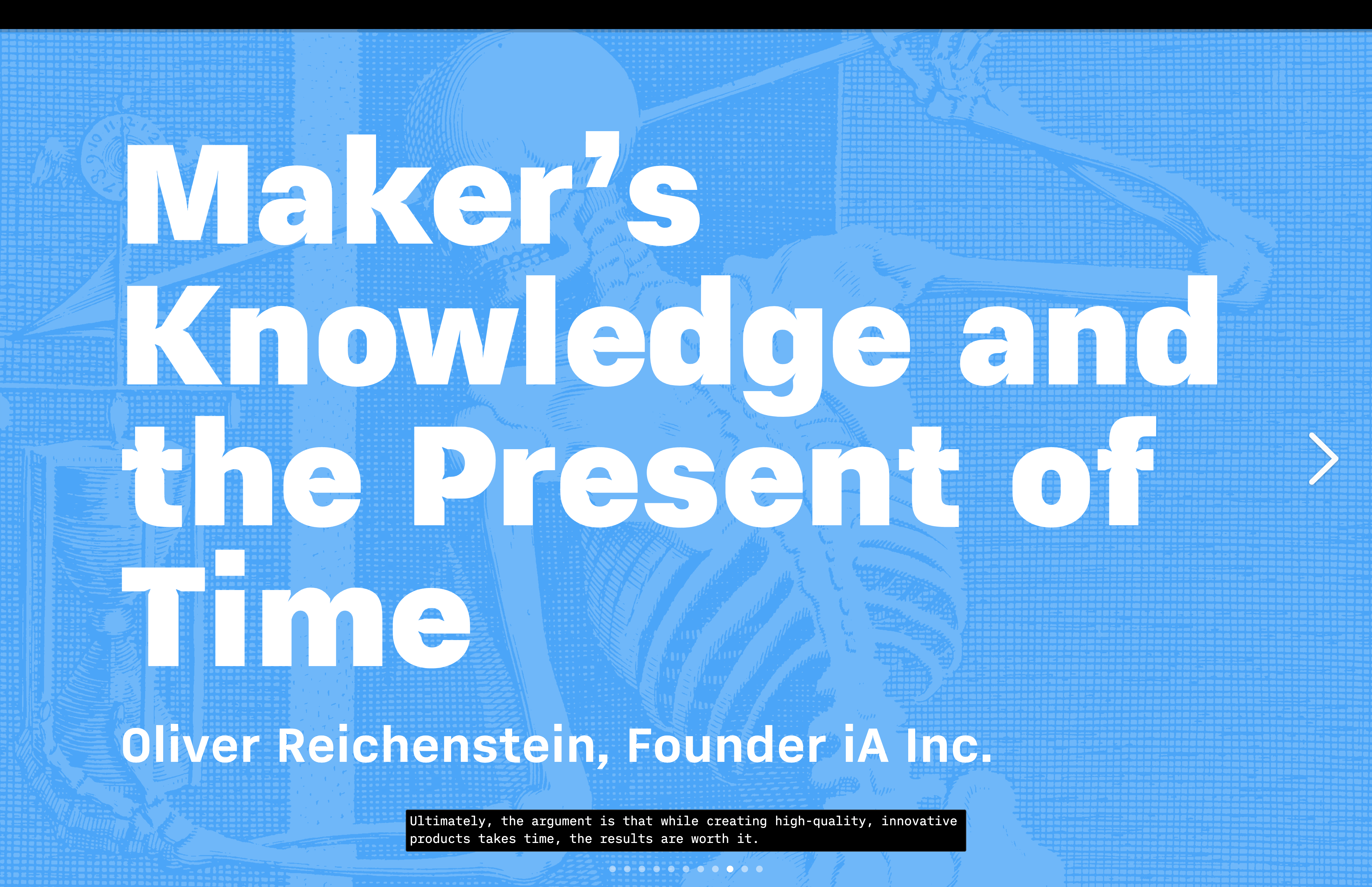
Of course, it offers a fullscreen mode, but what is really cool is that…
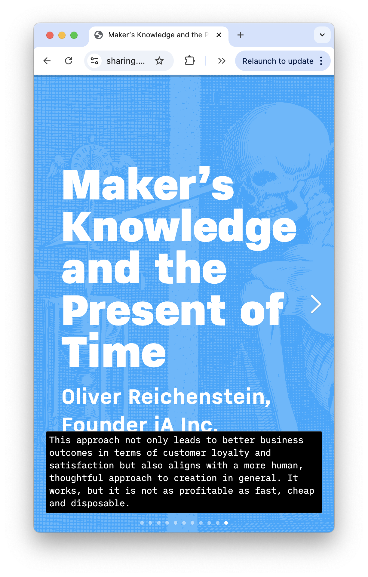
…you can look at the presentation in a desktop or mobile browser, the story shows as subtitles.
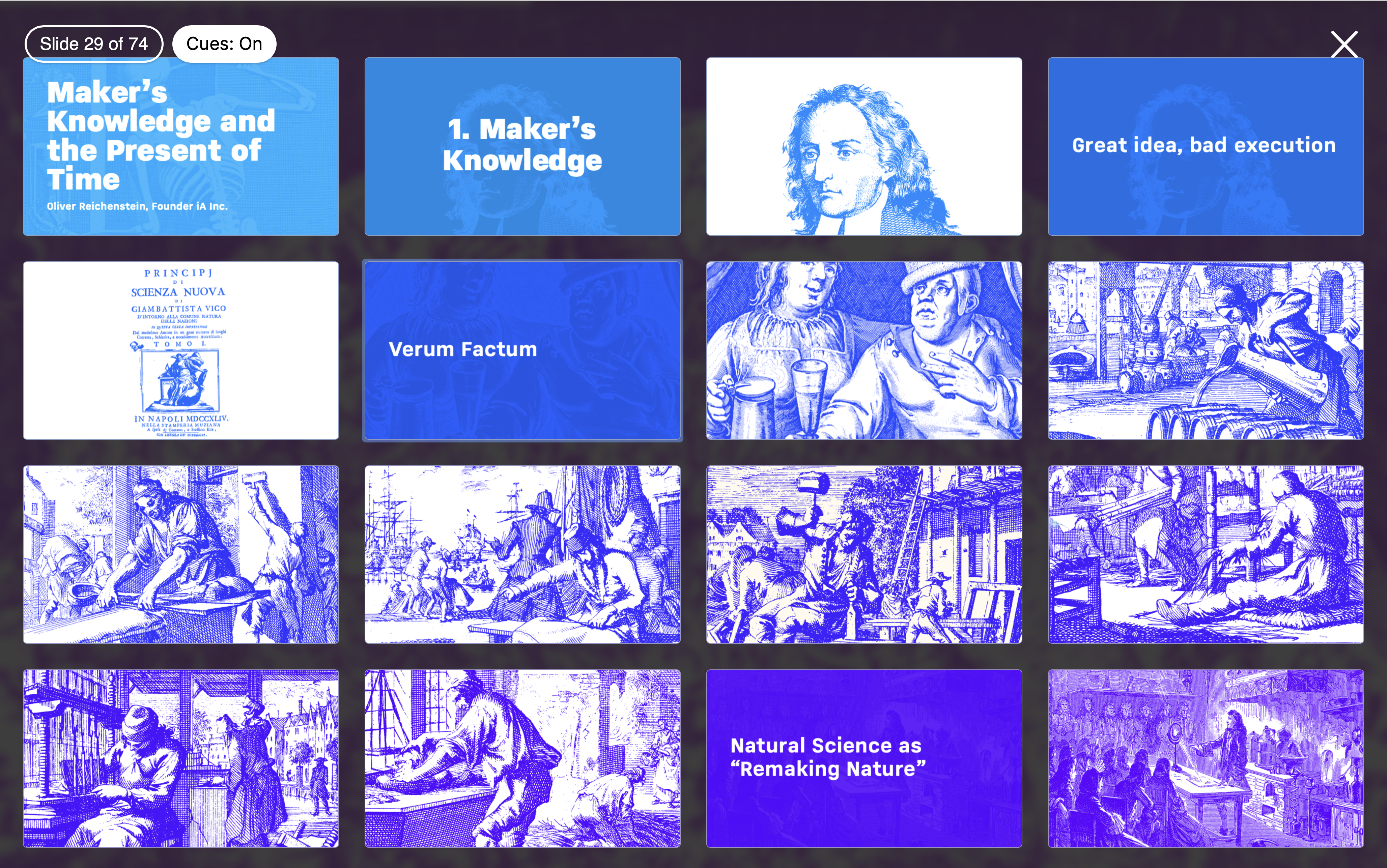
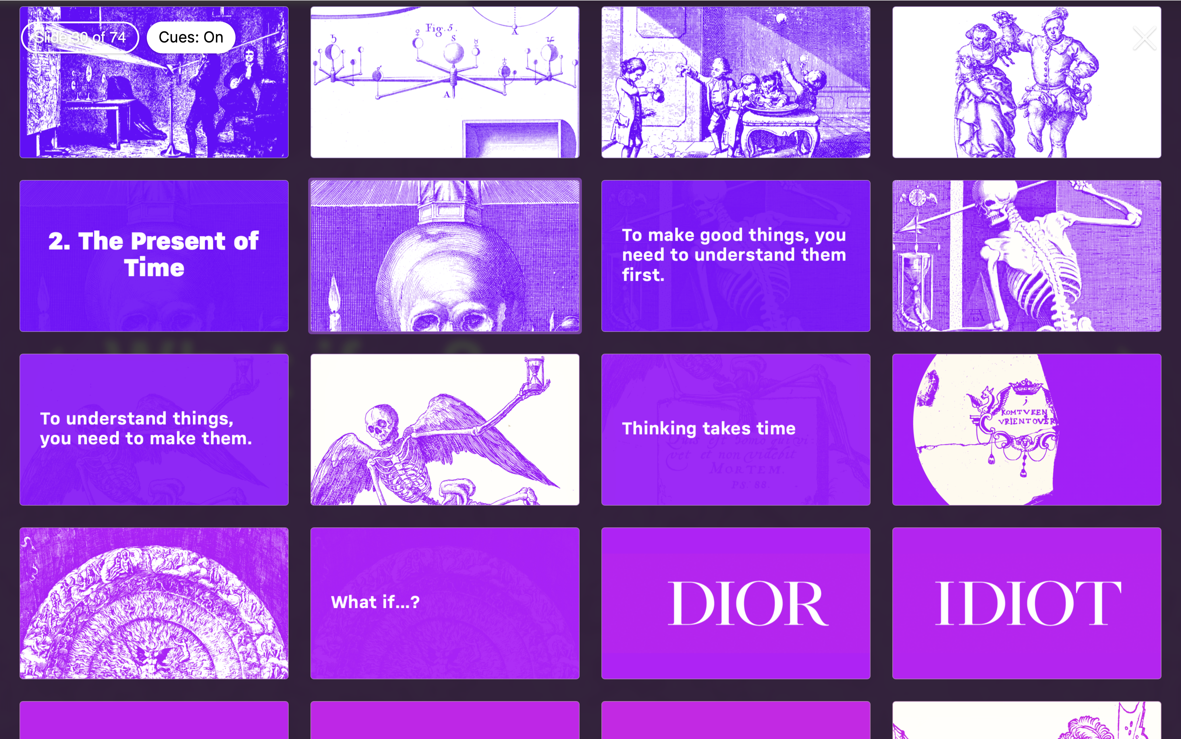
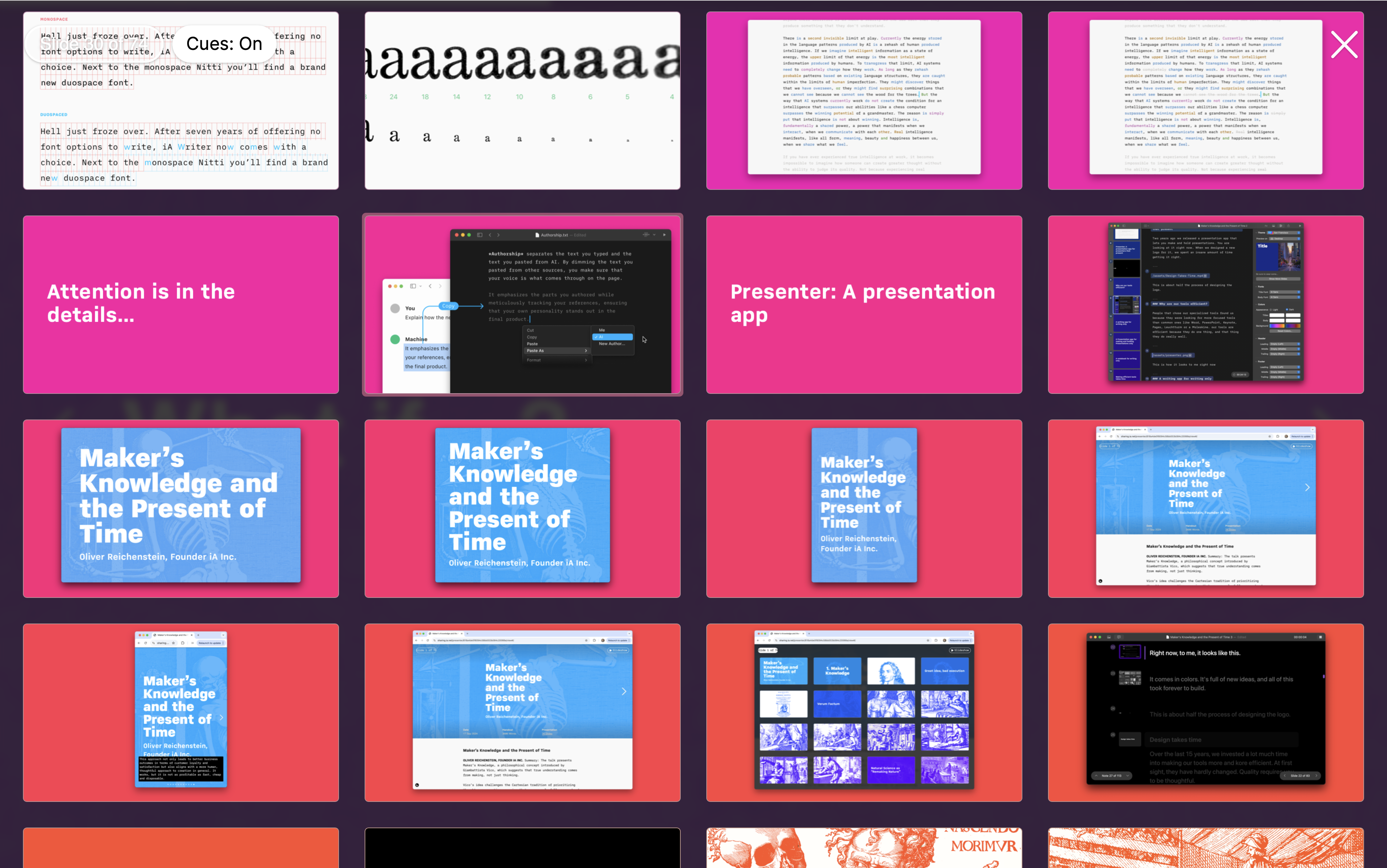
It comes in colors. This doesn’t save time but it feels nice and gives orientation. The default presentations go from blue (the cold start) to red (climax) to the finish (in gold).
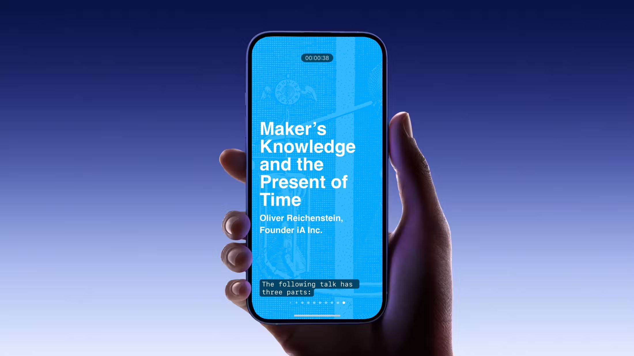
It’s not the first presentation app on a phone.
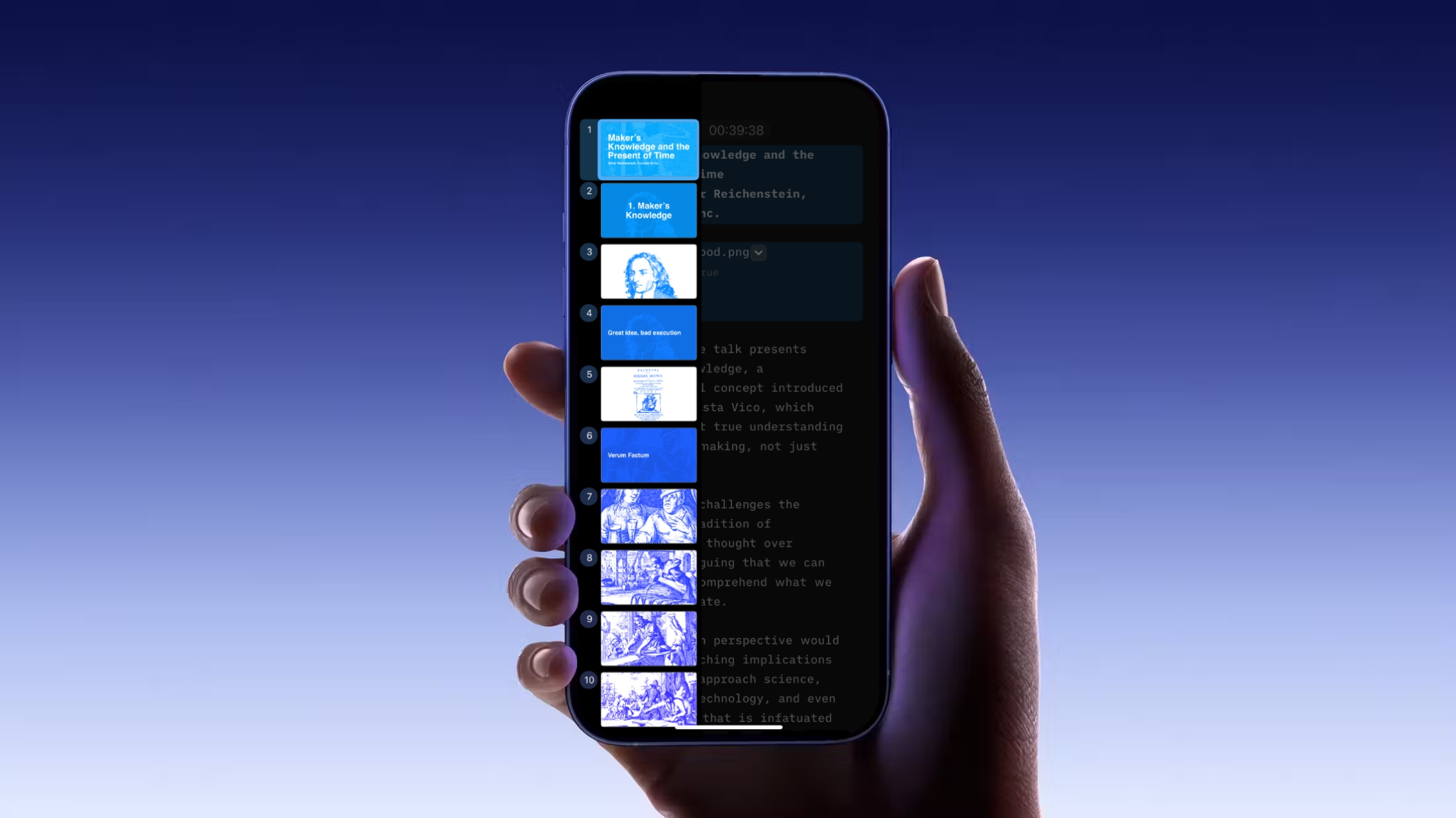
But becuse it’s so focused, and with it’s story first approach completely free of fiddling, it could it is the first one that is really easy and fun to use.
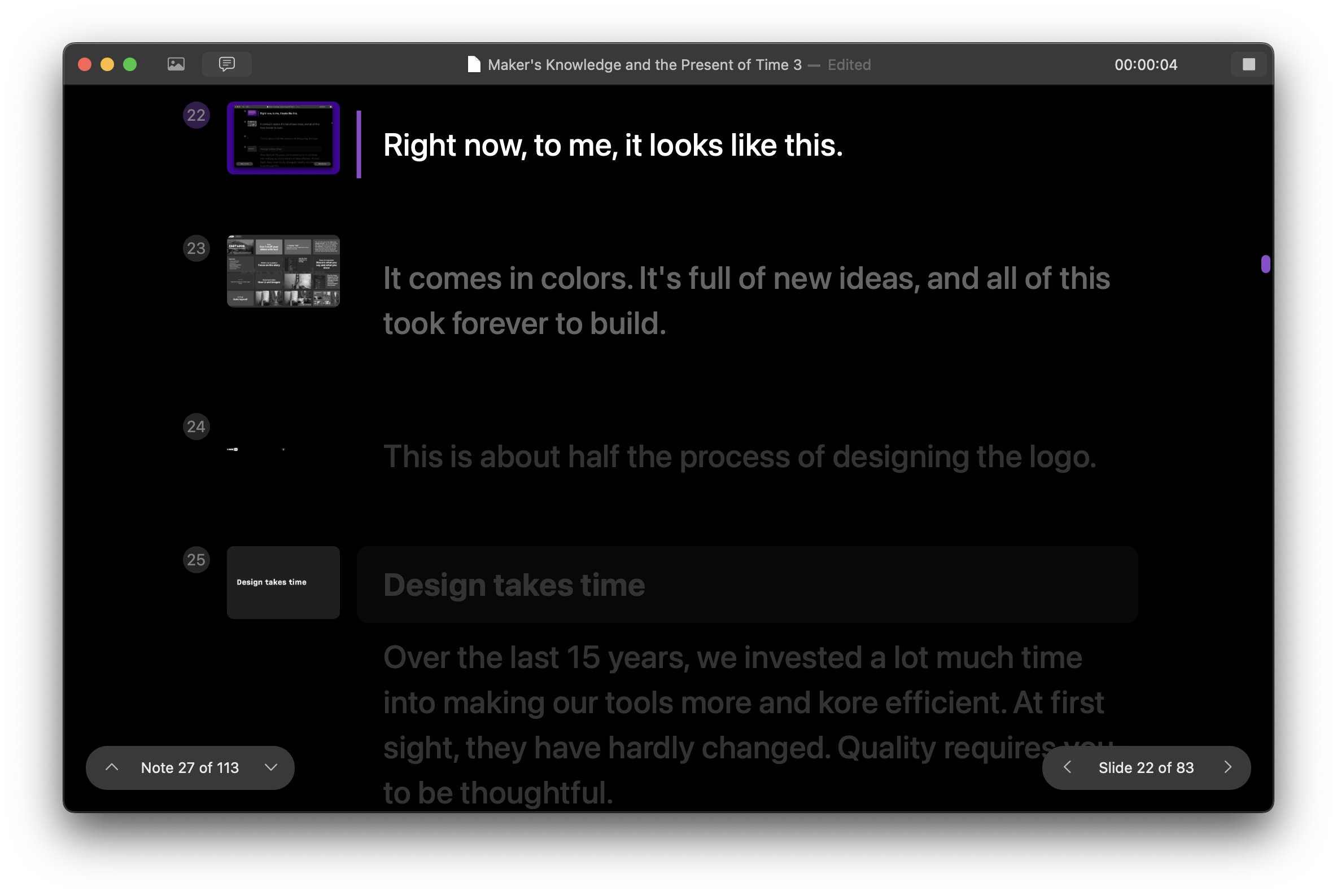
Right now, right here, on the teleprompter, it looks like this. I’ve been reading most of this because it’s the first time I’m giving this presentation and I am a little intimidated talking about managing our products to 800 professional product managers.
Image Library, central templating, progressive color coding…
After four years, iA Presenter is full of new, realized ideas. Along the way, we obsess about every detail, iterating, iterating, iterating, and testing testing testing without end. Without deadlines. We work hard. Things are done when they are done. Let me give you an example…
This is the first three years of development through the keyhole of the app icon. It ends at launch. We are one and a half years ahead now.
Quality requires understanding, and understanding takes time.
The time we invest in our products becomes time saved for our users. It feels like an expensive gift. Putting time into a product is expensive. It takes courage and generosity. But users feel it. A lot of our users understand and appreciate the present (and the presence) of time in our products.
They pay for our products and we are thankful for that, but when they thank us in return for the extra time we put into our products, and they thank us in return, it feels better than making disposable stuff. The more time we invest the more they save. Not having deadlines sometimes keeps me awake at night, but when I talk to some of our customers it again all makes so much sense.
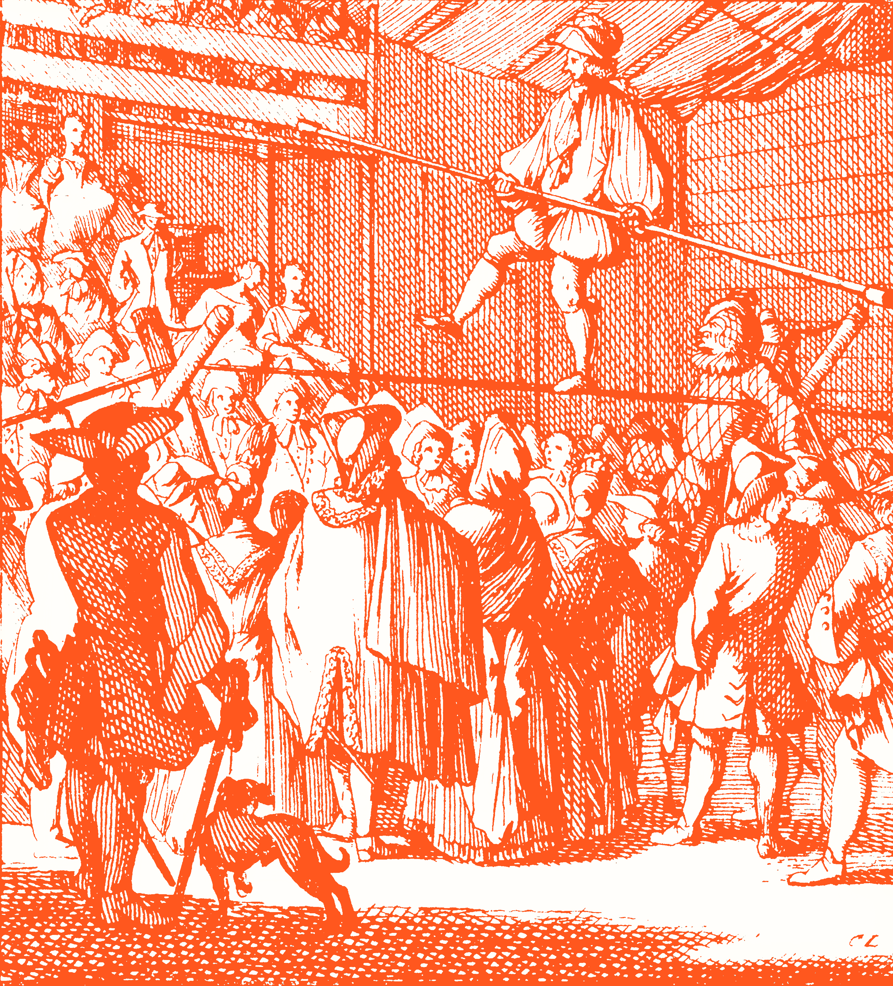
As you may have guessed, I have no formal design or product management training. I studied philosophy and after 6 years at uni, I got bored of putting the world in my mind, so I finished my degree and started to work at a design company, to and put my mind into the world.
These days, I enjoy walking on the tightrope between the two: philosophy and design. It’s risky but so much fun walking from one end to the other. I want to believe that what we do is both philosophy and design. Not artificial intelligence but Intelligent artifacts.
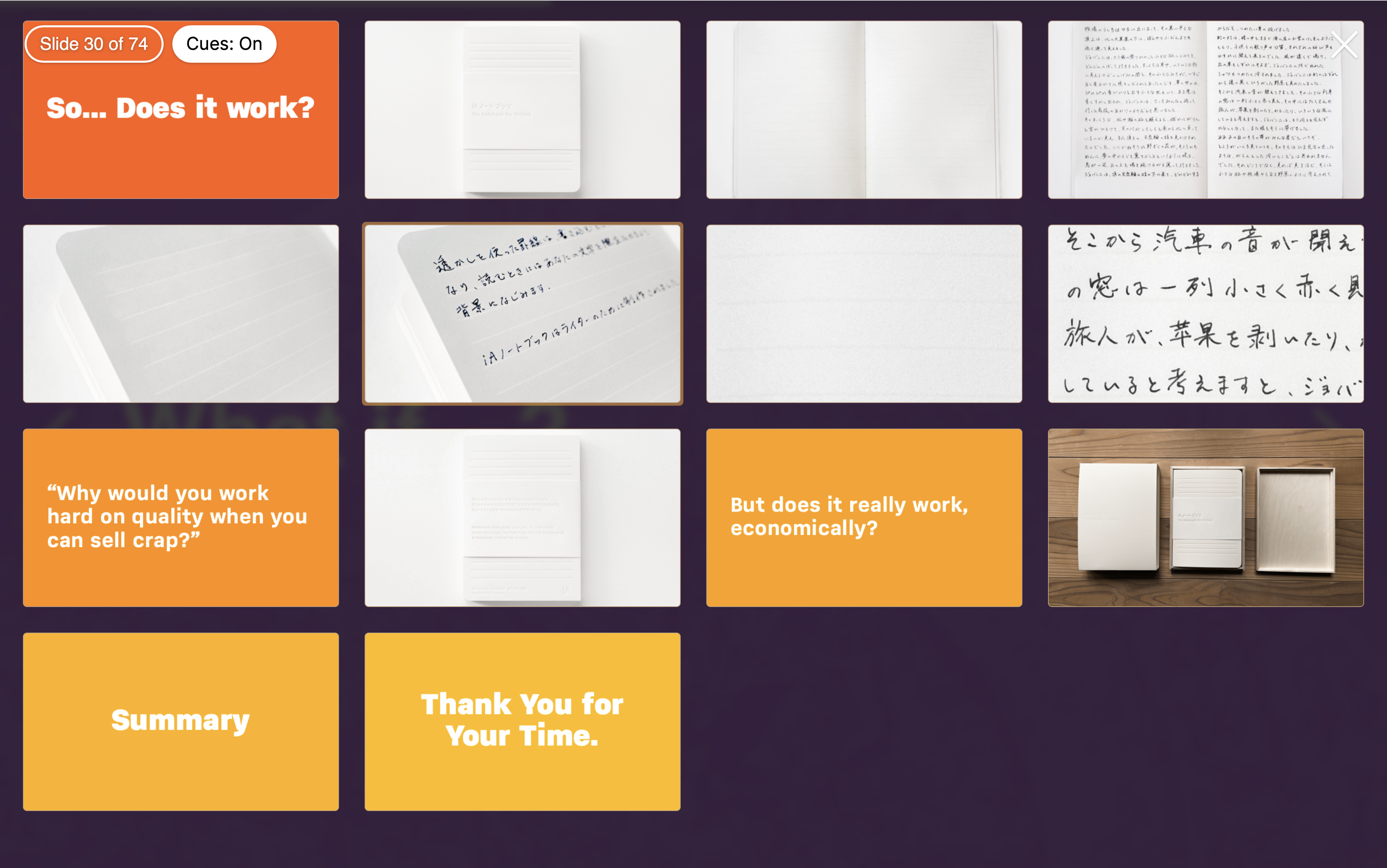
So… Does it work?
Applying Maker’s Knowledge to product development is slow and expensive, but it pays off in happy customers and good work. Writer sales went from one to three million. It costs 50 dollars per app per platform. iA Presenter pays its bills. It grows linearly. We’re at 20,000 apps sold. 2,000 subscribers. That may not sound exciting if you work in Silicon Valley.
We offer the choice between subscription and buying the app. This is also a bit whacky, but good for–do I say this right?—customer segmentation. We found that single users prefer buying their everyday tools, while companies prefer subscriptions. Here’s one last example of how iA combines philosophy and design, thinking and making and investing time a fond perdue.
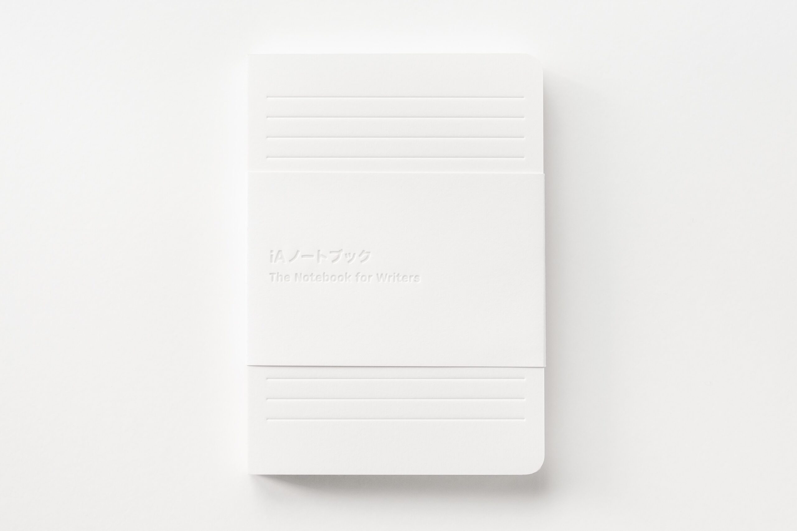
This is our Notebook. It took 10 years to make.
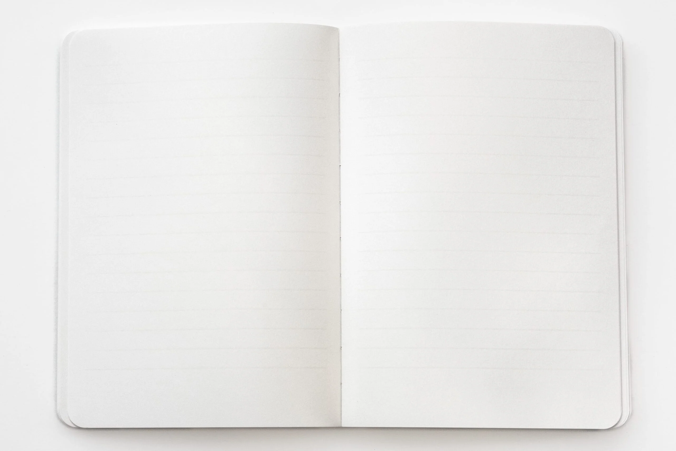
This is how it looks when you open it.
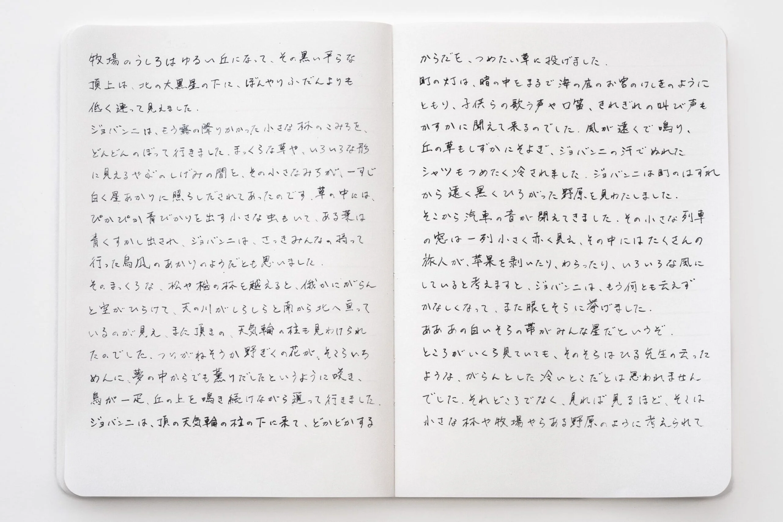
This is how it looks when you’ve written in it.

It has watermark lines.
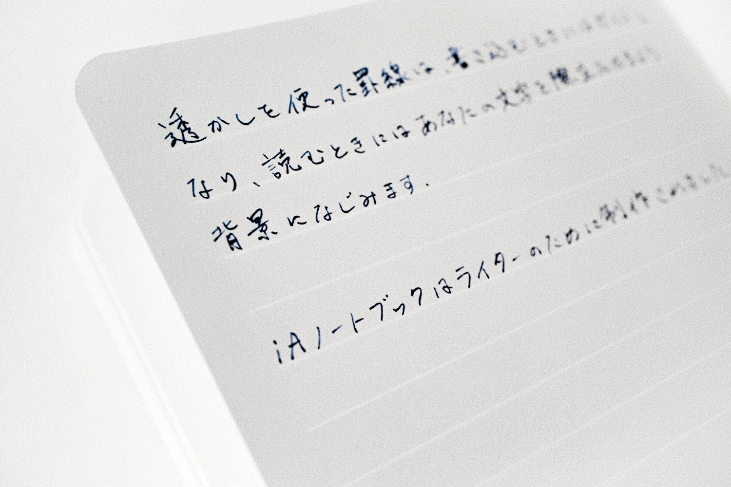
How does that help?

You can see them on a blank paper.
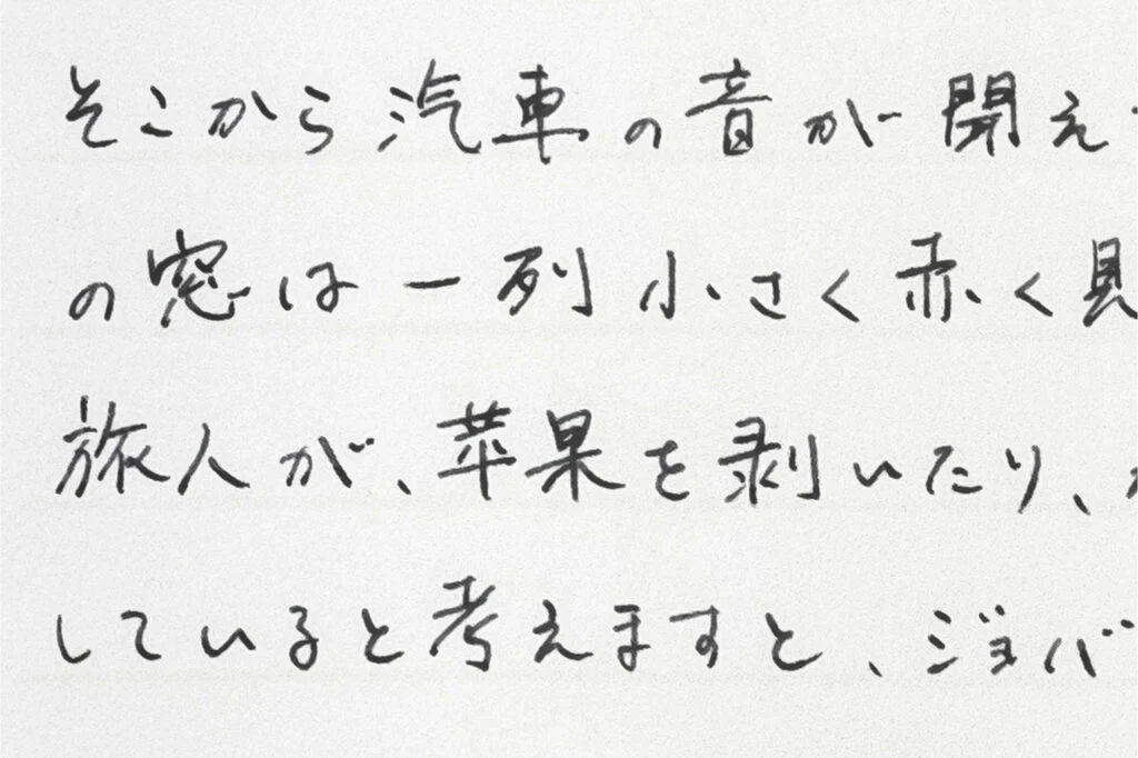
On written paper, they disappear because of the stronger contrast between the ink and the paper. It’s an optical illusion used as key element of the product. Yeah, I know how that sounds. But who doesn’t like to look at optical illusions? Now, we made them more than just fun. We make them work for you.
“Why would you work hard on quality when you can sell crap?”
Because that’s what I want, both as a consumer and maker of things. As a consumer, I want to spend money on great products. As a maker I want to know what I am doing—and I want to learn and grow as I work. I want to give people more than they pay for. I want them to find me thinking about them when they use our products.
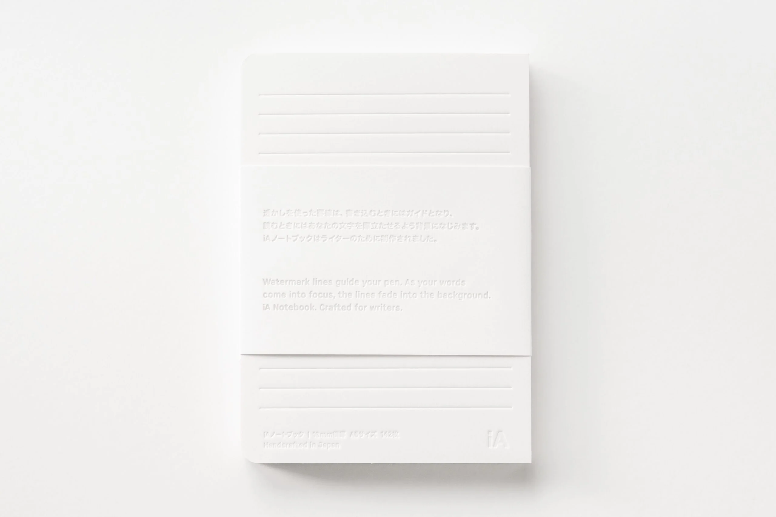
People love the idea but they love the product even more. They spend 70 euros on a notebook and come back thanking us. There is more than just an accidental connection between thinking of other people and thanking them. When customers use our products and realize that we have been thinking about them and not us when we made the notebooks is what makes customers thankful for the time we invested.
But does it really work, economically?
We invested 10 years and about 100,000 euros to develop the notebook. We have sold 1,000 copies at 70 euros in one week. We’re not in the black yet, but by the end of the year, we will break even. The feedback is humbling. People don’t just thank us for it, they come back and order 10 to gift it as a present.
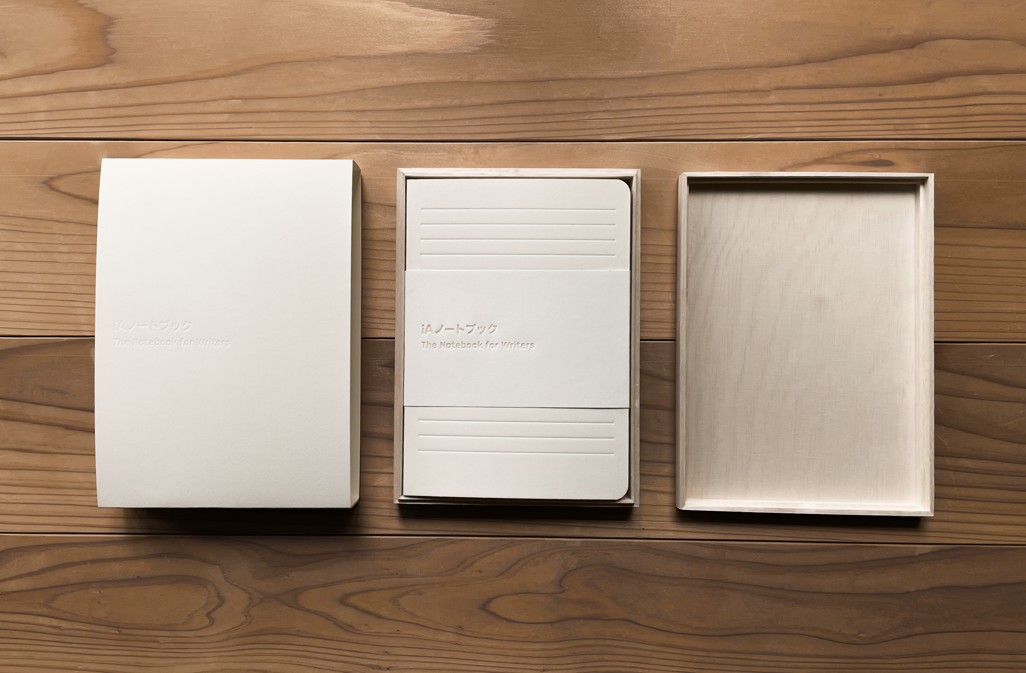
People who appreciate quality know that over time they save money. We may not all fully understand that products made thoughtfully over a long period of time hold the most precious gift inside: The gift of time. But we all feel it. Good products feel more real because someone put their time and energy into shaping them.
The packaging for the notebook alone took a year to perfect. It took so much nerve to make. Now, if you don’t buy any of what I just said, I can’t blame you. I tried to sell the idea of a much smarter person and if he failed, why would I succeed?
Gianbattista Vico tried to explain his whole life that the Verum is the Factum. Thought and words matter but ultimately, truth shows in what we do. Factum comes from Lat. facere, to make. A fact is literally what is done. (And yeah, the most popular word in English has the same root.) Truth is not primarily in what we think and say, but what we create.
I know that in a time of so-called alternative facts some of this may sound a bit suspicious. And that’s why, to close, I’d simply like to invite you to check it out yourself down here, during the coffee break. I brought one example of the notebook we made for you to look at, and touch.
Summary
Since this was quite a journy, let’s revisit: Maker’s Knowledge means that there is no purely theoretical understanding, but that we only truly understand what we make. Turned around this means that we need to understand what we do if we want to make high-quality products. This takes time and runs counter to the way economists want to make things: Fast, Cheap, and High Quality. We need to give our designers and developers time to create innovative quality products. This time is not lost. The presence of time in the product creates the experience of high quality on the customer side. When we look at a high-quality product we recognize that to create it others had to put a lot of time into it.